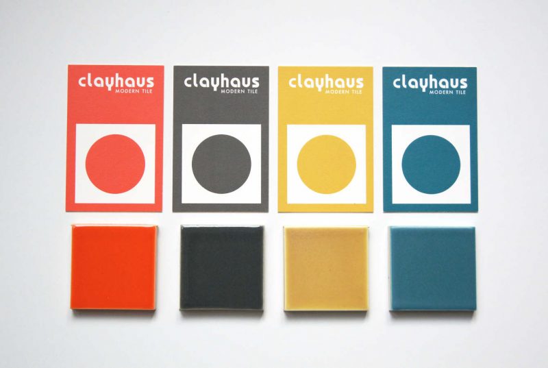
Providing bold, crisp, and innovative tile options, Jason and Megan Coleman created Clayhaus in 2010 and have been brightening up spaces ever since. We’ve talked with Jason in the past and this time we chatted with Megan about both the process and the inspiration behind their dynamic collections.
Classic Field Collection
“Every tile company has to have some standard shapes and sizes,” Megan explains of the classic squares, rectangles, circles, and hexagons that shaped the beginnings of this collection. “From there, you have to develop collections that help emphasize your brand,” Megan continues. Using the process of elimination, Megan and Jason ruled out styles and colors they did not want to offer, such as crackle glazes and sea creature patterns. Finally narrowing in, they decided on “clean, modern, crisp, bright, and bold,” which helped to develop a color palette. Knowing that neutrals were needed in the collection, they also wanted to incorporate bold colors to offer something unique for customers.
Color
With so many tile companies leaning towards grey and white, customers are drawn to Clayhaus wanting color. “We are color based first, we are known for our vibrant, bold, and saturated colors. We aren’t afraid of color and I feel like our clients aren’t either,” states Megan. Currently offering 76 glossy colors (28 of which have just been added) and 24 matte choices, the tile combinations are endless. While ‘Megan’s Green’ is indeed named after her, Megan admits that her favorite color is actually ‘Blue Hawaii.’ “It can be a cocktail or a vacation spot. Or a vacation spot with a cocktail,” she explains—and who can argue with that?
Futura
Inspired by the dynamic pop culture styles coming out of Britain and Italy in the 1960’s termed “The Look,” Jason created the Futura collection, further defining the Clayhaus brand. The five unique tile designs can be mixed and matched and when combined with endless color options, evoke the abstract illusion of op art.
Topo
When Portland Designer Stephanie Dyer came to Clayhaus with contemporary pattern ideas, the challenge was first to translate the designs into tile. Once the programming and designing are completed, a 3D model is made which Jason then casts and turns into something he can put into production. The collaboration brought a fresh perspective and different aesthetic to the company that ultimately allowed for a different customer base. “We put a modern twist on these designs and it’s been a great success because it’s brought in other clients who aren’t quite as bold but they really like patterns,” says Megan.
Cassette Deco
Clayhaus puts it best when describing this collection “We did it! We found a way to blend our two biggest passions—tile and music—and we think the results are nothing short of awesome.” Prior to Jason working in tile, he was a professional musician. Being a major record collector, Jason’s first choice for this collection was naturally records, however it didn’t translate into tile. So, Jason grabbed an old cassette tape, “… I believe it was Foreigner 4, he took the tape and cast a plaster mold and that is how we got the cassette tape,” explains Megan. “It’s just a little bit smaller due to the casting process but has all the detail.” This whimsical design was predicted for more commercial use but has surprised Clayhaus with many residential applications.
Next Up…
Keep your eyes out for an upcoming new modern deco dimensional tile collection in Collaboration with Portland product designer Kristine Morich!
Go Create!
Feeling inspired? Design your own tile, color, and grout combinations with Clayhaus’s highly addictive ‘You Design Tool’. Check out some of ours below!


