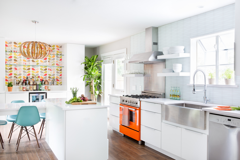
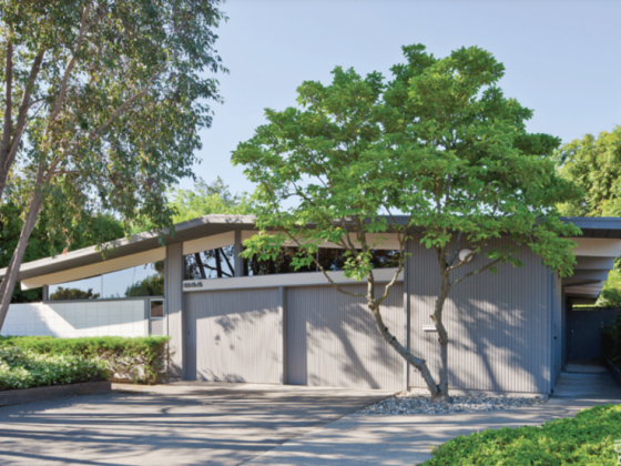
Once closed off and dark, this late 1970s Austin Texas house is now as bright and cheery as its owners. Upon purchasing, a low budget renovation was done all over the house, including the kitchen, where Formica countertops and MDF cabinets were installed. While this helped with functionality, several years later the couple decided to open things up and turn this colonial style into a midcentury modern haven. In 2014, with the help of Interior Designer Becca Stephens, renovations began by grinding down the concrete floor put in during the previous renovation. Plank ceramic tile was used all throughout the house as a scratch-proof solution for a family with a son and dogs.

Finding Inspiration
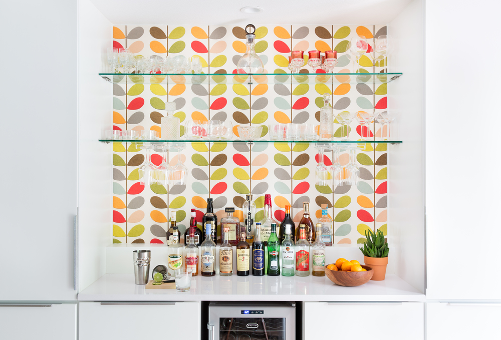
Going into the renovation process, the owners knew they wanted white cabinets to replace the blond wood previously installed—and had a vision for an almost-all white kitchen. When something mod and colorful was desired to brighten the room and break up all that white, wallpaper from designer Orla Kiely immediately came to Becca’s mind. The owners loved the print so much they wanted to put it everywhere upon first glance. Eventually though, they “decided on a limited amount for high impact,” explains Becca. “We found the wallpaper first and designed the kitchen around that,” Becca continues regarding the inspiration for the room. The eye-catching orange stove was brought in to complement the Orla Kiely print. From there, Becca added some textures that were “interesting enough to balance the wallpaper and anchor the stove but not too competing.” Adding visual contrast, tapered glass backsplash tiles break up the straight lines and bright whites of the room.

Designing a Kitchen for Entertaining
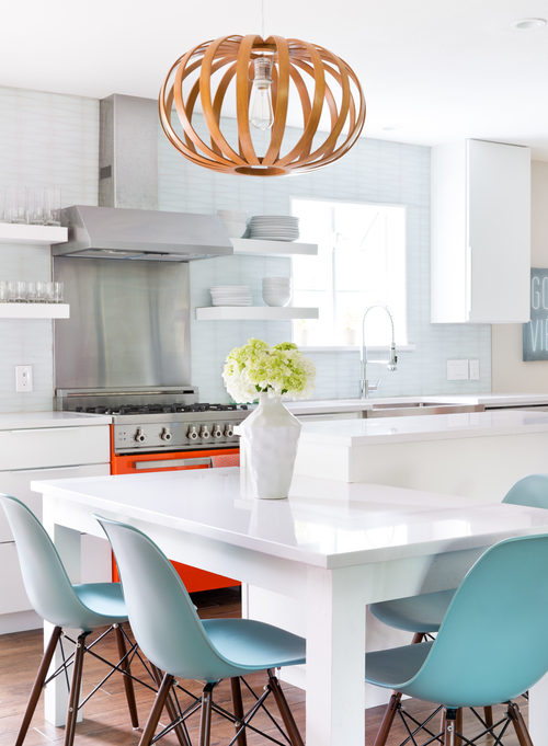
Because the couple owns an event company and loves to entertain, seating and flow was a major factor in the kitchen renovation. A corner that was once the dining room is now an island, table, and an upbeat bar area.
Given a closer look, you can see that the table is actually built into the countertop and made of the same engineered quartz that has just a bit of light speckling. This two-level island makes a rough L-shape and created a way to have another dining area without taking up too much space. With new cabinetry, a wine fridge, and an eye-catching wallpaper backdrop, the bar area is a natural gathering place for guests.
To see more interior design eye-candy from Becca, visit beccastephens.com.


