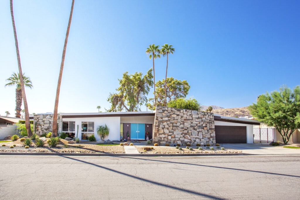
The 1965 Wexler home in Palm Springs boasted stunning original details, from the stacked stone and desert views to the in-tact floor plan and vintage appliances. Robert and Jaymi Gottfried knew the home was right for them and were prepared to put in the work to maintain it. “The minute we saw it we knew we had to preserve all the wonderful original features that Don Wexler incorporated into his design and the Alexander’s built so well,” the couple says.
An Outdoor Refresh
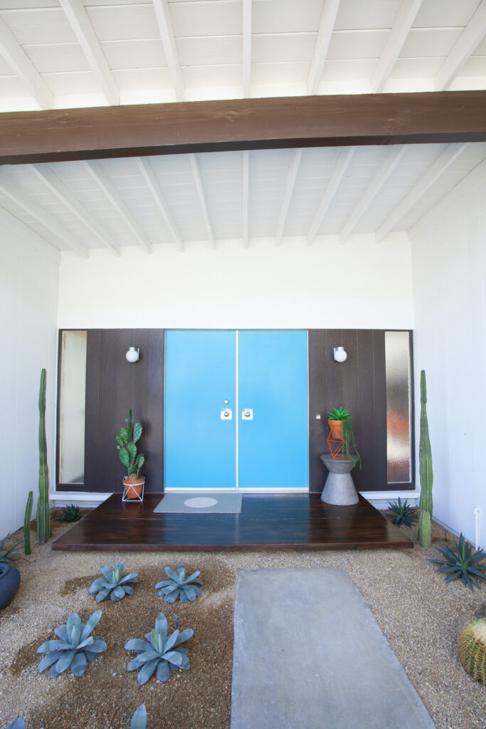
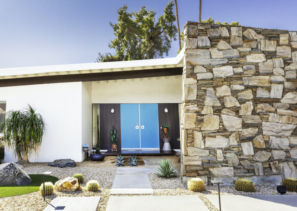
For the exterior, that meant new landscaping and paint. Cypress trees that covered the original rock walls were removed, as was the lawn. New desert landscaping was installed. The door radiates in Behr Island Dream, a shade that ties in with the interior color palette. Refreshing the door revealed more original touches.
“The step actually had indoor/outdoor carpet that was installed almost from the time the original owners bought it (we saw it in photos),” the Gottfrieds share. “When we pulled it off, we found that the wood was pretty much pristine. We use the same wood polish that we use for the interior floating step and the hearth.”
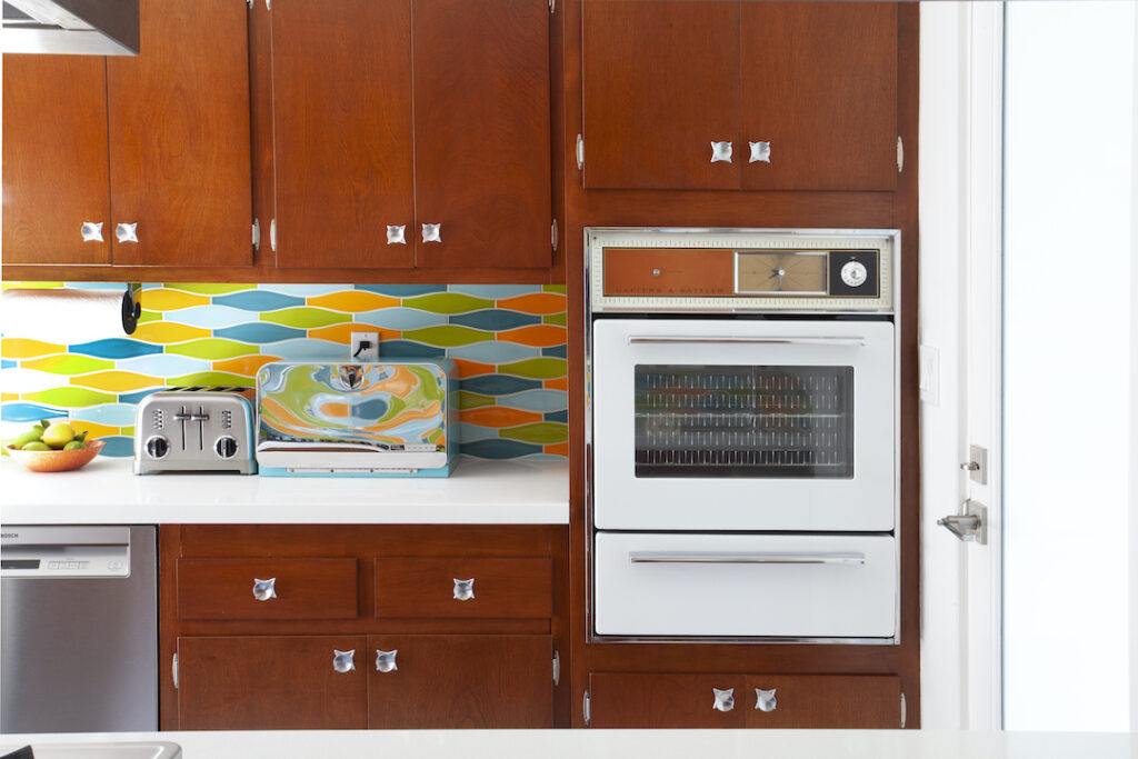
Pristine Pieces in the 1965 Palm Springs Wexler
A gorgeous original feature inside the home required considerably less work to discover—the fireplace. “When we walked in and saw it for the first time, I told Robert, ‘We are buying this house,'” Jaymi says. ”It’s all completely original down to the finish on the bowl and chimney, in fact we purchased the house from the daughters of the original owners, who told us that it had never even been lit. Their mom always kept silk plants in it.”
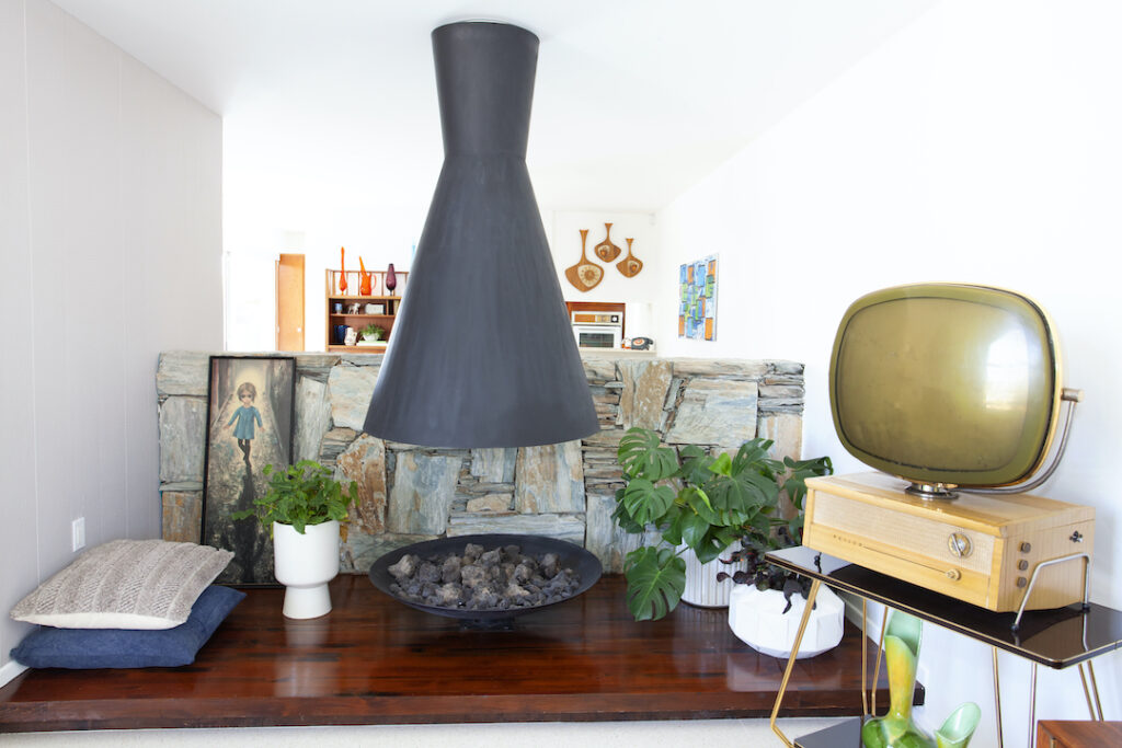
The homeowners and their guests curl up around the fireplace in a collection of vintage and vintage-inspired furnishings. The couch, chairs, side table, lamps and TV stand were sourced from vintage sellers. The stereo was a gift from a friend and the credenza was custom–made.
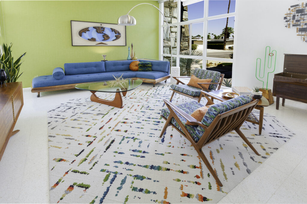
The living room connects to the dining room and has a view into the kitchen over the fireplace wall. All three spaces share the same color scheme and share an easy stylistic flow. “Since the space is accessible to the dining and kitchen areas, we wanted it to flow nicely,” the homeowners share.
And of course, don’t forget to follow us on Instagram, Facebook and Pinterest for more Mid Century Modern inspiration!


1 comment