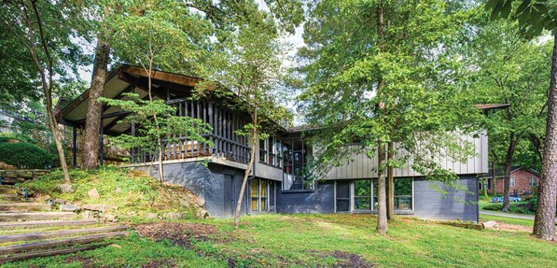
A new generation adds its touch to this MCM Arkansas gem, while taking care to respect the past.
The L-shaped, two-story, wood-nestled home boasting an array of enviable original features would be a must-see for any house hunter with a passion for mid century design. For current owners Elisa and Clayton Belknap, it was the Little Rock home’s story as much as its style that made it a must-buy for them. The home had been owned by just one other family: Elisa’s grandparents.

“My grandparents were a huge part of our lives,” she says. “They kept me before I was old enough for school, on holidays, on days I was sick, and we always had Sunday night family dinner at their house. If there is one house that has been a constant in my entire life, it is this one.”


Dr. Eugene Towbin had the home built in 1960 for his family after he took a job as chief of staff with the local VA hospital system (a VA healthcare center in North Little Rock was named in his honor). He enlisted Hollis Belk, a draftsman with a nearby lumber company, to design the home, and he designed the landscaping himself.
Original Condition
Once the home was officially theirs, the Belknaps enlisted Herron Horton Architects Inc. to get this family home ready to welcome in new generations. “When Clayton and Elisa showed us this house and walked us through what they wanted to do, we were amazed by the design and the finishes of the house,” architects Jennifer Herron and Jeff Horton recall. “Every decision was purposeful, yet simple.”


Even with an impressive list of original features—from the raised fireplace to exposed beams to the terra cotta floor—the home still had areas that needed some extra attention.
Making Space
The homeowners quickly identified the main bathroom as one of those areas. “Many MCM bedrooms and bathrooms are small,” Elisa says. “The original master had an office nook that was offset to the original bathroom. We wanted both a shower and a bathtub, and in order to do both, extending the bathroom into the office nook and combing the shower/bathtub space was the best option.”

Taking over that nook was just the start. “There weren’t any structural changes to accommodate the space for the primary bathroom; however, there were layout changes that involved incorporating a small space called the study into the new primary bathroom,” the architects say. “By doing this, we were able to position the freestanding tub by the windows and have a separate shower along with space to the double vanity. We removed a linen closet, a tub/shower unit and a built-in vanity unit. The toilet remains in the same location but is now in a private space with a door. The original bathroom had a door entry from the hallway as well as a door entry from the main bedroom. We kept the original door at the main bedroom and removed the door entry off the hallway. The vanities were removed, and the new double vanity unit was designed and positioned where the old door to the hallway had been.”
Old and New
The kitchen was also in need of updating. “The kitchen appliances were originals, and many were inoperable,” Elisa says. “Additionally, the dimensions of these appliances were obsolete, and replacing them with modern equivalents was not an option. Since the cabinetry was white birch veneer plywood and site built, it was not possible to modify to accommodate.”
Unlike the bathroom update, the kitchen renovation didn’t require any major layout changes.

“This kitchen has some wonderful features of mid century design that we did not want to lose,” the architects say. “Those features included the exposed columns, beams and rafters, the natural light from the awning windows at the carport, the cabinets that did not go all the way to the ceiling, the base cabinets with upper cabinets supported by a metal pipe, which allowed someone sitting at the dining room table to see through to the kitchen as well as someone who could sit at this counter and converse with others in the kitchen.”


For the other side of the kitchen, the homeowners requested a piece that would connect that space with the living room. “Mid Century Modern design has different types of screens, layers and incorporates the openness, light from the exterior to the interior, so we did not want to enclose this kitchen in any way,” the architects say. “The size of the kitchen was sufficient; it did not need to be bigger. So we opened up the kitchen to the living room by providing a bench at the kitchen with an open space above it. We took cues from the idea of the screen … by designing various size openings allowing for more visual connection to the kitchen/living room.”
A New Chapter for the MCM Arkansas Gem
The renovations took two years to complete. Along with these projects, the Belknaps also updated light fixtures, brought in new and vintage furnishings to complement what came with the house and continued to maintain Dr. Towbin’s landscape (unfortunately, though, some of his trees have been lost over the years).


“Obtaining and renovating this home was a much more arduous process than we had imagined, but it was worth it,” Elisa says. “It’s been an honor to own such a beautiful, and significant, piece of property. The admiration it receives from friends and family, and even strangers, brings us a huge sense of pride, not only in our family history but in the work that we did to update it.”
Digging Deeper
Turn to community resources to uncover your home’s history.
As the granddaughter of the original owner, Elisa Belknap was already primed on the history of the home she shares with her husband, Clayton, but wanted to know more. When she and Clayton began the process of purchasing the home, they reached out to a Little Rock-area Mid Century Modern Facebook group to get help finding out more information. The group helped the couple uncover more of their home’s history and got the home listed on the National Register of Historic Places.

“Little did we know they were in the habit of nominating houses for our local historic register and were adding Mid Century Modern homes especially,” Elisa recalls from reaching out to the group. “Once they realized that my grandfather was a person of local significance, they realized that with the uniqueness of the home and his prominence in the community, the home deserved a chance at being recognized nationally.”
You can learn more about your home with the help of area historical societies and conservancies, public libraries, community museums and nearby universities that may have materials like marketing brochures for your tract, architectural plans or newspaper stories about the original owners (your home could have been featured in the lifestyle section of your local paper). In addition to filling in your home’s story, these resources could also help you get special recognition for your home, maybe even a national designation like the Belknaps got for theirs.
If you love the architectural screens in this home but don’t have any in yours, browse bookcases and room dividers that can create a similar effect! And don’t miss Richard Harvey’s Sculpta-Grille Screens! Of course, don’t forget to follow us on Instagram, Facebook and Pinterest for more your daily dose of Mid Century Modern inspiration.


