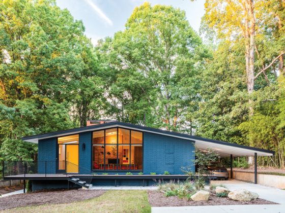
These designers found creative ways to showcase their art collection in their mid-century-inspired home redesign.

Most new homeowners don’t consider the placement of artwork until after the remodeling and redesign work have been completed. However, the homeowners who also redesigned this late-1970s modern build made the placement of their art collection a primary consideration early on in the process.


Dick Burkett and Russ Uthe, owners of Richard Russell Design, have an extensive art collection and wanted to create spaces that would showcase the art.

“The placement of the art collection is always of prime concern for us anytime we are looking at purchasing a new home,” Burkett says. “We have lived in numerous parts of the United States and Mexico and have traveled overseas, so art became a passion to collect along the way. This home is our 20th in a series of residences we have owned that spanned various architectural styles, including this project, which features late-1970s modern architecture.”

There were some obstacles on the road to the redesign that they needed to knock down on the way to completing their dream home.
“When we purchased the home, there were popcorn ceilings and strong-colored walls to deal with. We added recessed lighting to capture the mood and specialty lighting to highlight the art,” Burkett explains.
The designers were involved in the home’s remodel, as well as the redesign.

“Russ and I were totally involved and directed every aspect of the remodel,” Burkett says. “Our goal was to maintain the integrity of the architecture while readapting and updating the interiors somewhat.”
They created a detailed floor plan to ensure that their home’s redesign showcased each piece of art.

“Prior to any work being done, we created a to-scale floor plan for the furniture and lighting for the art placement, which is key for a successful design,” Burkett notes.
Unique Features of the Home Remodel
A charming architectural feature attracted the designers to the neighborhood.
“After looking at several condominiums on the south end of Palm Springs (California), we zeroed in on Mesquite Canyon Estates, which we found to be an excellent transition from a freestanding home to a condominium,” Burkett says. “We were quite taken with the ‘lollipop’ street lighting, which was the tipping point for our decision.”

The 2,150-square-foot home has two bedrooms, two baths and a media room.
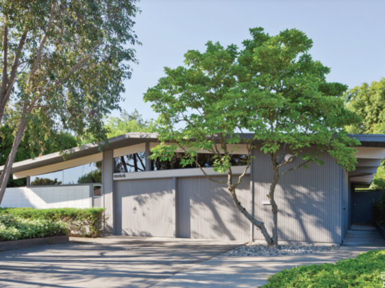
“When we observed there were three distinct roof lines—a double gable, a single gable and a raised flat roof—we wondered who the architect was, because this feature had been used on many other mid-century, multi-family complexes,” Burkett says. “The architect-of-record is David Christian, whose main body of work was commercial. The expansion of Temple Isaiah and Las Casuelas Terraza in Palm Springs are two well-known examples. He worked for [prominent Palm Springs architects] Donald Wexler and Hugh Kaptur early in his career. Our research indicates that many of his later projects were international and that he founded one of the largest architectural and interior design firms in the area. Of utmost importance to us were the almost-15-foot-high ceilings in the living room and the generous spaces in the kitchen and nook.”


While the original floor plan was kept intact, there were a few modifications to the interiors: In the guest room, a large walk-in closet was converted to a home office, and an 8-foot-wide alcove was repurposed as a closet. A linen closet in the hall was converted into a display case for an international pottery collection. To accommodate a major piece of art, a storage area in the kitchen was drywalled.
Creating the Canvas for the Home Design Showcasing Art
After the remodeling stage was completed, the room redesigns could begin.
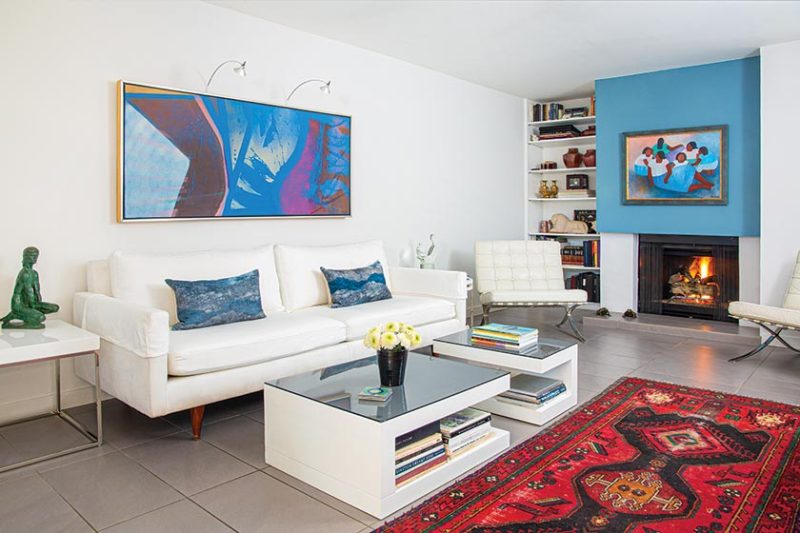
“The ambiance we chose for the interiors was an eclectic approach—a blend of bold, geometric, original Oriental rugs, classical and mid-century pieces, modern and a touch of the 1970s. Special attention was given to blending the texture of materials to create interest. The intention was for the environment to possess a touch of low-key, sophisticated elegance through careful editing.”


The color palette was also carefully considered so that it would respectfully reflect the period’s architecture.
“We are thrilled that the homeowners association did paint scrapings and referenced vintage photos to determine the original exterior colors. This returns the enclave to be true to its roots,” Burkett points out. “To provide a neutral background for the art collection, we chose a warm white for the walls and medium-gray Italian porcelain floor tiles for the interior palette.”
Incorporating Mid-Century Art into the Home’s Redesign
Here, designers Dick Burkett and Russ Uthe discuss how they incorporated their art collection into a mid-century design:

- Wall space. “One of the things we always must be concerned about is adequate wall space to accommodate some large pieces of art we have collected over the years,” Dick Burkett notes.
- Scale sensibility. Burkett explains, “The scale of the pieces and the rooms in which they were to be installed were coordinated with the furniture, taking into account color combinations and subject matter. A gallery effect was used in the workspace area for a cultural mix of portrait photography from Costa Rica and Mexico, along with a ‘mola,’ which is a handmade textile of traditional women’s clothing of indigenous people from Panama, Central America and Colombia.”
- Delightful greeting. “The aluminum abstract sculpture in the foyer was chosen as a way to greet our guests—and for our own delight!” Burkett points out.
- Eye rest. It’s important not to fill every square inch of wall space with art in order to have room to “breathe.” Let a beautiful exterior view be the art for the room in some cases.
For more ideas on showcasing art in your home, see Showcase Your Artwork With A MCM Gallery Wall. If you love Palm Springs and modernism, get ready for this year’s Modernism Week. Atomic Ranch will be there! And of course, don’t forget to follow us on Instagram, Facebook and Pinterest for more Atomic Ranch articles and ideas!

