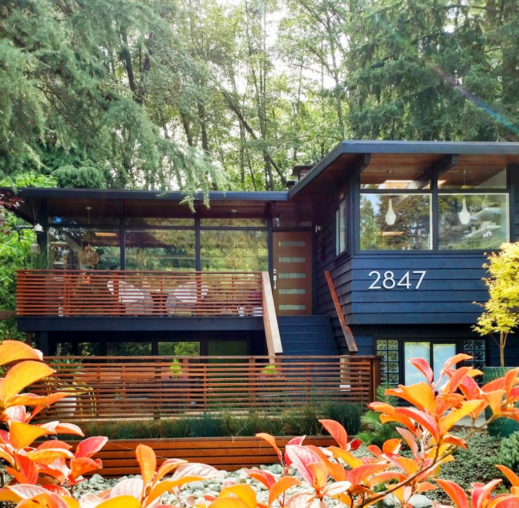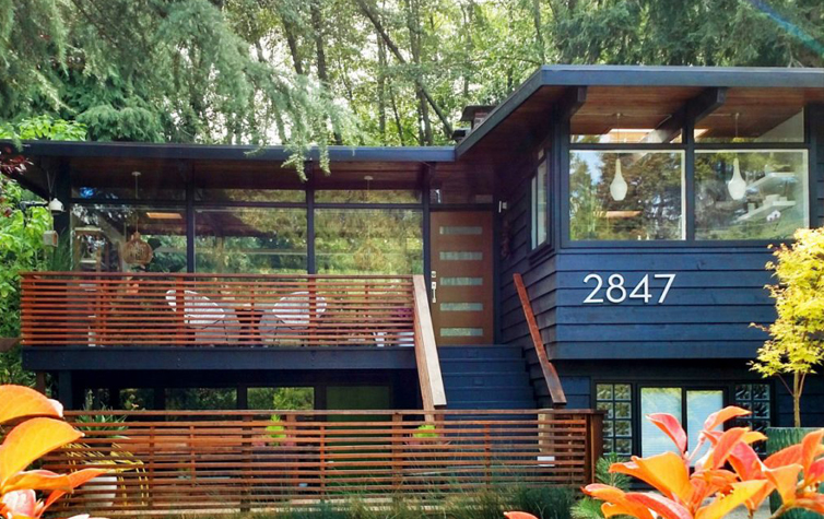
Nature takes the limelight in this 1958 John Burrows house. The residence’s dark, dramatic exterior (“Caviar” by Sherwin Williams), inspired by charred Japanese wood called Shou Sugi Ban, distracts from the fact that it is a man made structure among the Lake Forest Park woods in Washington.
“With the natural setting of house, we wanted nature to take a focal point, and black helps it recede into it,” said homeowner Audrey McGill.
The home’s interior also reflects Audrey’s desire for her home’s wild surroundings to draw visitors’ eyes. Large panes of glass encapsulating the residence and an open floor space enable an unobstructed view to the natural wonders outside. Audrey prefers her home uncomplicated and uninhibited, just like her home’s outsides.
“We wanted a simple, uncluttered feel, but also wanted a feel of coziness and warmth,” Audrey said.
After purchasing their home in 2012, Audrey and her husband Kevin set out on a renovation process to emphasize these elements—but they weren’t in a rush. The couple needed to adapt to their new home and feel out its flow before making major changes, so they first uprooted the carpet in the hallway and one of their boys’ bedrooms to expose the wood.
The home’s wood features are especially important to Audrey. A majority of the original flooring was kept and only re-stained; Audrey believes that the previous owners used a Swedish finish to match the living room flooring to the rest of the house’s oak. But it’s a special wood feature that John Burrows built himself that Audrey is especially fond of: the cedar wood beam ceiling, which extends to outside of the house. For Audrey, the beams brighten up what could have otherwise been a gloomy living area.
“Especially in Seattle, we have so many grey days,” Audrey said.

This wish to brighten up the area was conveyed in the walls, which were painted white. With an appreciative eye for pretty images, whether it’s for forest scenery or a painting, Audrey also illuminated her walls so they could serve as a better backdrop for artwork and furnishings. To Audrey, the house’s foundations are not meant to stand out; instead, they help other arguably smaller features take center stage.
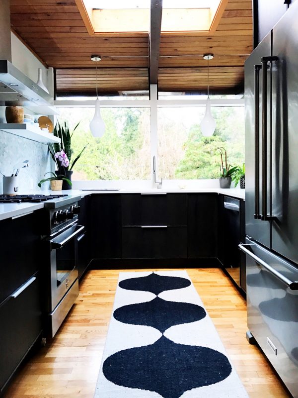
Audrey also applied her design philosophy to the kitchen. It took a year until her and Kevin felt confident tackling this project—and even then, they went at it steadily, taking four months to make all the updates. Everything was approached with a “DIY” attitude, save for the countertops.
“There was upper-cabinetry in the kitchen when we moved in, and the previous owners did a lovely job matching the cabinets that they added to the home with the style of the house,” Audrey said. “But we wanted to remove the cabinets to allow light to come in from windows.”
The cabinets were exchanged for more light-friendly open shelving, and the previous owners’ grey quartz countertop got the boot for the same reason. Audrey and Kevin installed two other new features in their kitchen: a white quartz countertop and bottom cabinets from IKEA. But the latter was not implemented for brightening purposes. Instead, it was a move that reflected another renovation goal besides incorporating more light: the wish to modernize the couple’s space.
A hybrid John Burrows home
Audrey is not a purist—and admits it. Find out how she and Kevin put a unique twist on their midcentury home, which includes a Japanese-inspired feature, in Part 2!


