Which trends are the right fit for mod homes and which looks will be timeless? Interior design experts share their insights on designing with tile.
We modernists have a blatant love affair with tile. There are online networks devoted to saving vintage tile from project sites, there are notable buildings and interiors that are recognizable based solely on their tile, and tile posts, such as this one, are among the most clicked on our website. Therefore, choosing and designing with tile for your renovation project is a big decision.


However, designing with tile is wonderfully customizable and can impart an elevated feel to a space. For Savannah Duren and Lilli Morgen of LS Design Studio based in San Diego, California, rooms with statement-making tile are all about bold looks in smart colors.


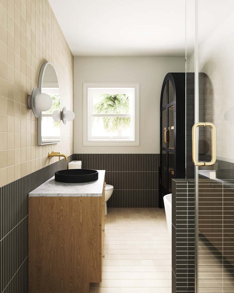
Their full-service interior design firm focuses on large-scale remodels, kitchen and bath renovations, and home furnishings, so working with tile is a big part of what they do. “The hard-surface selections, such as tile and countertops, are what give the room its own individual look and feel,” Savannah says. Lilli adds, “Each decision that goes into them is intentional—from the material type, the layout, the finishing details—it all creates a unique look that forms the character of the space. If we choose a marble herringbone in the shower, it’s going to have a completely different personality from a black ceramic subway tile stacked vertically. Your tile and hard surfaces then become the base of the space, with the other surfaces working off of them, meaning they are incredibly important.”
They share their design insight, expertise and tips for designing with tile below:
What are some exciting things you’re seeing right now in the world of tile?
We’re still seeing a huge amount of natural and organic materials, like Zellige tiles, a comeback of travertine, a heavy use of marble… and then, on the other hand, we’re seeing tons of straight lines and geometry: linear tiles, color blocking, checkered patterns, ranging grout sizes. We love everything that’s happening right now!
Do you think tile has the ability to make or break a room?
When selecting materials, hard-surface selections, such as tile and countertops can absolutely make or break a space. Functionally, if a material is chosen for the space that doesn’t work with a client’s lifestyle, in our eyes, it counteracts a beautiful design. Additionally, a beautiful tile selection can stop you in your tracks so we put a ton of thought into what we specify!
What are some trends that you think fit the mid mod aesthetic?
In a Mid Century Modern design, we really love the use of geometric tiles and like to think outside the box with them. For a linear tile, that might mean adding a thick grout line to make it unique. For a checkered pattern, it might mean going bold with the color ways. There are also so many curves when it comes to Mid Century Modern, so throwing in a curvy tile or a funky, wavy cabinet hardware is a great way to pay homage to MCM.


What’s one way to use traditional tile in a new fresh way?
As far as traditional tiles, we don’t think you can get much more traditional and timeless than a basic subway tile. That said, there are so many ways to mix it up: You can install it in a funky pattern like a herringbone, you can do a dark or even colored grout color to add contrast, you can mix in other unique tiles as an accent with it. The options are endless.
What is the key to creating a design that is timeless?
The biggest key is creating a design that YOU love, not just what everyone on Pinterest is loving. We are also firm believers that quality materials are timeless and, most of the time, splurging for the more durable materials will pay off in the long run.
What’s the key to using tile in a way that is bold?
Thinking outside of the box! It’s easy to put in a white subway with a brick layout and a white grout. It takes a little more effort to come up with a layout and design that’s more eye-catching and unique. Our best tip is to pick a color story for your space of about 3-4 colors/tones and select each material based on these colors. This will help open your mind to lots of options while making sure everything is cohesive in the end.
What are some mistakes people make when it comes to choosing and incorporating tile into a renovation/remodel?
The top three mistakes we see are, first, selecting an incorrect material or finish. A prime example of this would mean using a large-format polished marble tile in a kids’ bathroom—we can’t think of a more unsafe and slippery material! The second would be incorrect use of scale. For example, if you have a small laundry room that’s only a few feet wide by a few feet long, using a 24” x 48” tile likely would not be the best choice, since you will only see a few tiles and the grout lines are going to feel very sporadic. The last would be going overboard with patterns. We always try to be really careful about mixing patterns and tile mosaics in an effort to not distract your eye in the room, but rather guide it through the design. If you have a small diamond mosaic tile on the floor paired with a chevron mosaic on the shower walls and a penny dot on the shower pan, your eyes are not going to know where to land and it’s going to read much more busy than you were anticipating!

Looking for more MCM tile design inspiration? Think outside the bathroom and read on for How to Choose Tile for Your Pool, Outdoor Tile, Mid Mod Style, Tile 101: How to Choose the Right Tile for Your Midcentury Home. And of course, don’t forget to follow us on Instagram, Facebook and Pinterest for more Atomic Ranch articles and ideas!


