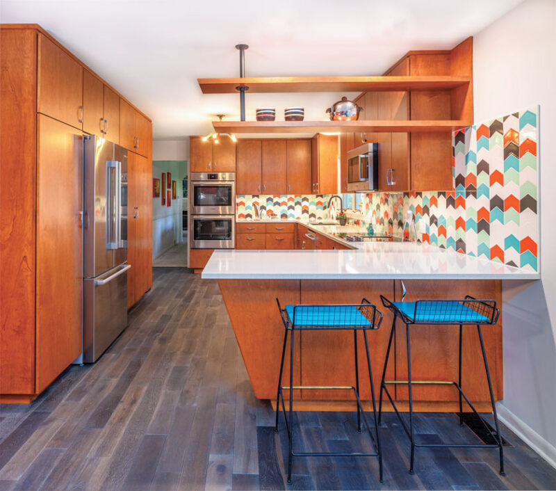
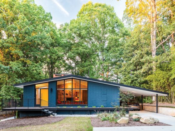
With a main course of mid-century style and a dash of color, this kitchen retrograde became the icing on the cake of a dream vacation retreat.
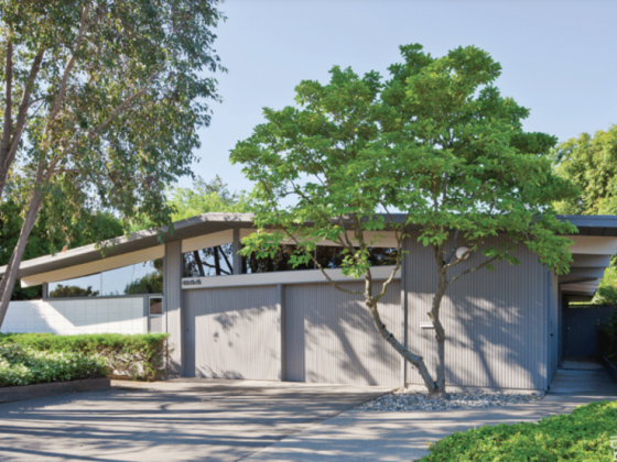
When Nikki Luzanski and Steve Karpeles found this 1965 mod in a desirable neighborhood of Lansing, Michigan, the kitchen had undergone the dreaded ’90s renovation. Most of its mid-century charm had been replaced by maple cabinets with raised panels, soffits and linoleum tile floors. The homeowners brought in Elin Walters of Exactly Designs and leaned on her Mid Century Modern expertise for a kitchen retrograde with a mission to restore the space to its former glory.
“The goal of the renovation was to get rid of the ’90s look and take it back to a vintage look, making better use of the storage and allowing for seating of some sort,” Elin says. “The space needed better flow with the adjacent living room.”


Fixer-Upper
The narrow kitchen sported an island on wheels and a built-in desk and closet. “There seemed a better way to clean up the look and be more efficient with space,” Elin says. “The island on wheels made the kitchen feel cramped and there was no seating to hang out. The soffits were unnecessary, taking away potential storage space and creating a more closed-in feel. The flooring was choppy and made the two spaces feel disjointed. The lighting was misplaced and not practical.”
Elin gutted the kitchen for a fresh start for the retrograde. She removed the soffits and laid flooring that matched the rest of the house and designed custom cabinets for the space. “We simplified the placement of lighting and created a clean bank of floor-to-ceiling wall cabinets,” Elin says. “We added floating shelves above the peninsula to create the illusion of a ‘wall’ to divide the two spaces, making for a cozier space. We introduced a retro angled-base cabinet and mimicked the angle above on the floating shelf.”

Kitchen Retrograde Muse
Elin says the overall design was inspired by a vintage booth that was to be used in the layout. “The booth was recovered in turquoise, black, white and red vinyl, with chrome banding and legs. The back of the booth has a large triangular design. It was our intention to use the booth seating, so we carried the angle theme into the cabinetry, shelving and backsplash,” Elin explains. “As we further developed the initial design, we became aware that it was going to feel too cramped using the booths. Instead, we extended the long wall of cabinets and created counter seating with an overhang. But the colors and the angles took on a life of their own and we ran with that same vibe.”


If you love this kitchen retrograde, don’t miss more of Elin’s work such as this Spacious and Vibrant Michigan Home. And of course, don’t forget to follow us on Instagram, Facebook and Pinterest for more Mid Century Modern inspiration!

