Thoughtful details and a careful consideration of light gave this Portland home an exterior renovation and connection to the outdoors.
When Patrick Seehafer discovered this Portland home on the Internet while living abroad, he knew even without seeing it in person that it was the kind of property he and his family could live on long term. “It was recessed off the street and set lower, so it really gave it a suburban-recluse vibe that we were drawn to immediately,” he says. Patrick made the purchase and held onto it for a few years before enlisting Skylab Architecture to undertake the detailed renovation in 2009.
“We loved the envelope—the footprint. It was just about the right size,” Patrick says. While the home’s square footage was functional for his family, he wanted to transition from classic ranch to a more open, distinct and modern type of living. “The house had really strong bones in terms of the wood structure, an open landscape and some mature landscape around the perimeter,” says Brent Grubb, principal at Skylab. “Our goal was to reinterpret this type of a house and modernize it, which was exciting with a design-focused client like Patrick.”

From Ranch to Mid Mod
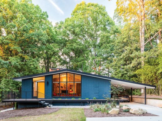
To bring the vision to life while operating within the existing envelope, the Skylab team, led by founder Jeff Kovel, AIA, and lead project architect Chris Brown, took a uniquely creative and focused approach. “We really obsessed about all the details to make it functional without adding any square footage,” Patrick says. “It creates a utilitarian luxe feeling.” Major changes involved interior layout adjustments to better suit the family’s lifestyle and drastically opening up the house via floor-to-ceiling windows. “Most ranches historically have smaller windows for privacy,” Brent says. “We reframed most of the exterior walls and introduced new floor-to-ceiling windows for a seamless structure.”

Blurred Lines
It’s easy to see how the windows play a major role in connecting the interior to the outdoors, but upon closer inspection there are so many unique details at play. “We decided to just sandblast and leave the eaves so the natural wood runs from the outside to the interior of the house,” Patrick says. The result is a felt sense of connection between the interior spaces and the outdoors where the eaves hang. “It makes everything feel much more integrated, warm and whole,” Patrick says.
Another major contribution to the indoor-outdoor connection is the unique pattern of the cement pavers. “One of the big drivers for the Skylab design team was asking, ‘how do you connect the dining kitchen to the outdoor garden and how does that relate to the entry etc.?’” Brent says. “The team also worked with landscape architect Jonathan Beaver at Knot Studio (formerly 2.ink Studio) and he had proposed several different schemes.” In the end, this geometric pattern to connect spaces won. “I immediately gravitated toward and fell in love with the cleanliness and strength of the cement lines,” Patrick says.

Light as a Material
A final point of connection—and perhaps one of the most subtly noticeable—is the use of light. “A significant material in this sense was light: how you reframe light in the house while maintaining the existing structural frame but give it a fresh interpretation for the next generation,” Brent says. They played with new skylights, the aforementioned floor-to-ceiling windows and even reconceptualized the home’s exterior design from that perspective. “The idea was to have a darker, protective exterior while preserving the underside of the roof structure in a clear and natural finish,” Brent says. “The expanded skylight openings allow natural light in during the day, and then at night it inverts and the house becomes a lantern.”
From beginning to end, every detail of this renovation was thought out with careful attention. “A challenge in this case was that we were maintaining the structure and trying to reuse materials that were there, so it takes more time and care to deconstruct something and respect history in a sense, but then update it, refinish, reframe and complete it,” Brent says. In the end, all the careful considerations were well worth it for the new life of this stunning home.


How to Foster a Stronger Connection Between Indoor and Outdoor Spaces
It’s the goal of almost all mid mod design, but some projects accomplish it better than others. Here are three tips to achieve a better indoor-outdoor connection.
- Exposing the structure. “When you’re honest about exposing the structure, that transparency amplifies the openness of the home and connection to the landscape,” Brent says. Floor-to-ceiling windows created a greater sense of openness between spaces.
- Carrying lines from interior to exterior. Sometimes you’ll see exposed beams run from inside to outside, but in this case the entire underneath side of the roof continues between the two. “It looks and feels like you don’t know if you’re inside or outside,” Brent says.
- Make the landscaping a contribution. Find ways to connect your exterior landscaping decisions to the interior. Here, the unique pattern created by the cement pavers outside seems to weave in and out of the house. “It blends it all together,” Patrick says.
For more inspiring Mid Century Modern landscaping inspiration and pointers, don’t miss An MCM Landscape that Bridges Styles & Seasons, The Keys to a Great Modern Garden and Front Yard Fall Foliage. And of course, don’t forget to follow us on Instagram, Facebook, Pinterest and YouTube for more Atomic Ranch articles, house tours, and ideas!


