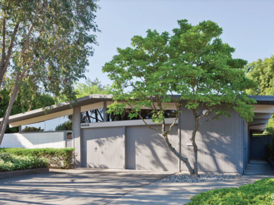
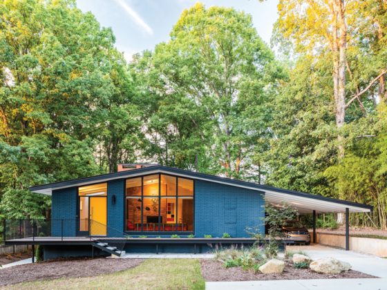
The Alexander Construction Company built this 1957 home, and visionary and architect William Krisel designed it. It’s tucked into the vibrant and picturesque Twin Palms neighborhood in sunny Palm Springs. Over the years, the home had fallen into neglect and was in need of some work.
When realtor, Twin Palms neighborhood resident, author and Krisel expert Chris Menrad saw the home on the market in late 2011, he envisioned an opportunity to honor the home’s original design while giving it a refresh.

Chris collaborated with friend J.R. Roberts on the restoration and renovation of the home. J.R. Roberts is a board member of the Palm Springs Modern Committee and well-known in the area for his preservation and restoration work. As a team, they consulted with original architect William Krisel himself for the project.

Mid Century Haven
The three-bedroom, two-bathroom home is part of a greater section of housing designed by Krisel between 1956 and 1957. It was during the housing boom in Palm Springs. “Tract housing was sort of a derogatory term. However, Krisel managed to make these homes all look different from the outside while having a very similar layout inside,” homeowner and author Heidi Creighton says.
Heidi purchased the newly refreshed home from her friend, neighbor and realtor Chris Menrad in 2012. “Good design can transcend restrictions, and you can have amazing architecture on a small scale,” she adds.
Related Reading: Desert Modernism: Coachella Valley’s Favorite Style

Heidi’s love for all things Mid Century Modern was first sparked in her childhood in Don Mills, Ontario, Canada. “It was the first suburb in Canada that had modernist homes,” she says. That love grew into a passion for modernist art and architecture that led her to shop for a second home in the mid century mecca, Palm Springs.
While walking through the Twin Palms neighborhood, she came upon this home for sale, knowing right away that it was special. “I bought it from the street,” she says. “I knew it was the one for me.”

Design Refresh
With a passion for preservation and restoration, Chris and J.R. had worked with William Krisel on two previous homes. One of them was Chris’s own house. Heidi’s home was the third collaboration and, while it had fallen into neglectful disrepair, the team saw the potential. “The bones were still good; it just needed interior finishes,” Chris says.
Related Reading: Get A Kick Out Of Frank Sinatra’s Twin Palms Estate

There were few structural changes needed due to the excellence of Krisel’s original design. “The house was already very functional, so we didn’t have to do a lot,” Chris says.
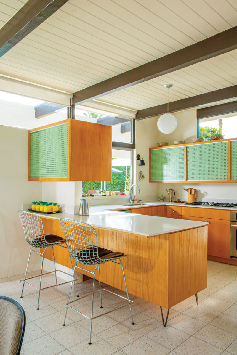
The interior of the home had seen some updates throughout the years, but the overall footprint was still intact. Inside the kitchen, they removed a wall dividing the dining area from the kitchen to create an open layout. “The original cabinets had the pegboard. We based the design off photos of the homes in this area by Julius Shulman in 1957. And we used the plans for the kitchen that are at the Getty Museum in Los Angeles,” Chris explains.
Another major interior change was removing an open-air atrium between the bathrooms to expand their square footage. “While we did make some changes, we worked hard to preserve the soul of the house and the authenticity of what was originally done,” he says.


Letting in the Light
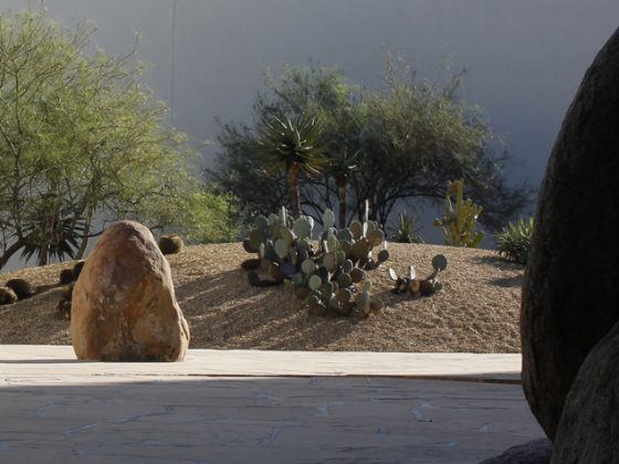
On the exterior, the team gave the home a landscaping facelift, mixing the original design with modern materials. “The most important thing William Krisel did [during the update] was redesign the sun flaps to let in some light and a glimpse of the mountains,” Chris says.
William Krisel added a gap to allow light and views, while maintaining the original design feel of the exterior of the home. “We removed about 3 feet of the tongue-and-groove ceiling that extends out to the eaves,” Chris explains. “It improved the look inside and outside.”

With its modern lines, retro palette, vintage pieces and functional updates, this home honors the best of its original design. But it also allows for some modern updates.
“Krisel’s work on this house reflects what he believed about [modernist] language. The root of the language—in this case, structure—stays the same, but it can encompass new words—or in this case, materials,” Heidi says. The home still stands as a testimony to Krisel’s original vision of bringing together functionality and design in a cohesive and creative union.
Related Reading: Sunny San Diego’s Palmer & Krisel Pacifica Neighborhood

For more Palm Springs inspiration, tour this colorful Donald Wexler home.
And of course, don’t forget to follow us on Instagram, Facebook and Pinterest for more Atomic Ranch articles and ideas!

