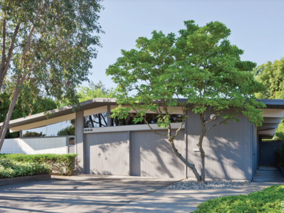
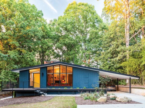
“A lot of people who have great mid century homes don’t know what they have. That was really the case here,” says homeowner Daniel Krog. His 1951 ranch in the hills of Studio City, California had a traditional makeover before he moved in.
“We knew what it could be when we saw it. The glass walls, the masonry and the curved fireplace were all original. But everything on top of that was kind of like a Rolls Royce covered in pink paint.”

Daniel is a graphic designer, classically trained musician and lyric tenor. He and his spouse, Adam Bonnett, a TV exec with the Disney Channel, owned a house in Palm Springs. So, they both knew and loved modernism. The pair fell for the large lot, the valley views and the layout of the 1951 ranch. Then they set out to free it from the ’80s trappings.

Stone Age
A new roof and flooring headed the to-do list. “The floor plan was so open. So, it was evident that whoever did the interior had no idea what to do with it. Everything was broken up,” Daniel comments. They took up all of the hodgepodge flooring, and they ground the concrete slab to receive 24″ honed bluestone tiles in the living, dining and family rooms and kitchen. The entry hall and baths got Italian ceramic tile, and we carpeted both bedrooms.
Related Reading: Bringing it Back: A Palm Springs Home Renovation

Kitchen Conundrum
The existing kitchen had a mix of avocado-colored metal and particleboard laminate cabinetry. The original electric appliances and a laundry room were shoehorned into one side. The couple worked with designer Annette Eason, who helped finesse some of their ideas and solve specific problems, like the surprise they found behind the old wall oven.
“When we did the kitchen demolition, we discovered the back of the curved fireplace in the living room,” Eason says. “They built a bump-out to accommodate that. When these kinds of things happen—and they always do—I like to make them an asset if possible. So instead of an awkward, unintended bump-out, it became a column of color with floating shelves that anchors the corner of the room.”

For kitchen 2.0 of the 1951 ranch, they chose Treefrog lower cabinets and stainless steel appliances They opened up the wall between the laundry and the kitchen. “I fought for the kitchen backsplash tile to be installed on the vertical, because it’s reminiscent of stone you see on midcentury buildings,” Daniel says. Although the couple loved all their choices, the room still felt small and cut off from the rest of the house.
“When we opened the wall, everything on the kitchen side had to be carefully removed and then matched/replaced,” remembers Eason.
Related Reading: MCM Atrium: A Dry Garden Makeover

Updating Tradition
Another puzzle was the fireplace and barbecue in the family room. “This was a section of the house we didn’t quite know what to do with. The chimney had been ruined in an earthquake, and to fix it we would have had to rebuild that side of the house; we knew we didn’t want to do that,” he says. “Instead, we opted for a bookshelf where the fireplace was, and where the indoor barbecue was, we had Nick Ganzoni, our cabinetmaker, build a walnut mini bar that pulls out. Many people think these are original to the house, which makes us happy.”

Backyard Transformation
Daniel says the episodic remodel really came together when they tackled the last big project of this 1951 ranch: the backyard. A pink concrete patio, a pool house that was sliding down the hill and a view-blocking fence weren’t doing it for them. Working with landscape designer Judy Marchyn, a retaining wall added a few more feet of level yard, and the pool got new steps and coping.
“Judy nailed the types of plants we wanted and how to lay them out; she really did a great job with that,” Daniel says. But his own favorite feature is the cement patio design he suggested, with scoring that mimics the bluestone pavers inside.
Related Reading: A 1955 Harvey Park Home

Two years and thousands of dollars later, Adam and Daniel are still besotted with their home. “Doing the renovation room by room as you live in the space taught us how we use the house and informed our decisions,” Daniel says. “It’s not like we walked into a classic mid century home and started ripping it down. We felt it was more stripping away the excess to let the real house live again.”
Check out another mid century home that needed its original features unveiled: Uncovering Ellerbroek, a 1960s home renovation.
And of course, don’t forget to follow us on Instagram, Facebook and Pinterest for more Mid Century Modern inspiration!


