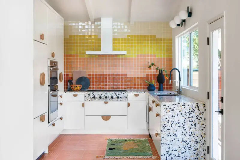
A 1956 kitchen renovation brings together bold materials and exciting design elements in a seamless and functional way.
Creating your dream kitchen is a balancing act. Juggling the needs of your family, maximizing space and including your favorite design elements can often seem like an impossible task. But for one lucky couple in the Los Angeles neighborhood of El Sereno, everything fell into place in extraordinary fashion when it came to their 1956 kitchen renovation.

“Our clients wanted a fun, functional kitchen that was fresh and bright with thoughtful storage solutions,” says Gabrielle Aker of Aker Interiors, who took on the project in 2020. But before the fun began in this 1956 home, the layout of the kitchen would have to be reimagined.


“We had spatial restrictions on either side of the kitchen that could only be resolved by remodeling the whole first floor, so instead we chose to meticulously design it to maximize the space,” Gabrielle says. This careful expansion included bumping the left cabinetry wall out by 12 inches to allow more space in the center of the kitchen and removing drywall added by a previous owner to expose the vaulted ceilings.


Gabrielle also made a bold decision in the MCM world: covering up a window. “The original kitchen was a galley style with a window looking out onto the street where the current range hood is,” she says. “We chose to cover the window to maximize functional storage space and create privacy while also increasing the size of the window over the sink so natural light wasn’t lost.”
Thinking Outside the Box
When it came to the more delicate design elements of this project, the homeowners were very clear that they were willing to take some risks. “They wanted a bright, happy home that felt in line with the mid-century architecture but had surprising and creative twists throughout.” These twists can be seen in harmony throughout the kitchen. The colorful, sunset-inspired backsplash blends seamlessly with the bold terrazzo countertops that flow over the range. “The playfulness of the terrazzo felt like the perfect balance without being too dramatic or overpowering,” Gabrielle says. Appliances are hidden behind white cabinetry that are accented with large, striking pulls. “With the white cabinetry, we wanted the pulls to have interest, either in finish or shape,” she says. Thankfully, the design team had a connection at custom furniture maker Aker Studio, who created beautiful pieces of curly white oak to incorporate.


“Take the time to really plan your project out. Kitchens & bathrooms, in particular, are all about functionality and thoughtful storage while maintaining the desired aesthetic,” Gabrielle says. “It is going to be more expensive than you think and it’s going to take longer than you think, but it will be beyond worth it in the end, and you’ll be so glad you did it.”

Looking for more MCM kitchen renovation ideas? You won’t want to miss Vibrant Vibes in this Palm Springs Wexler Home’s Kitchen and Small MCM Kitchens With Big Style. And of course, don’t forget to follow us on Instagram, Facebook and Pinterest for more Mid Century Modern inspiration!

