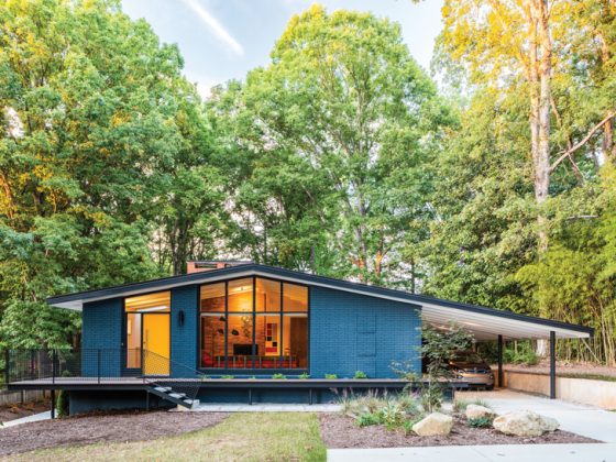
A 1962 Palmer and Krisel in Las Vegas gets a complete mid-century renovation seven years in the making.
In 1961, architects Dan Palmer and William Krisel were finishing up a housing development in Palm Springs, California. At the same time, in Las Vegas, developer Irwin Molasky was starting construction on the first master-planned neighborhood in the city, called Paradise Palms. The development was originally supposed to contain 300 homes situated alongside the Las Vegas National Golf Course. Molasky was inspired by Palmer and Krisel’s work in Palm Springs and wanted to hire them to design his new development, so he waited until they finished up their project, even though he’d already broken ground. And when he finally approached Palmer and Krisel, they were eager to design homes in a different desert.

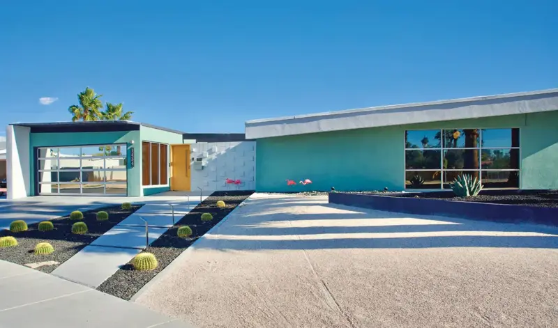
By the time Paradise Palms was completed in the late 1970s, it had over 1,000 homes instead of the original 300 as well as the first enclosed mall in southern Nevada. Today, it’s a designated historical neighborhood and still a desirable place to live. The houses have classic MCM features such as asymmetrical rooflines, bright colors, sunken living rooms and floor-to-ceiling windows.

History of the 1962 Palmer and Krisel Las Vegas Home
This is the neighborhood landscape into which Kyle Wright and Holly Erker came to view the 1962 ranch house on Seneca Drive. “We both fell in love with the back windows,” Holly says. “It’s 100 feet of floor-to-ceiling original commercial-grade windows.” There had only been two previous sets of homeowners: Joseph and Dorothy Terefenko bought the house for $35,550 in 1962 and sold it to Don and Sandie Hamilton in 1977. When Don and Sandie passed away, their son sold the house to Kyle and Holly in 2017. “The second owners had purchased the house in 1977 and that’s when they did their renovations,” Holly says.
“Nothing had been done since.” The previous homeowners added onto the home’s footprint, bringing it from 1,720 square feet to 2,892 square feet. But the updates hid original mid-century features, like the butterfly roofline, and replaced most of the original finishings inside. Kyle and Holly wanted to change that.


“It took some time to figure out what we wanted,” Kyle says. “We lived in the house throughout the renovations and a lot of the changes came from actually living in it.” It’s always a good idea to live in a house before deciding what changes to make. “I think that was such a huge value, being able to live in it and not jump into renovations right away,” Holly says. “We lived here three years before we really started anything inside.” Instead, the couple started outside, partly by necessity.
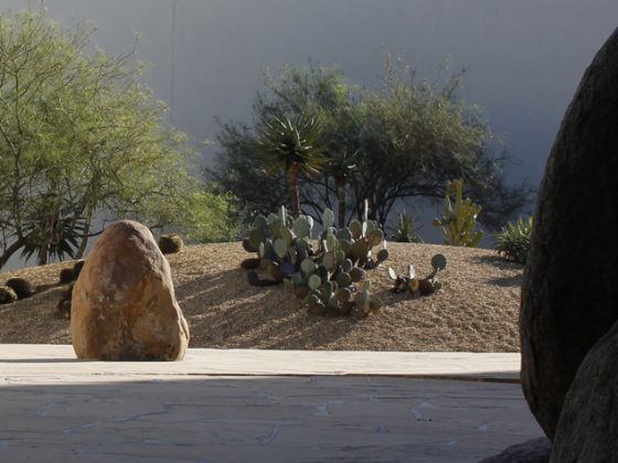
“There was a broken irrigation line, and when we got the first water bill, that was the indication of where to start first,” Holly says. They replaced the lawns with desert landscaping, resurfaced the pool and decking, replaced the back fence with a breeze-block wall and re-stuccoed the house.


Restoration Sequence
The couple decided to hire a local mid-century specialist, designer Mark Adams. “He’s done a lot of residential projects in Las Vegas,” Holly says. “We gave him carte blanche to do whatever he wanted. We couldn’t have done this without him.” They renovated the house in three phases: First came the exteriors, then 2,000 square feet of the main living spaces and primary suite. Phase 3 was the last 1,000 square feet, which included two bedrooms and bathrooms. While they were finishing Phase 3 in late 2023, Mark passed away, leaving the house on Seneca Drive as the last legacy of his restorative mid-century work.


Design Basics in the 1962 Palmer and Krisel Renovation
Central to the design was the color palette. Mark picked aqua, gold and white, which had an unexpectedly emotional connection for Holly. “Mark was inspired by the Howard Johnson hotels of the 1960s,” Holly says. “Around the same time, I was on a drill team in Seattle and those were the team colors. I still volunteer with that team, so it was very emotional, what the colors represent to me. It felt like it was meant to be.”

Some of the interior changes in the 1962 Palmer and Krisel home included opening up the kitchen to the rest of the living areas and converting a large closet into a new primary bathroom. “There was a weird bedroom/bathroom built into the side of the garage,” Holly says. “We took that out too.” The flooring was previously a Tuscany-inspired tile, so they replaced it with stained concrete and terrazzo. “We tried to be as period-specific as possible,” Holly explains, adding, “We love the look of walnut, so there’s walnut in every room.”
While there were very few original features left when Kyle and Holly moved in, they did the work of revitalizing the home’s original Palm Springs-inspired style. “We put it back to the original mid-century feel rather than the ’80s Tuscan feel,” Kyle says. Now the home not only matches the neighborhood but stands as a testament to the original vision, suited for 21st-century living.


If you love the story of this 1962 Palmer and Krisel home, read more about A Fun, Functional Colorful Krisel in Palm Springs and Dani Nagel’s Krisel Home. For more on Las Vegas Modernism, check out this article showing homes from a previous Las Vegas Modernism event. If you’re in Nevada and would like to get involved in Nevada Preservation efforts, head to their website at nevadapreservation.org. And of course, don’t forget to follow us on Instagram, Facebook and Pinterest for more Mid Century Modern inspiration.

