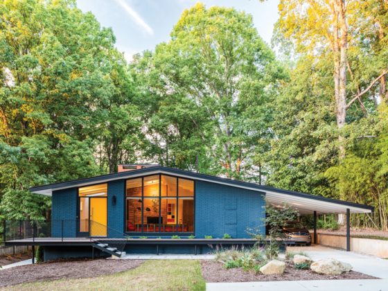
A 1955 Seattle kitchen renovation opens the floor plan, adds light and modern updates while maintaining a period authentic feel.
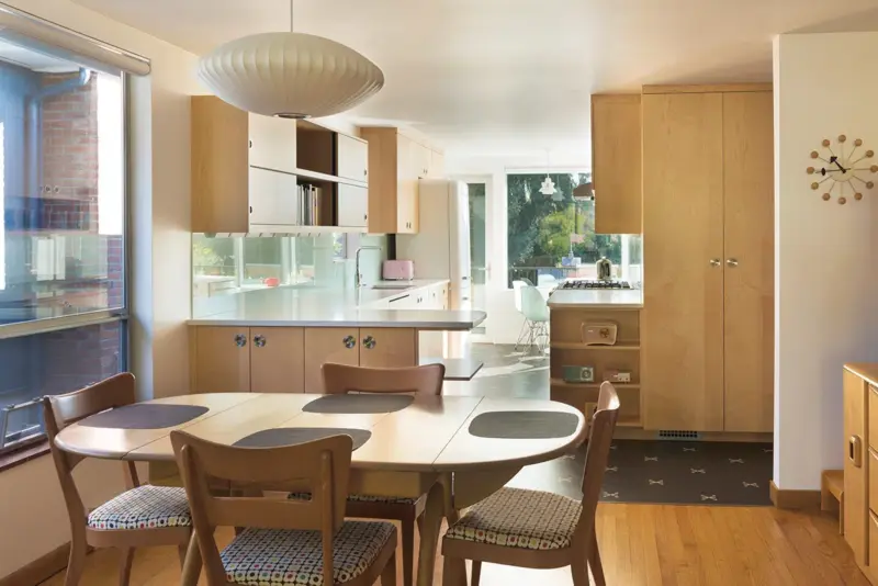
Striking the right balance between a sleek and charming Mid Century Modern design and contemporary updates to accommodate modern living can be a challenge. Luckily for the homeowners of this 1955 gem by August Liliquist, the design team at Atelier Drome brought the two together in a total renovation to create this retro-infused kitchen space.
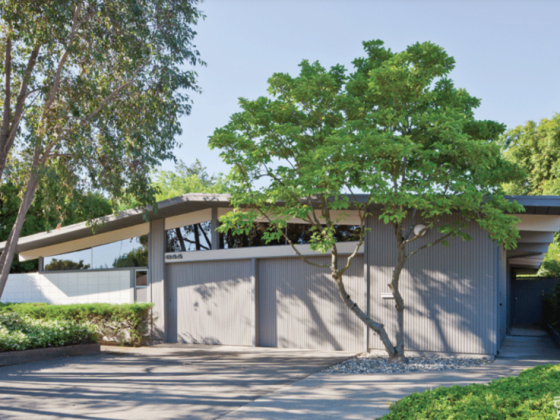
At 2,440 square feet, this split-level home is located in the Magnolia neighborhood of Seattle and boasts plentiful outdoor views, including glimpses of Mt. Rainier. The main goals of the homeowners were threefold: create an open plan for the kitchen and dining room, bring more light into these spaces and honor the home’s original architecture and design.

Opening Up
To begin, the layout of the 1955 Seattle home had to be reimagined to allow for the more modern style of living the homeowners desired. “Even though the original kitchen was a galley, it suffered from awkward circulation,” says Michelle Linden, owner and architect at Atelier Drome. “There was an exterior side entry that bumped into the kitchen, the connection to the dining room was very compact and the large fridge created a pinch point.”
To remedy this, the team at Atelier Drome decided to open up the floor plan between the two spaces. This, in turn, allowed the natural light to pour further into the home and provide the abundance of light the homeowners wanted.

Rethinking Retro in the 1955 Seattle Kitchen Renovation
The last major goal of the renovation was to keep the heart and spirit of the original design of the home while updating for modern conveniences. Much of the “before” kitchen was in great need up upgrading, both aesthetically and functionally. The team at Atelier Drome accomplished this by replacing all the appliances with stainless steel and choosing new finishes and materials that honored the ’50s look and feel while also serving the practical needs of the homeowners.
“The design really leaned into the mid-century aesthetic, with the two biggest departures being the glass backsplash and the open-to-the-dining concept,” Michelle says. “Modern updates were focused on the use of the space, ensuring the flow worked for current lifestyles and that everything functioned well.”


If you’re planning (or simply dreaming of) your own kitchen renovation, check out Mid Century Inspired Cabinetry for your Kitchen and Small MCM Kitchens With Big Style. And of course, don’t forget to follow us on Instagram, Facebook, Pinterest and YouTube for more Atomic Ranch articles and ideas!

