The Case Study Houses were and are an illustration of modernism’s intended audience—the masses. These homes were intended to change the way we look at residential design and forever alter the way we live. Built or unfinished, preserved or lost, join us as we take a closer look at each of the iconic designs that carry the name “Case Study House.”

CASE STUDY HOUSES 101
Looking ahead to a post-war building boom, the Editor of Arts & Architecture magazine began an innovative program to create eight houses by eight nationally known architects—including Richard Neutra, Eero Saarinen, and Charles Eames—each to fulfill a specific living problem.
Without the restrictions of war, designs were to be focused on new materials and construction techniques for these “contemporary dwelling units”. Though not all houses were built, the program spanned from 1945-1966, and included 36 designs located mainly in the Southern California area. With the intent to be accessible for the average family, the houses were designated a budget (subject to price fluctuation) and had to be easily duplicated.
MEET HOUSE #3
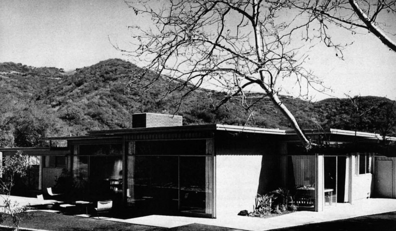
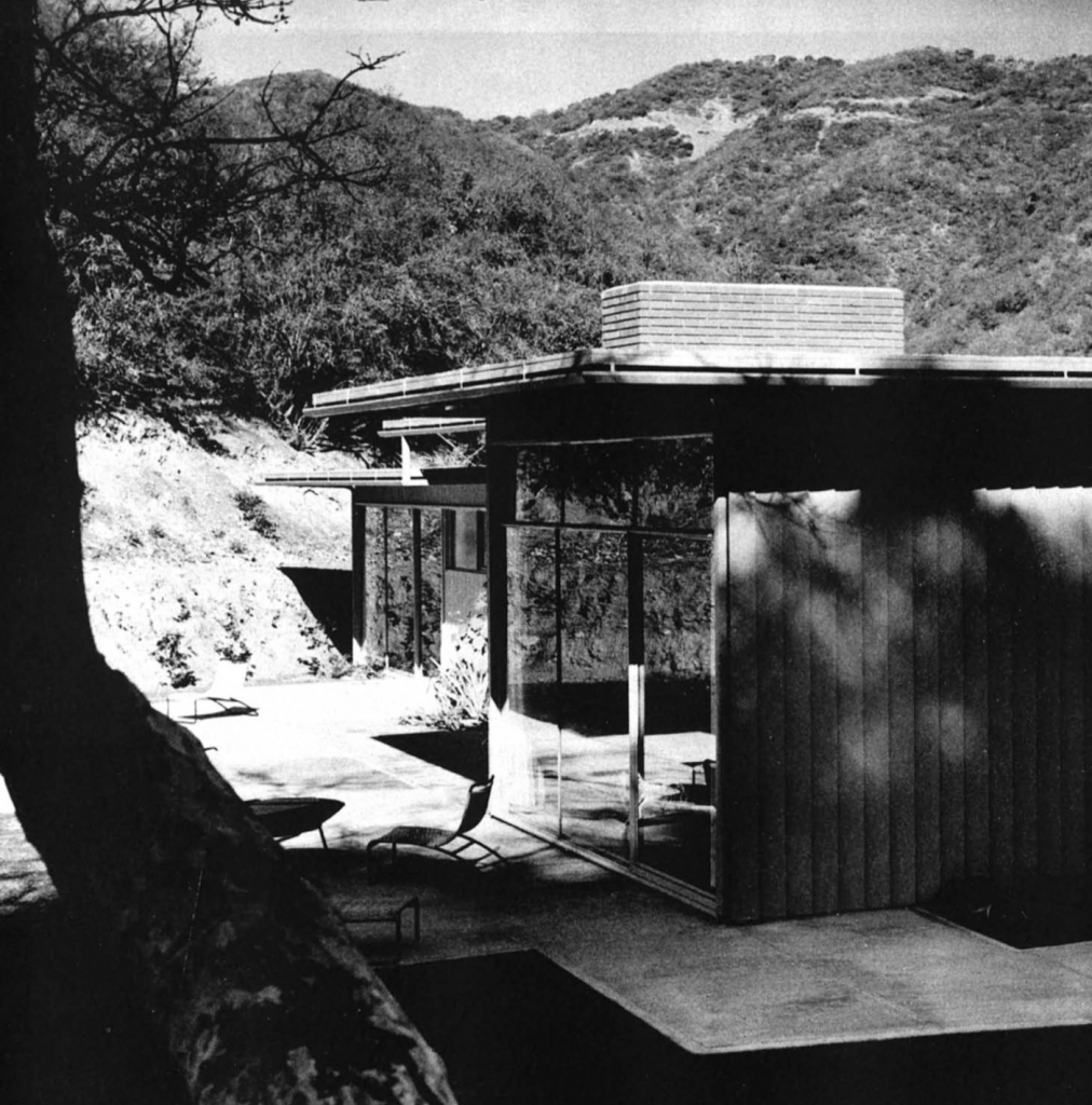
Situated on a two-acre plot once belonging to a botanical garden, privacy meets peace and quiet in the third Case Study House. Built by the Wurster, Bernardi, and Emmons firm in 1949, the Mandeville Canyon location provided incredible views of the mountains and surrounding greenery. “Designed for two adults with two children, the plan is a sensible, easy arrangement, beautifully adapted to the informalities of California life,” states Arts & Architecture magazine.
THOUGHTFUL LAYOUT
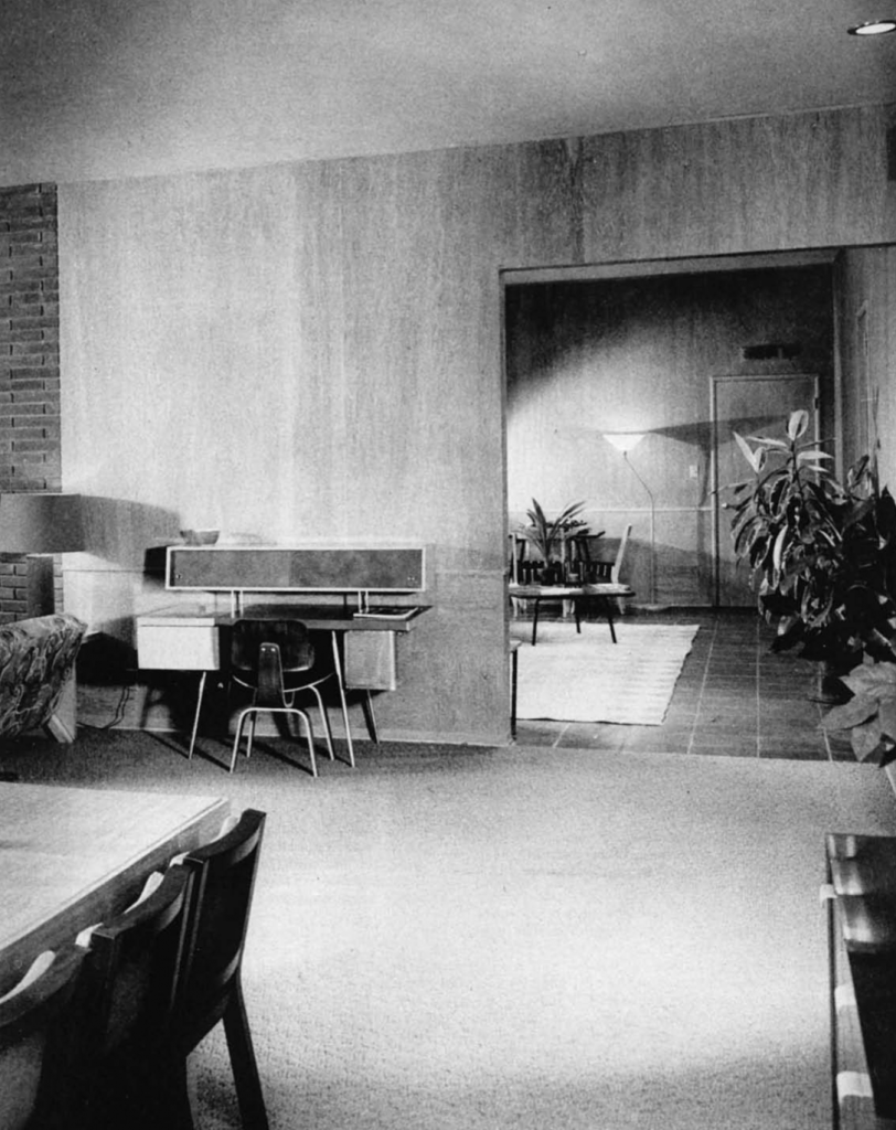
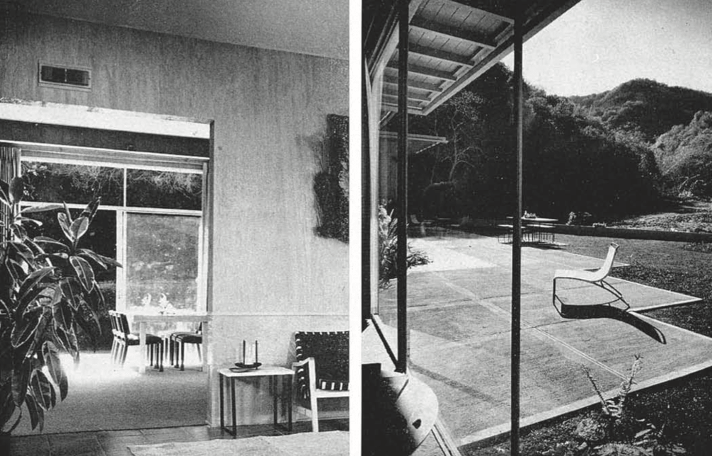
Designed to separate the social and work sections of the house from the sleeping areas, the house has a general “H” layout. An enclosed porch divides the kitchen and living areas to the north from the bedrooms to the south. The furnished porch or “garden room” connected the two sides of the house and was also used for recreation and dining. The terra cotta flooring of the garden room created an outdoor feel, while its paneled walls were consistent with the social areas of the house.

CANYON COLOR
The general color scheme mimicked lush flora of the canyon, with a gray-green living room and carpeting to match the color of nearby tobacco plants. With brown overhangs and light gray-green aluminum siding, the exterior also complemented surrounding landscape. For a more whimsical take on the idea, one of the small bedrooms featured deep blue-green walls with coral draperies while the other room was beige with dark green hangings.
QUINTESSENTIAL CSH
Overall flow from inside to outside is something we’ve seen in all previous Case Study Houses, and—with outdoor access from almost every room—Number 3 is no exception. Shielded from the street by a grape stake fence, a garden area is shared by the two smaller rooms, each with its own entry. Across the hallway, the master bedroom’s large sliding glass doors open to the living terrace. On the opposite side of the house, an exterior paved space can be accessed from the dining area. When desired, the large sliders in the garden room could open to create a protected semi-outdoor area. Large louvered-skylights in the ceiling further enhance the effect.
In contrast to other Case Study Houses we’ve looked at, Number 3 was designed without the many built-ins seen in Number 1 and Number 2. Perhaps the informality of the overall design suggested that the owners may want to play with the space and create a flow based on individual needs.

