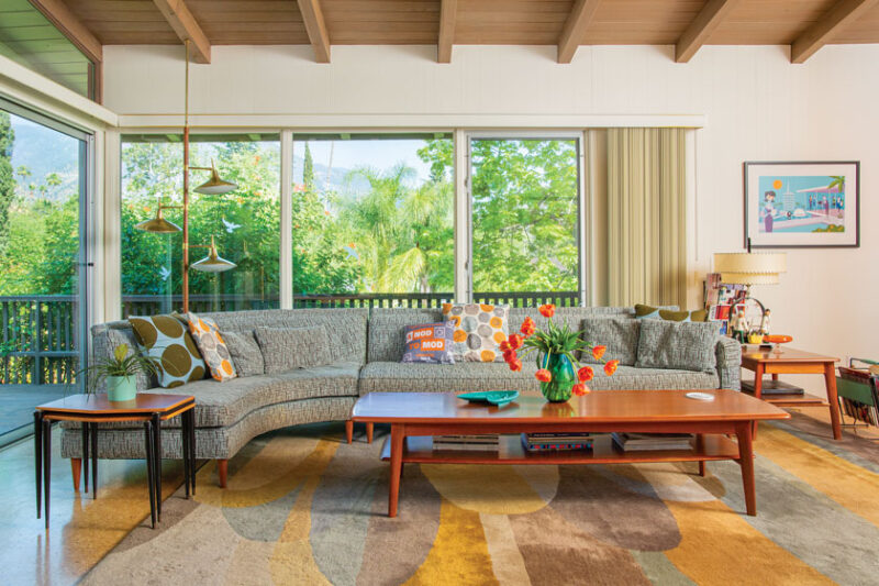
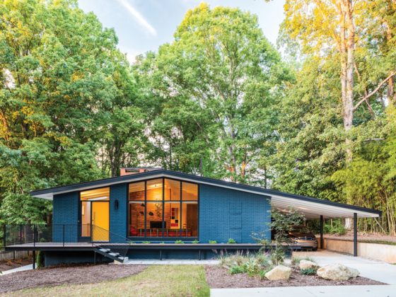
A bank-owned, 1960s MCM home in Altadena, California, went from bland to bold with only a few updates.
As a professional designer, it can be difficult to pinpoint which home style suits you best. “I love all styles. They all have something unique that speaks to me,” says homeowner Goli Karimi, director of design at Home Front Build. When she and her wife, Deb Smith, moved into a 1960s MCM home in Altadena, California, they embraced its history and let its mid-century architecture dictate how they would renovate.


“When we got this house, it really amped up our love for mid-century style,” Goli says. “We were both jumping up and down because of the view. We felt lucky to be able to purchase this home.”
Tricky Topography
It was only recently that the homeowners looked into who built the home back in 1960. “I’d been wondering for years,” Deb says. After doing some research at the Altadena heritage office, she found the name and, eventually, the phone number of the original owner and called him. “He told me the story about the woman who built our house,” she says. “She was a Swiss-born artist named Gisela Meier who had studied under Kem Weber.”

Gisela was an inventive builder who had the challenge of working around the steep slope of the home’s landscape. Most of the rooms are long and narrow to accommodate the slope. “It was brilliant how she dealt with this lot,” Deb says. “The bedrooms are in the back, where it’s darker, and the common areas have the view. You can sit at the dining room table and see the San Gabriel Mountains.”
Respectful Renovation of the 1960s MCM Home
The renovation team at Home Front Build wanted to make as few changes as possible, only renovating when necessary and preserving as many original features as they could. “Our company is all about sustainability and likes to use reclaimed wood and salvaged products as much as possible,” Goli says. “We understand the needs of the client while honoring the original architecture of the home.”

Luckily, the home was clean and functional, but it had been stripped of most of its character. “It was bank-owned when we bought it,” Goli explains. “It wasn’t in bad condition, but they had painted everything white and put new beige carpet everywhere.” After replacing the floors and repainting the walls, most of the work left was designing each space to fit the mid-century aesthetic.
While most of the home updates occurred in the ’90s when they moved in, Goli and Deb recently renovated their kitchen for better function. The footprint of the galley kitchen remained the same, but they relocated the washer, dryer and refrigerator to create more walking space. They also updated the cabinetry to match the material of their family room built-in and added personal touches, such as the turquoise paneling and the custom backsplash. “Inspiration for the kitchen came from our family room,” Goli says.Goli and Deb opted for a classic retro color palette: turquoise and orange with white and wood tones. “We’re not afraid of color,” Goli says. “Deb and I both like blue, and it pops against the wood. Plus, it was a popular color in the 60s.” These colors can be found in prominent pieces of furniture and smaller décor items, making a bold statement that keeps the home vibrant and fun.

As for furnishings, they had to start from scratch, since this was their first experience living in a Mid Century Modern home. Rather than buy everything new, they decided to put in the work and go authentic. “After we moved, we started replacing our furniture with vintage mid-century furniture, which isn’t something a lot of people were doing in the 90s,” Deb says.
While Goli’s experience with the style came from her schooling and work life, Deb’s came from personal experience. “This home harkened me back to when I was a kid,” she says. “My uncle built his own midcentury-style house, and I always loved it.” This familiarity helped them both when they were on the hunt for unique vintage pieces to make the house their home.
1960s MCM Home Original Features
Most mid-century renovations are approached with the goal of transporting homeowners and guests back to that time period. That’s easier when original features of the home are preserved and accentuated, honoring the home’s history. In this project, they kept the home’s footprint. Most of the changes were material or paint-based; they didn’t enlarge any rooms or knock down walls, deciding that the original layout suited the homeowners’ needs.


“Thank goodness they didn’t paint the ceiling,” Goli says. The stained post-and-beam structure was untouched in any previous renovations of the 1960s MCM home, preserving its original beauty. “And we hardly touched the bathrooms,” she says. “It’s all original cabinetry, tile and hardware, and I was able to find the original hardware for what was missing in the blue bathroom.”


Their experience showed that while it’s important to find your style, sometimes your style finds you. “Now we’re huge Mid Century Modern enthusiasts,” Deb says.
For more sensitive and inspiring Mid Century Modern renovations, see A Mod Renovation in Newport Beach and Restored to Glory: A Mid Century Renovation in North Carolina. And of course, don’t forget to follow us on Instagram, Facebook and Pinterest for more Mid Century Modern inspiration!


