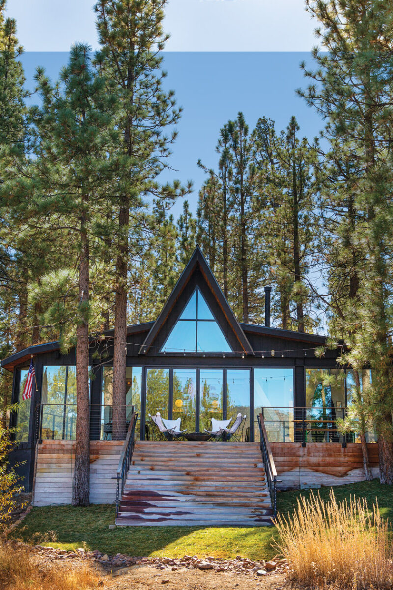
Two creative visionaries transform an A-frame into a sleek and airy four-seasons escape.
It was the winter of 2015 and Jason and Laura ODell, owners of the clothing brand called The ODells and a retail store called The ODells Shop, had brought their kids to Big Bear, California, for a sledding trip. While they were there, Jason casually browsed listings for homes in the area when he stumbled upon one for a lakefront A-frame built in 1963. “We drove over to it and called the real estate agent,” Jason says. “Within an hour, she was giving us a tour.” Despite the fact that the interior was covered in mouse droppings—the couple recall carrying their children the entire time so they wouldn’t touch the dirty carpet—and that it seemed as though no one had been inside it for ten years, Jason and Laura knew it was perfect.


After all, the creative couple are natural visionaries who see potential where others might just see dilapidation. Jason grew up around his parents who remodeled every house they lived in. Laura is a designer who breathes print and color as naturally as air. “Laura and I remodeled our first home in Los Feliz, sold that house and moved to Silver Lake, where we remodeled again and did an addition,” Jason says. “We get a lot of joy bringing a house back from the dead.” Soon, the couple turned the neglected A-frame into an architectural feat that celebrates the Mid Century Modern concepts of minimalism and natural light.
One with Nature
When it came to the exterior of the home, everything was transformed, but the couple made certain to keep the original design in mind, parti
cularly the distinctive A-frame profile. “There’s something about the shape of the A that is Mid Century Modern,” Jason says. “Not in a traditional way, because you can take an A-frame and make it really woodsy—but in going modern, we embraced the original intent of its design.”


They hung a huge I-beam along the back of the house to get a wall of windows facing the lake. Then they added ‘wings’ on both sides of the A-frame, along with Ipe wood decks in both the front and back of the house. In addition, it was important to Jason and Laura to integrate the home’s exterior into its natural surroundings, and they artfully worked to blend the two. Now, the A-frame profile reflects the linearity of the trees while floor-to-ceiling windows become mirrors for the forest setting.

Black paint was chosen to help the home meld into the trees and the Ipe wood decks epitomize organic beauty. The craftsmanship also extends to the union between the home’s inhabitants and landscape—Jason intentionally made both sides of the house have decks so “there is always a place to sit and take in nature.”
A Great Room
The great room, which is the heart of the A-frame, is breathtaking to behold. The anatomy of the house is on full display with myriad beams rising to form the A. In order to figure out the best architectural steps for the home, Jason sat for four hours in a lawn chair during construction, considering the various options. “I wanted to make sure that the sofa had a nice view of the fireplace as well as the lake and was having a hard time trying to place the TV,” he explains. In the end, he decided to eliminate the TV in favor of a retractable movie screen, which allows anyone lounging in the seating area to easily see out to the waterfront view.

A blue sofa and ornate Turkish rug anchor the airy great room and add pops of color against the white oak floors. “We love vintage Turkish rugs,” Jason says. “This one was purchased on a whim while Laura and I were on a date night in Los Angeles, while the sofa is from our friends at Artless. I love the walnut framing and shelf on the back.” These intentional design decisions allow the great room to be a wondrous experience that both draws the eye skyward through the rafters and outward to the beauty of the lake.


“We had limited space to fit three bedrooms and two bathrooms on our lot footprint, so we don’t have a traditional main bedroom, and the two bathrooms are right next to each other,” Jason explains. “It’s very unorthodox, but I studied a lot of European forest houses when I was designing the floor plan.” Additional wings added onto the A-frame push the house out further toward the lake and give the dining room a breathtaking view of the water. Here, black trim contrasts the light floors and walls but everything is kept neutral—Jason says, “I wanted to create a blank palette so Laura could bring in pops of color with the décor.”

Discovering that 2″ x 8″ black cement tile is much more expensive than an 8″ x 8″ size of the same kind, the couple got to work cutting 8″ x 8″ tile into 2″ x 8″ pieces—“it only took one day of cutting!” Jason says. With their newly-resized tiles, they covered the whole wall in a herringbone pattern. A freestanding white tub provides distinction from the wall in both color and texture.
Originally, Jason and Laura considered using the little 1963 A-frame in the woods as a vacation spot and renting it out when they weren’t there. Very quickly, they had a change of heart. “We love it so much, we decided against renting it,” Jason says. “Now our family spends time there almost every weekend making memories together.”
 If you enjoyed reading about this 1963 A-Frame in Big Bear, read on about Phoenix Rising: A Modern Lake Tahoe A-Frame Structure. For more fall MCM vibes and ideas, don’t miss our new fall issue! In it, find inspiration for your home from the inside out, from wall art to the patio. Get your copy here!
And of course, don’t forget to follow us on Instagram, Facebook and Pinterest for more Atomic Ranch articles and ideas!


