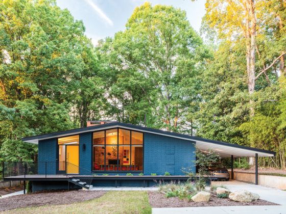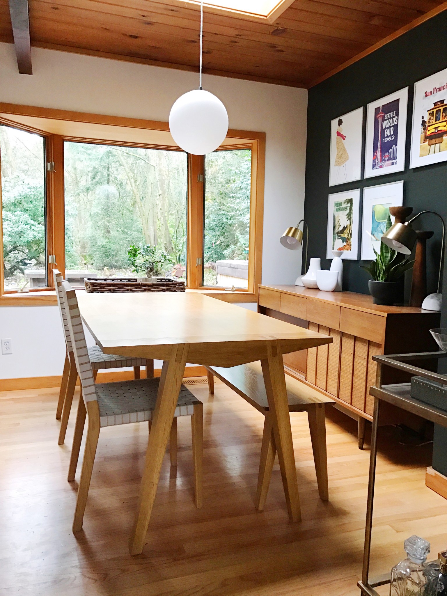
Audrey and Kevin want to modernize their newly purchased 1958 John Burrows home, which had underwent ’90s-inspired changes from the previous homeowners. Renovation actions like installing bottom cabinets from IKEA in the kitchen may be breaking MCM design rules a little bit (part 1), but it’s more important to Audrey and Kevin that their home adheres to their lifestyle and not a guidebook. Even if that means approaching an updated design for their home.
“What we’re doing is updating again from the 1990s and giving it a midcentury flare but modernizing it as well for us, for how we live,” Audrey said.
The McGill home is a hybrid of midcentury and modern. Some aspects of the home are no longer original, like the layout of the kitchen and dining room, which the previous homeowners lifted to swap the rooms with one another. But the grill, which is inserted inside a hole in a brick wall where the original kitchen was, remains intact. Audrey says other homes in the neighborhood do not have this hibachi feature.
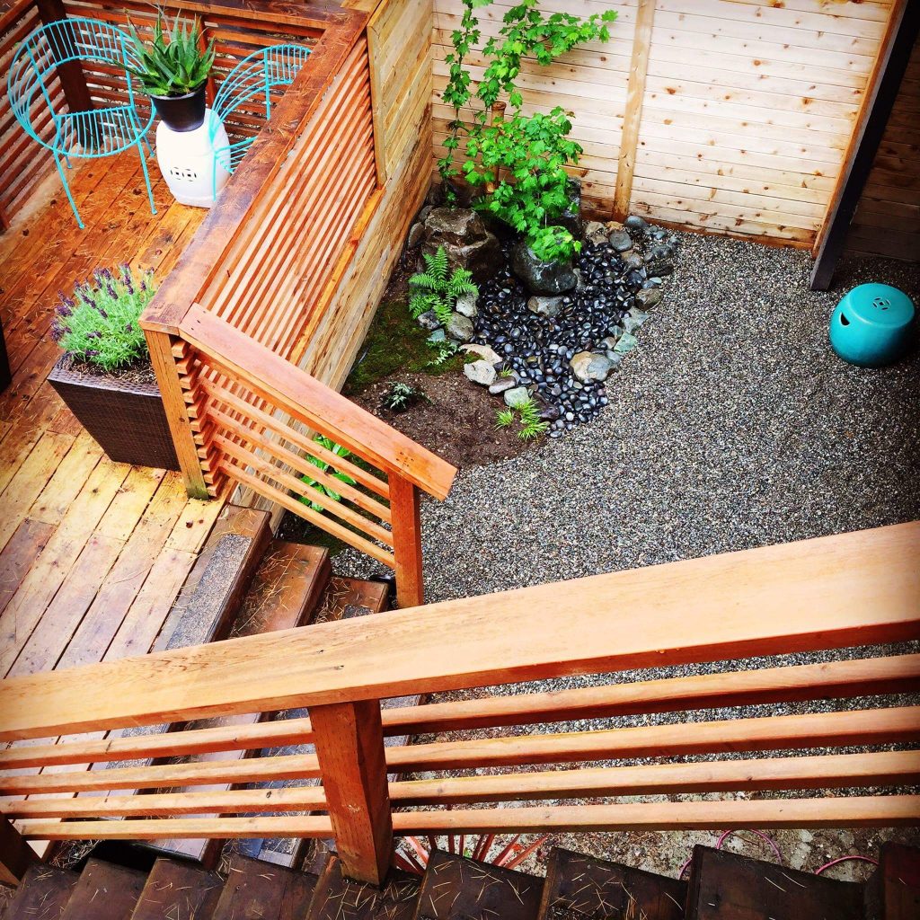
Then there are the upper and lower decks adjacent to the exterior, which are newly built features. Japanese design inspired Kevin to construct them out of horizontal deck slats for a clean and modern aesthetic. Adding features onto the home that are not traditionally midcentury demonstrates how Audrey and Kevin do not distress if a design they wish to implement does not exactly fall within the MCM style guidelines.
“[I’m] definitely not a purist,” Audrey said.
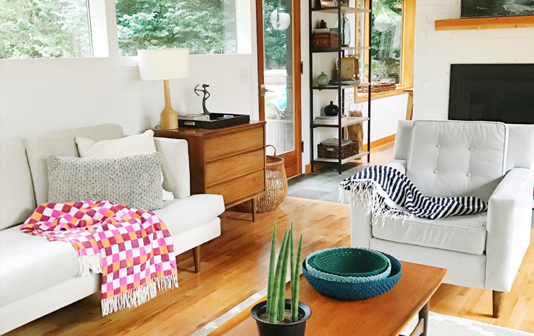
The choice of furnishings serves as evidence to this statement. “I put what I love in the home,” Audrey said. “I love a lot of designs. Like Scandinavian style design, bohemian…so I kind of mix that all in.”
But Audrey was cautious of filling her home with too many furnishings. She emphasized the importance of leaving a small footprint, since the home lacks a generous amount of storage space. This was a primary reason why Audrey, a newcomer to the MCM community, chose the furnishing style since it encourages spacious layouts.
“We tried to bring in our previous furnishings and it just didn’t work, [our] overstep chairs overwhelmed the room,” Audrey said.
Even the lighting Audrey and Kevin chose to install don’t occupy floor space. In the dining room a single globe lamp overhangs the dining room table. “I loved a lot of the fixtures out there now like the Sputnik lights but because the room is so small, and we have a lower wood ceiling, we wanted to focus on the view outside and thought that a simple globe light would work,” Audrey said.
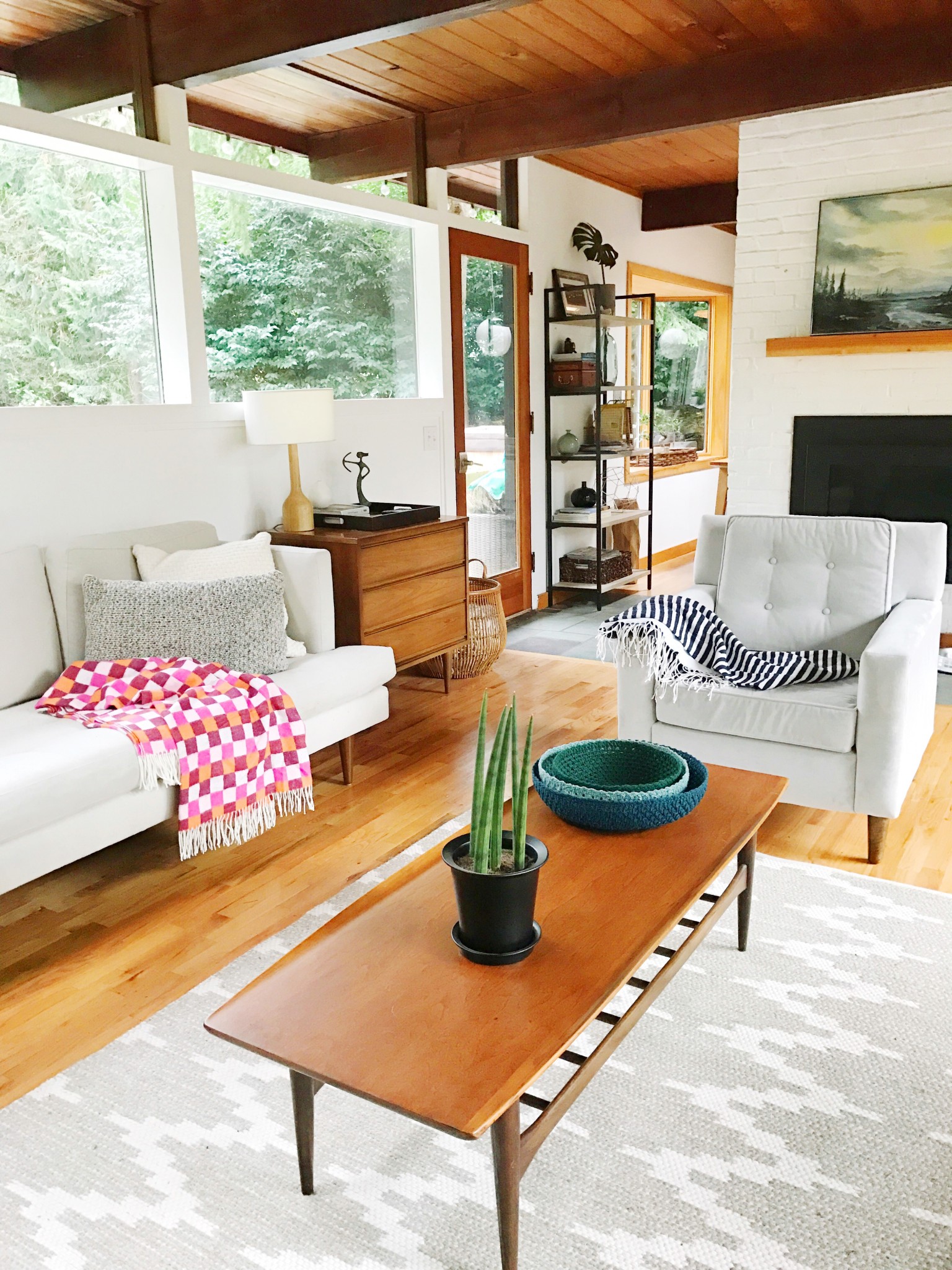
It makes sense that Audrey designs around the view outside. Burrows was an architect who specifically sought out lots with difficult terrain to build on—meaning that if it’s a property that Burrows picked out, it’s going to be submerged in nature.
“When we started digging we found so many huge huge riverbed rocks in the ground,” Audrey said of what it was like renovating outside.
But the high maintenance ground on which the house stands ultimately led to a low maintenance lifestyle for the McGills—and most importantly, a lovely view.
“We have a wooded quarter acre around the house,” Audrey said. “It has streams, trails…we have owls that we hear hooting at night and it’s such a lovely natural setting.”

