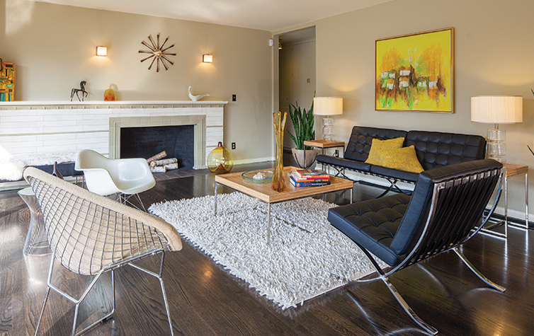
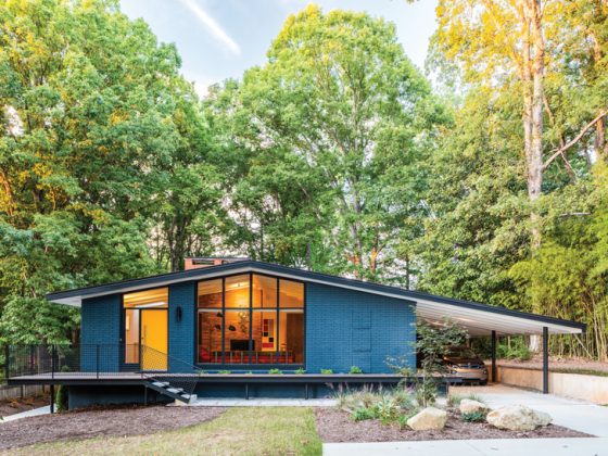
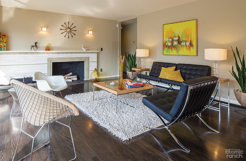
After moving in, the Schuur design process started by adding some personal touches and upgrades—ebonizing the hardwood floors, painting, upgrading the electrical, adding central air and replacing leaky single-pane windows in the daylight basement.
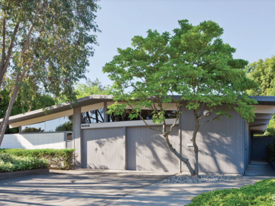
Ten years ago, Tony and Josette Schuur weren’t even looking for a house when they stumbled across a 1954 brick ranch in Portland, Oregon. They were already collecting midcentury furniture and art in their ’20s bungalow, so it fit their underlying aesthetics and they jumped on it. The house had been flipped by a local tile manufacturer, so while some of the design choices weren’t really in synch with the age of the home, it was a turnkey purchase.
After moving in, the Schuur design process started by adding some personal touches and upgrades—ebonizing the hardwood floors, painting, upgrading the electrical, adding central air and replacing leaky single-pane windows in the daylight basement.
“We were so caught up with all the inside stuff we neglected to think about the yard, especially the lack of privacy a corner city lot provides,” says Tony. “If I had a dollar for all the times I heard, ‘What’s for dinner?’ as I barbecued on the side lawn next to the busy sidewalk, I’d be a wealthy man.”
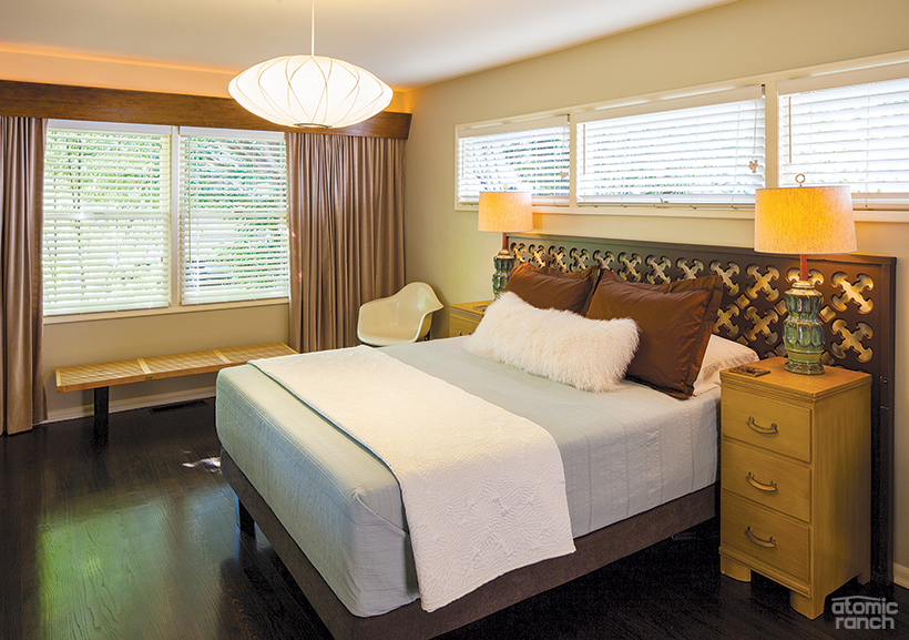
The bed and nightstands are family hand-me-downs, while the headboard was a panel from a store window display. An Eames shell chair, Bubble saucer lamp and reissued Nelson bench team up with Italian Raymor lamps with retrofitted Jonathan Adler shades. The Schuurs added the lighted valance over the window and painted one wall a deep chocolate color.
The lot had a dogwood and four Japanese maples in front, a tall hedge and miles of grass—more than 1,700 square feet to mow and edge, just counting the parking strips. The Schuurs instead wanted a flexible plan with room to relax, entertain, cook and grow vegetables—and to do so without always being on display to passing walkers and bikers.
So began the Schuur’s design process that ultimately ended up with an epiphany after building some rusted steel planters for a small vegetable garden. “The rust really picks up on the color of the house mortar and has an earthy yet modern sensibility,” Tony says. “You just can’t slap a wood fence up on this architecture and call it good.”
“For us, that isn’t being a good steward of this house,” Josette, a 41-year-old art director, adds.
“I had studied the Case Study Houses, and a few by Craig Ellwood always stood out for me. I loved his use of steel and translucent glass to add privacy from the street and I felt it would complement our architecture as well,” the 45-year-old advertising executive producer explains.
Risking the law for midcentury design
Tony and Josette Schuur’s design vision extends to the exterior—and nothing, not even the risk of violating city code or the general guidance of their hired architect, will stop them. Read about how the couple’s renovation efforts labeled them the “crazy kids” in part 2! Read on for the lush landscape design in part 3.
And of course, don’t forget to follow us on Instagram, Facebook and Pinterest for more Atomic Ranch articles and ideas!

