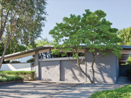
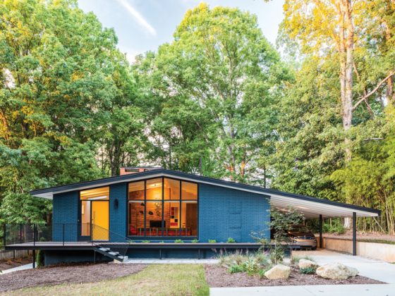
Unlike most kitchen renovations, this one began at a charity auction, ultimately resulting in a functional kitchen design with truly mod sensibilities.
Homeowners George and Mary Campbell, along with their daughter Molly and dogs Poppy and Hazelnut, live in a 1957 ranch in the Blue Ridge neighborhood of Seattle, Washington. Down to one functioning burner and wishing their kitchen better suited their lifestyle, they decided it was time to move forward with a fresh design.
The Final Burner
When George and Mary bought their midcentury home in 2007, it came with a somewhat original kitchen. “There was a wall where the peninsula is [with a] very small pocket door—the kitchen felt small and closed off from the rest of the house,” Mary says. The cabinets and car decking (also known as tongue and groove) ceiling had been painted, and the countertops, sink, fridge and dishwasher had all been updated.
“In the years leading up to the remodel, one by one our original in-counter stovetop burners stopped working,” Mary says. “We pulled the trigger on the project when we were down to only one burner.”
Wish List Items
The main goal of reworking the kitchen design was to open the space up for entertaining and create a better flow. “We love to entertain,” Mary says. “It seems to be a universal law with parties that people like to cram themselves around the kitchen. We wanted to create a space that allowed for maximum ow and interactions with guests while preparing the food and drinks, without being cut off from our family and guests.”
Despite this desire to bring the kitchen together with the living space, George and Mary were set on staying true to the aesthetic of the home’s period while also bringing what they call a “modern energy.” “We fell in love with Kerf Cabinetry thanks to Atomic Ranch, and much of the design was done around the cabinets,” she says.
Dream Team
The Campbell kitchen is proof that in the renovation process, the right team makes all the difference. Architect Prentis Hale of SHED Architecture & Design kicked off the project when George and Mary purchased a block of time with him at a charity auction. He met with the couple, went over their needs and came up with the sketches that inspired the final project.
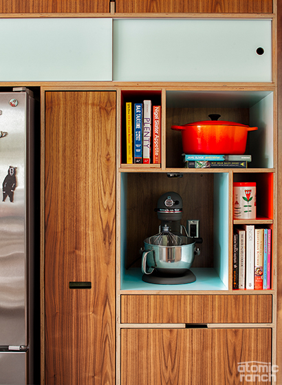
At the recommendation of a friend, next came the team at Fivedot Design/Build, including Geoff Piper and Sharon Khosla— who helped bring the Campbell’s Kerf dreams to life. “We designed custom cubbies in the pantry to hold and show off her bright orange Le Creuset cookware and a mixer too,” says Nathan Hartman, owner of Kerf Design.
Final Design
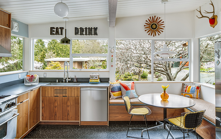
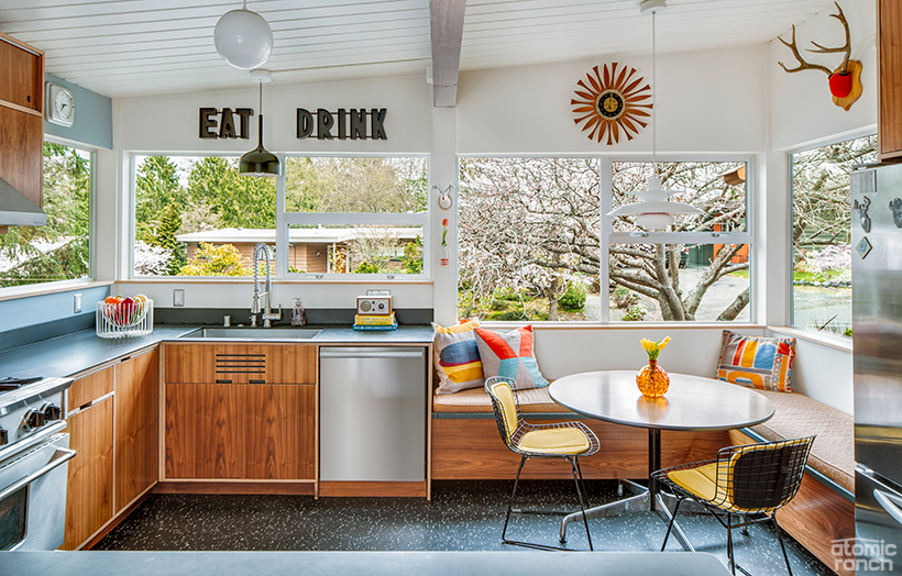
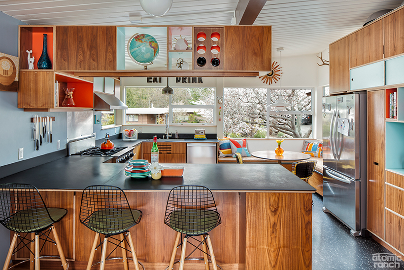
Following a nine-month design and build process, the Campbell kitchen was completed in 2011. The 190-square foot space was transformed thanks to custom cabinets, a peninsula that replaced the former dividing wall, as well as plenty of space for friends and family to gather.
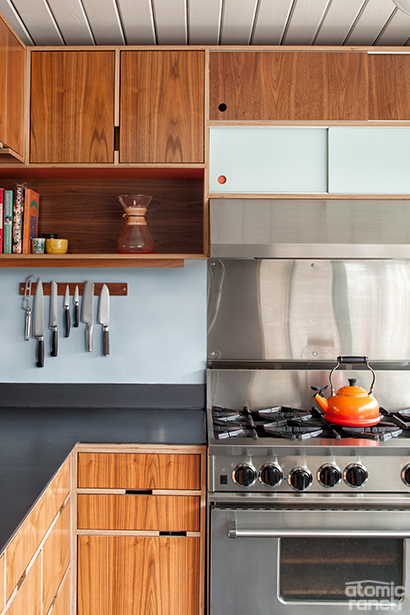
“The countertops are repurposed slate from a demolished school, sourced at ReStore,” Mary says. “They were wet sanded to remove surface imperfections and gridlines. They are fantastic—can handle heat, and we can write on them with chalk for fun!”
However, the real star of the kitchen is the Kerf cabinetry with walnut and colorful accent veneers. “It was important to us for the kitchen to fit with the style of the home without feeling too retro. We wanted something bold and unique, and loved the elements of color and wood—a definite nod to the palette of the midcentury period,” Mary says.
Geoff added upper storage to the kitchen by designing a bank of hanging cabinets over the peninsula. What was once a wall now acts as seating for casual dining, a serving space and storage—all without compromising on the kitchen’s connection to the living room and letting light in from the west side of the house. “The uppers over the peninsula are high enough to stay out of sightlines, but it allowed us to put in under cabinet lighting to illuminate the work surface,” Nathan says.
“We had total freedom and flexibility with the cabinetry,” Mary says. “Every drawer, cabinet and nook was made to our exact specification—a very detailed design process!”
