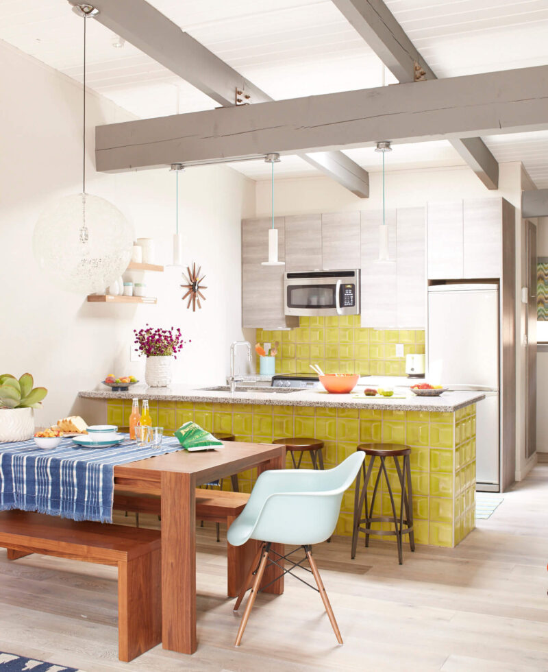
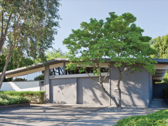
Hexagon Haus is proof that a mountain retreat doesn’t have to be dim and decorated with taxidermied deer heads. Designer and condo owner Kristy Kropat invigorated a 1960s apartment with a zest for color, pattern and a fun-loving MCM vibe!

Hexagon Haus and the Challenge of Remote Renovation
Kristy recalls, “At the time of this project I was living in San Diego, CA and was the owner and principal designer of my own interior design firm. Mammoth Lakes, CA is a 7 to 8 hour drive away. It’s located in the Eastern Sierra mountains and is a small town. They have a small hardware store called “The Do It Center” and a small lumber yard, both with very limited selection. The next large hardware store such as Home Depot or Lowes was over 3 hours drive away. Therefore, I knew I had to plan every detail and make sure we had everything we needed when we started construction.”

She and her family rented a U Haul and carted up everything including the kitchen sink! Finding a construction crew also proved a challenge. “I do many interior design projects in San Diego and have my favorite and trusted builder that I work with. So I asked him if he would do the job. He and his crew of three more guys went to Mammoth Lakes. He said, ‘I’ll give you two weeks–that’s as long as I can stay.”
so she recruited her San Diego construction contractor to give two weeks to the condo renovation. Kristy joined the crew and went to “The Do It Center” each morning with a list of any basic supplies they needed for the day’s construction. Kristy got to know the Do It Center owner very well, and picked up some skills as well.
She explains,”Some design decisions had to be changed in order to get the job done. I had wanted to move the kitchen sink location 6 inches. However, I was told that would take half a day and then there wouldn’t be time for other important things. So I had to make decisions like this on the fly. They were long, exhausting days. I learned how to cut tile and install tile. It was really awesome to work with the team and learn more about construction.”
A Fresh, Modern Vision for Hexagon Haus
Kristy grew up going to Mammoth Lakes, and she and her own family loved vacationing there. When they found the 1960s condo for sale, Kristy was eager to put her design skills to work. Kristy describes her vision, “I wanted to bring the apartment back to a modernized interpretation of MCM. Something that would set it apart from the boring vacation rentals we had stayed in over the years with hand me down furniture, crossed wooden skies, bear chotchkies, no inspiration. We planned to use it ourselves and also rent it to vacationers. I designed it for us, in our style, because we love MCM and I was excited to be true to the architectural era of the home.”

The hexagons served to both echo the natural surroundings and suit the MCM aesthetic. Kristy elaborates, “The hexagon design concept was inspired from a local geological phenomenon and national monument called ‘Devil’s Postpile National Monument.’ Millions of years ago, lava and ice created impressive hexagon shaped stone columns. It’s one of my favorite hikes in Mammoth Mountain. When you walk around on the top of the massive columns it almost looks like you’re walking across hexagon tiles.”
Bring On the Color!
“MCM in my view highlights functionality, stylish simplicity paired with affordability. More importantly to me is that MCM combines clean modern forms mixed with textures, colors and the warmth of wood that results in a modern style that is cozy, welcoming and has a cheerful vibe. Color is the element about the MCM style that inspires me the most,” Kristy says.
Kristy balanced neutrals with bright pops of color. “I wanted a modern MCM style yet also a design that is inspired from its mountain location, ie Mid Century Modern mountain style. I like how the MCM style brings together texture and colors. Therefore, I wanted to leave the texture of the rock wall, it makes a great focal point at the end of the great room and it also relates to the mountain location. For the color palette for the home I selected warm grays in order to offer contrast to the browns and beige warm tones of the rocks and wood MCM style furniture. I also selected gray tones inspired from the gray basalt stone columns in Devil’s Postpile.”


Functionality, An MCM Trait
Another way Kristy took cues from MCM style was in her philosophy of form and function. Kristy “Another element of the MCM style I like is functionality and affordable materials. Throughout the space I selected items that offer quality yet are durable and easy to maintain. With some items we selected very inexpensive solutions and with other items it was necessary to spend a little more to make a big difference on comfort, style, functionality or durability.”
“For example,” Kristy continues, “the tab pulls on the cabinets are very inexpensive, yet they offer a clean minimal look. Also, for the furniture selection, there is a mix of price ranges and we only spent more when it really made a difference. The Ligne Roset Togo sofa is extremely comfortable and ergonomic, you just sink into it after a long day of skiing or hiking. We didn’t want to sacrifice on comfort.”


Lighting
A very important subset of functionality that affects ambience and mood is lighting. But none of the bedrooms had overhead lights installed.

look like they were pencil drawings.”
“The bedrooms didn’t have ceiling lighting when we bought the townhome. This meant that floor lamps were necessary. We wanted to maximize the number of people that could sleep in the home. The blue, teal, olive room sleeps 4. There’s a queen bed and a twin with a trundle that pulls out between the twin and queen beds (not visible in the photos). In order to fit these 4 beds in the room the lighting had to be changed. Therefore we installed recessed ceiling lights for general lighting in both bedrooms. There also wasn’t room for traditional night stands for the trundle beds to function. Therefore I had custom floating shelves made in the yellow room so the trundle could slide under it. The floating bedside shelves are just big enough for a book, phone and a glass of water. We used bedside lights that clipped onto the shelves so they didn’t take up any extra space.
“In the other bedroom we built out the area between the columns as a long bedside table behind both beds. This maximized the width of the room for the beds and put the bedside tables out of the way, provided some extra storage and also clip on lights that took up minimal space. Therefore each bedroom had general lighting and ambient or task reading lighting that provided good layers of light and also maximized the footprint of the small rooms.”

To learn more about Kristy’s design work, visit kristykropatdesign.com or follow her on Instagram @kristykropatdesign.
For more MCM inspiration, keep reading for more MCM renovation stories Restored to Glory: A Mid Century Renovation in North Carolina and design ideas like How to Get The Colors of Palm Springs’ Doors. And of course, don’t forget to follow us on Instagram, Facebook and Pinterest for more Atomic Ranch articles and ideas!

