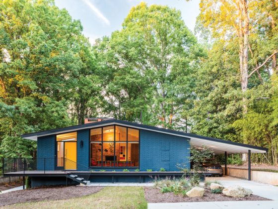
A live-in renovation of this early Mid Century Modern home resulted in the perfect blend of period charm and functional updates for a young family.
When it comes to renovating a Mid Century Modern home, homeowners and designers take care in deciding what to update and what to restore. Design duo Sally Julien and Halie Venema of the interior design firm Modernous specialize in all things modern, working together to bring a harmony of style and function in every project.

“I fell in love with mid-century design back in the early ’90s,” Sally says. “I spent the past 30 years learning about and loving the designs of the era. I find that the simplicity and clean lines make me feel calm in my own spaces, and I like to bring that feeling to my clients.”

When the owners of this Edmonds, Washington, home, built in 1959, approached Sally and Halie, they wanted to find a way to create a functional design for their young, blended family without sacrificing the original elements that made their home special. They wanted to preserve the character and original features and needed some guidance on what should stay, what could go and how to get the comfort of today’s technology into the home without losing any of its period charm, Sally says. “This project was a renovation, but the goal was to feel more like a restoration.”
Living + Designing a Pacific Northwest Treasure
Because the family had to live in the house during the project, Sally and Halie had to be very careful and strategic when it came to orchestrating the renovation so as not to cause too much disruption to their lives. “We also had to be responsive to changing priorities as they came up—which happened a couple of times—since their family needed to be comfortable living there and sometimes what they thought would be most important was superseded by other things in reality.”
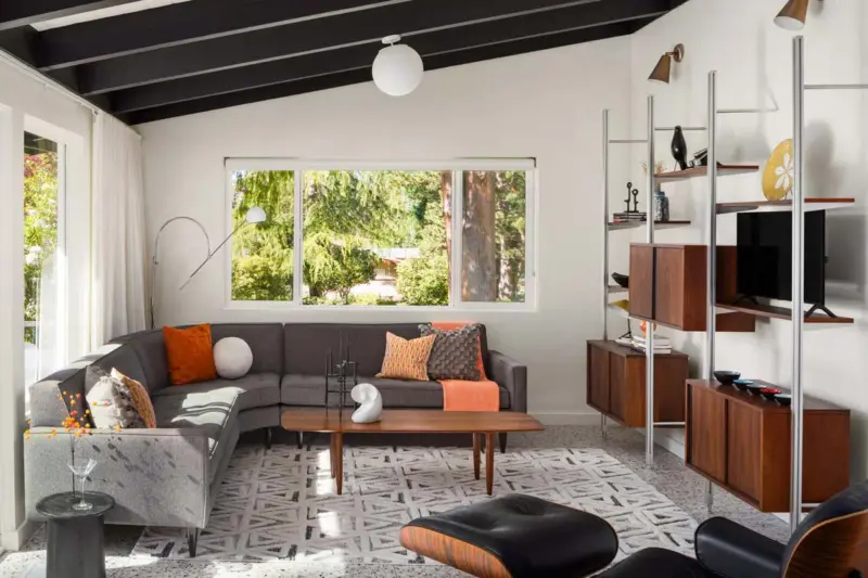
Inside the home, the designers started by changing out the old linoleum flooring in the music room and kitchen. “We recommended a terrazzo tile floor that would give a nod to the period of the house, brightening and lightening the rooms overall,” Sally explains. (Read more for MCM-friendly flooring choices here.) They also sourced both new and vintage furniture for the living room and music room to foster the MCM vibe the homeowners were hoping to achieve.

Next, they moved to the master bedroom, then the basement and ended with the small galley kitchen. The latter received a complete renovation, including the addition of a new window to bring in more natural light. “The client really trusted us on this, and the final product is almost exactly what we pitched to them,” Sally says. “I love that they weren’t afraid of the custom orange sliding cabinets that we had built for them and they went for the round vent hood.”
Balancing Act
The choices that need to be made to either renovate or restore existing elements are often the hardest aspects of redesigning mid-century homes. Thankfully, the homeowners collaborated with Sally and Halie in making it a priority to preserve key features of the original design and architecture in their Pacific Northwest treasure of a home. You can see this clearly in the living room and kitchen, where they retained the original paneled dividing wall. “It is such a ‘trend’ to have an open plan, and many homeowners would have wanted to tear that down,” Sally says. “We thought it would be a shame—and fortunately, so did they!”

While they kept the wall and did not design an open concept for these two living spaces, Sally and Halie used certain elements to ensure the design felt light and bright. “By adding a window and opting for white paint, floors and countertops, the kitchen reflects a lot more light than it did, while not looking like a trendy, all-white kitchen,” Sally says.
Perfecting the Palette for the Pacific Northwest Treasure
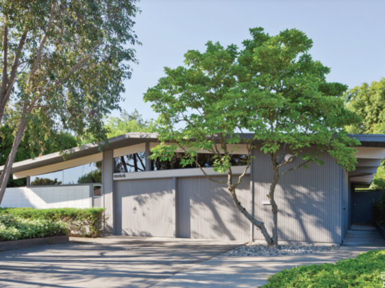
One of the most recognizable aspects of Mid Century Modern design is the unique color palette. However, for those wanting to blend in a more updated iteration of this style, the challenge is to balance the bright and bold colors of the era with a more modern palette. Often a home’s palette is inspired by a key piece or feature and expanded outwards. In this case, it began with the exterior of the home. “Because the house is a specific type of Pacific Northwest brick, we were limited in what would work with the exterior and make it look intentional and modern,” Sally says. “That drove the color of the beams inside, as those penetrate the envelope and flow throughout.”

Orange is one color that threads throughout the home, inspired by the husband’s desire to have an orange front door. When the wife expressed that she did not want to have too much orange in the home, they used other, more subtle accent colors throughout the home. “They all flow together without clashing, and we worked to include each tone in other places to create continuity: the gold in the living room, the green and blue in the bedroom, orange and other colors in the music room,” Sally says.


For more renovation stories of Pacific Northwest treasures, see The Crowd Pleasing Pacific Northwest Modern Gem, Zen Meets Mod in This John Burrows Seattle Mid Century, Tour a Unique Mid Century Renovation in Oregon.
And of course, don’t forget to follow us on Instagram, Facebook, Pinterest and YouTube for more Atomic Ranch articles, house tours, and ideas!

