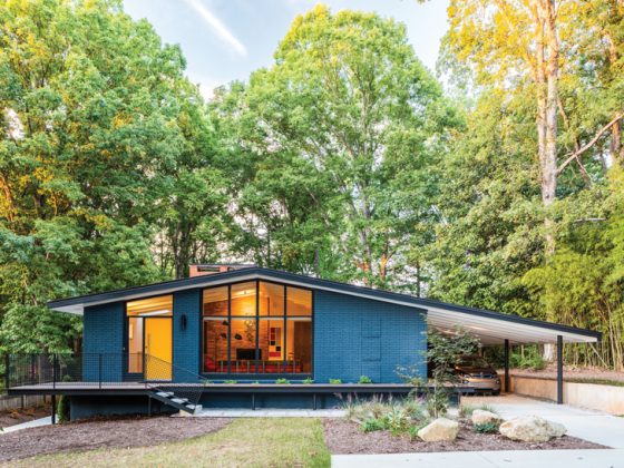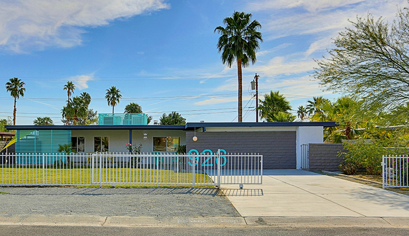
In south Palm Springs, this newly renovated ranch-style home stands out among the rest. The home is located in the up and coming Demuth Park neighborhood, which is full of very eclectic design and architecture. With a passion for midcentury design and preservation, flipper James Judge performed a vacation home renovation, creating a modern turquoise masterpiece in Palm Springs, California—the city for all things MCM.


When James spotted this house and saw its potential, he was dedicated to preserving the home’s original elements, like the tile and turquoise appliances, while making it a modern vacation destination. He immediately fell in love with the kitchen’s appliances and decided that they would be the centerpieces of the home’s design. He wrote the seller a letter detailing his intentions for the home and promised to make turquoise the staple of the house. James says, “I wanted her to understand my goals and hopes for the house.” He told her, “I have the intent to flip your house and I am going to do it with love.” With that, she sold James the house and his journey began to bring this midcentury gem to life.
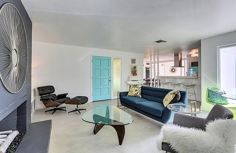
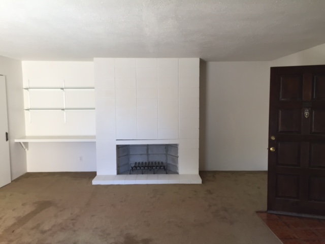
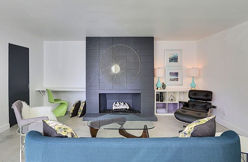
Change for the Better
With slight renovations and mostly interior design work, James was able to create the “happy balance between preserving the amazing retro details while adding current-day modern flair.” James wanted to make everything inside and outside of the home feel like it was always meant to be.
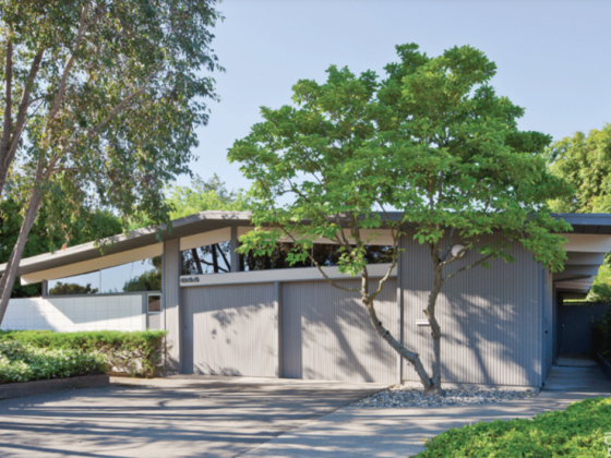
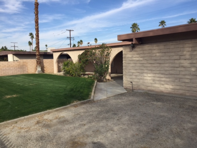
Some simple changes to the front exterior completely revolutionized the style of the house. James decided to remove the arches that were reminiscent of Spanish architecture and keep the front porch open and airy with some simple beams. He foreshadows the design of the interior with the large gray brick wall and bright turquoise house numbers. Talk about curb appeal!
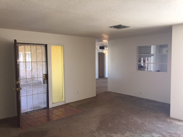
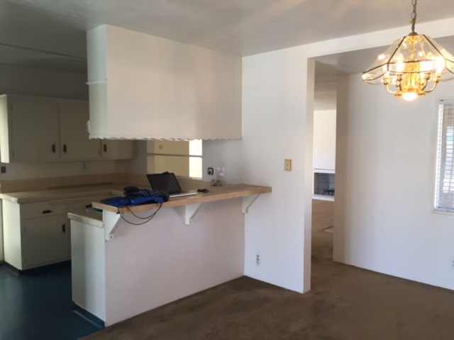
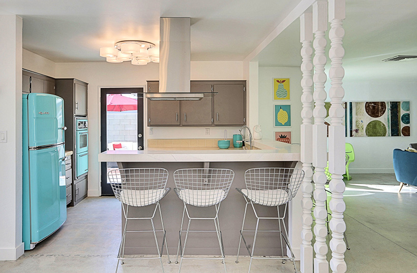
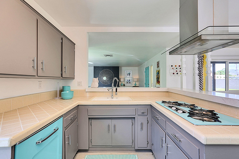
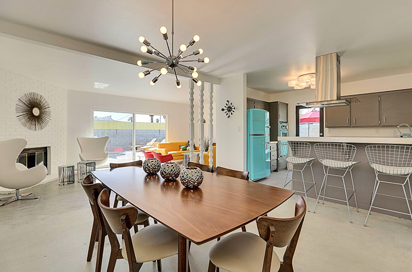
He the moved to the kitchen, the focal point of the home, and created a more open floor plan. He says, “The biggest importance was to open up that wall from the kitchen to the family room.” James was able to take down the upper cabinets and wrap the counter around the space so that he could cater to modern conveniences without threatening the integrity of the original elements of the kitchen, like the peach tile and turquoise appliances. Not only did this add additional seating to the kitchen area, it also created a more cohesive look by allowing the colors from the kitchen to be seen from the rest of the home. Since the entirety of the home is based off of this staple turquoise color, it was essential to remove cabinetry and drywall to let the appliances show through.
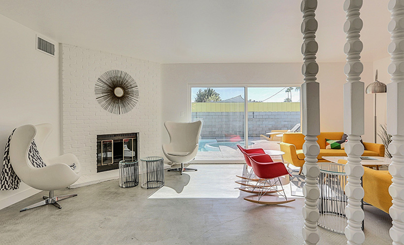
Flooring proved a challenge for James as the home had a variety of textures at play. Three different factors convinced James to choose a concrete floor for the first floor. The home sits in the middle of a desert, which is burning up for a majority of the year. Concrete is a great flooring choice if you want to keep your house cool all year-round. Secondly, James was aware that the buyers of his fixer upper had intentions to turn the home into a vacation rental. If you’re looking for something that has low maintenance and is easy to clean, concrete is the way to go. Lastly, James wanted to keep the theme of preservation. He says, “Concrete seemed to be the most pure in terms of achieving a midcentury home. Before any other flooring, that concrete was there.” He stripped away the textures to find a hidden treasure that’s perfect for a MCM look.
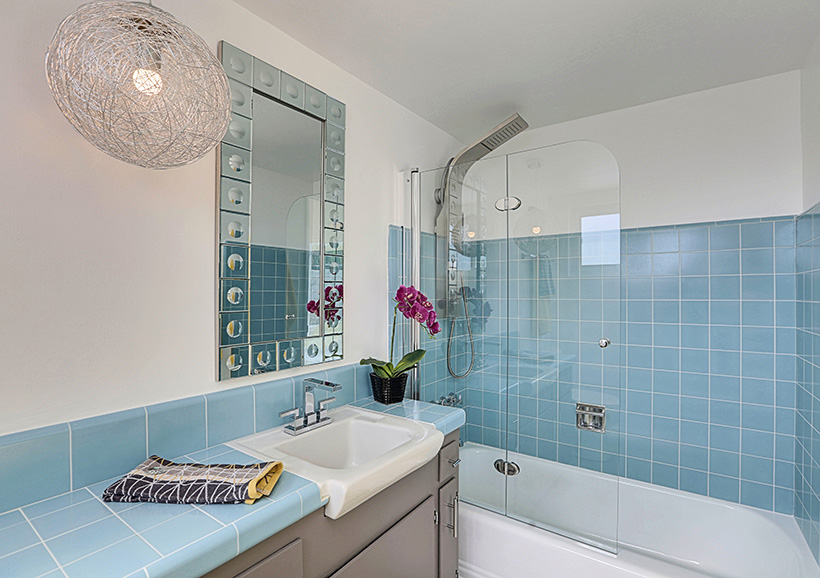
In the master bathroom, James asked himself, “How do I keep the integrity of the original bathroom, while giving it a luxurious feel?” Well, he certainly accomplished that balance by keeping the blue tile as it was and installing more modern plumbing through the sink fixtures and shower head.
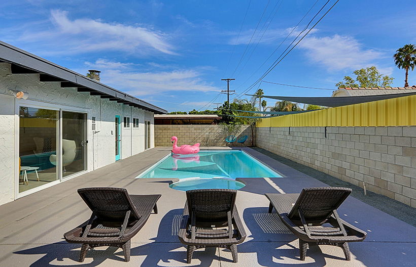
The last of the major renovations came in the backyard. The main focus of this redesign was the pool. “The pool dominated the backyard and we kept it that way,” James says. They simply re-plastered the pool to highlight the turquoise hue of the water. This staple color truly makes its way through the entire house whether through décor or natural elements, like water. He also chose to build a mounted yellow gate on top of the block wall to add some visual interest and give the residents more privacy.
The Finishing Touches
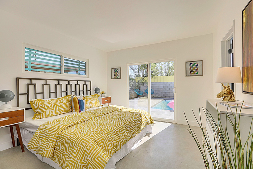
The cherry on top and the pull of this home comes from the simple yet functional décor. Each part of the design complements the home’s built-in elements and architecture. Not only does the design correspond with what the house is already giving, everything else in the house all flows back to the kitchen.
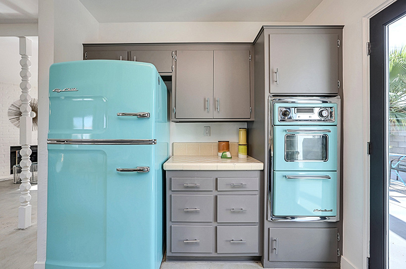
The turquoise appliances bring a special flair to the home that isn’t found in many homes today. James had to hunt down a refrigerator and a dishwasher panel from Big Chill Appliances to match the stovetop and oven from O’ Keefe and Merit. A little washing and a fresh coat of James’s favorite gray, Pencil Point, the tile, appliances, and cabinetry all came together.
The kitchen looks out into the family room that was once a carport. The previous owners closed the carport and installed what looks like a real fireplace. Discovering that this fireplace didn’t actually have proper ventilation didn’t stop James from making the most out of the area. If you’re working with a faux fireplace, like this one, try using a gel fuel fireplace kit. The kit will convince your guests that you have a real fireplace when you really have what James calls, “a really intense candle.”
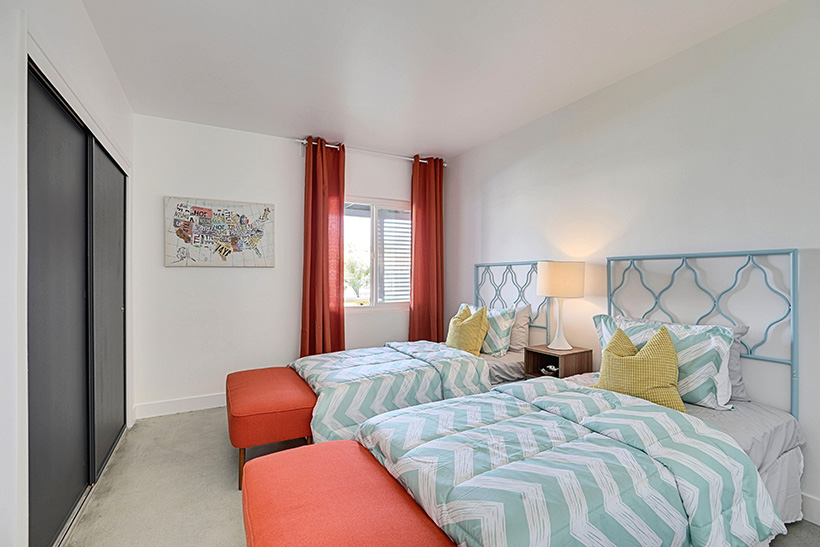
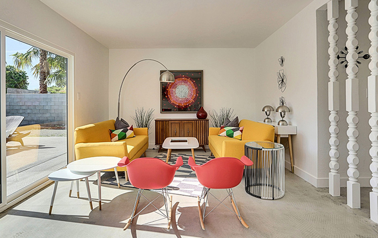
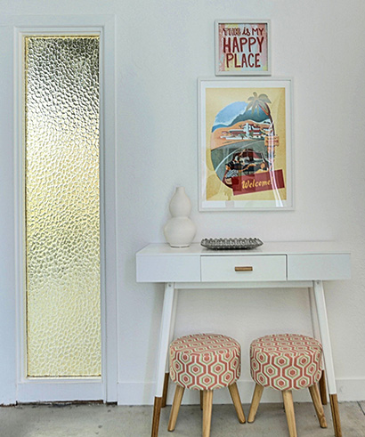
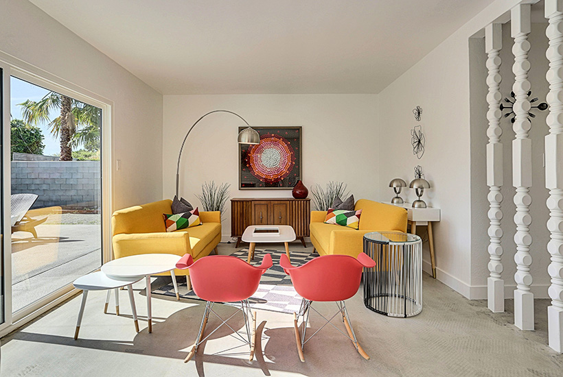
The décor of the living room plays off of the atmosphere outside and the cohesive design indoors. This room is one of the most colorful in the house and makes for a vibrant entertaining space. It also branches away from the turquoise theme and incorporates new hues. James says, “I knew I wanted to introduce yellow. The turquoise needed a best friend.” Yellow is a staple midcentury color and contrasts the turquoise elements without breaking away from the modern theme of the house.
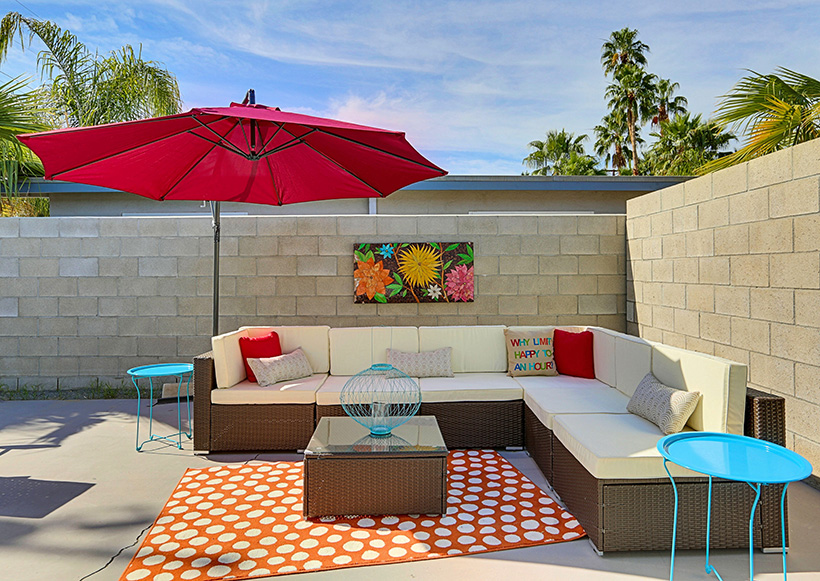
As this is a vacation home in a place that’s always summer, the outside area was really important to highlight. James kept the furnishings more modern and made a nice seating area on the side of the house. The rest of the backyard is fairly simple allowing the pool to be the focal point. The turquoise net chairs in the corner are “the nod to mid mod.”
Tips and Tricks
James Judge—flipper, designer, and house-a-holic extraordinaire—shares his three biggest tips for getting this look. He says, “If you got it, flaunt it.” As MCM fans know, preservation is top priority when renovating a house. If you’re working with great original elements, try your best to maintain those pieces. “Don’t be shy in terms of embracing reminiscent features,” James says.
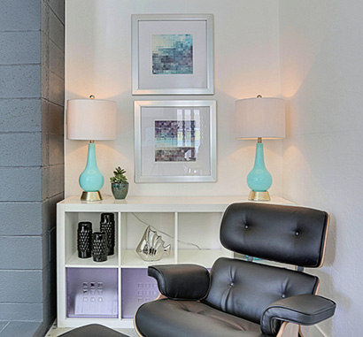
His second tip is to “get the biggest bang for your buck.” Having authentic midcentury pieces is always a plus, but you don’t have to sacrifice your budget to get the style you want. Many of the pieces from this home were found at HomeGoods and Amazon. Use these pieces while you’re saving up for that vintage chair you’ve had your eye on. Fake it till you make it, right?
Lastly, he advises making everything look intentional. When you look at a space, ask yourself “Does this make sense?” For James, having a wall in between the family room and the kitchen didn’t make sense. Let the space speak to you and whatever you change, make it look intentional, as if that was how the space was always supposed to be.
To contact James or to get more information, go to mrjamesjudge.com. If you want to see more of his designs, visit his Instagram @flippingdiaries.

