A designer uses a 1960s home’s original retro elements as renovation inspiration for this mid century kitchen with kitsch.
This mid-century kitchen renovation is a perfect example of blending the best of old and new design. The home where it is based is in Palm Springs, California’s Villa Roma condominium community built in the 1960s. It sports Greco-Roman Hollywood Regency style, with columns on the façade and a fountain with a sculpture of Venus. The community was recently approved by Palm Springs as a historic district, thanks to its unique architecture.

The new homeowner, Kyle, enjoys entertaining frequently. He wanted the kitchen to function more efficiently and improve the interaction with guests in the adjoining living and dining areas, so he contacted designer Michael Norpell, of Michael Norpell Wall to Wall, to renovate the room along with the rest of the home.
The kitchen had the original architectural and design elements when Michael was hired to renovate it. “It was the first time the unit was for sale since it was built,” he explains. “Kyle bought it from the original owner, Pearl, who lived to be 104 and didn’t do any updates, so it was pristine.” Kyle refers to his home as “Pearl’s Place.” Michael was involved in every aspect of the kitchen renovation. “I selected all the materials, finishes, flooring, wall color, furniture and area rugs,” he says. His design vision was to take elements of the original space and reinvent them with today’s materials and a fresh, modern look—and, of course, just the right dash of kitsch in the kitchen.

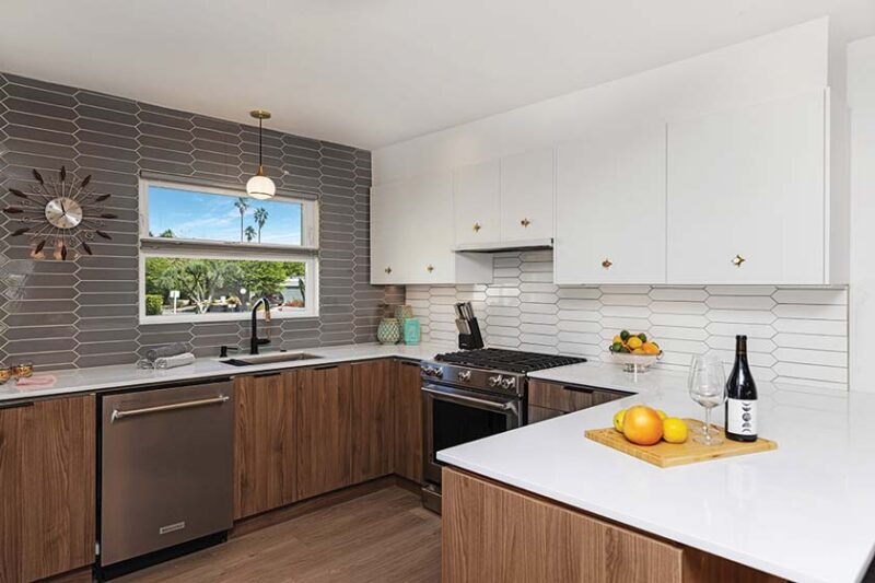
It was important to both Kyle and Michael to preserve as much of the existing architectural and design elements as possible—which included some kitschy kitchen accessories. “I wanted to reflect the client’s fun, outgoing personality,” Michael explains. The unit already had lots of natural light from large windows, and Michael selected lighting fixtures that aligned with the home’s mid-century architectural pedigree. “The hanging globe pendant light over the kitchen sink is a nod to the era of the home, and I incorporated an existing starburst clock, which is kitschy.”
Kitsch in the Kitchen Renovation Recipe
Kyle loves to cook and so does Michael, so he intuitively knew how to design the kitchen to be more functional. “I was thinking about standing at the range, getting ready to cook,” Michael says. “The kitchen was gutted, taken down to the studs. I placed the cabinets to create an ease and a joy while cooking. To the right of the range, I placed a three-drawer deep base for pots and pans; the top drawers are for cooking utensils.” To achieve Kyle’s goal to make the room energy efficient, he replaced the HVAC unit. All new doors and windows were added to increase efficiency; the insulation was increased as well.

Repositioning the appliances in the room was another key to the redesign. “We moved the range and relocated the fridge,” Michael says. “Kyle wanted a breakfast bar with two stools, so we included that in the design.”
Michael and Kyle wanted the cabinetry to complement the mid-century architecture and feel of the home. “The original cabinets were dark wood, so I made them a walnut color, which added lightness and openness to the kitchen and blend with the walnut furnishings found throughout the house. The white upper cabinets brighten the space, enhancing height and lightness,” Michael explains. “The cabinet style is a flat-slab front to keep simple, clean lines. The cabinet hardware is composed of two pieces: a backplate that creates a star pattern and a brass, conical knob. Together, they create a fun, mid-century look. Typically, cabinet pulls are off to the corner, but I centered them to change it and make it more unique.”

The brass-star backplates under the pulls on the cabinetry give off a vintage aesthetic, yet also manage to be clean and modern. The modern, elongated diamond backsplash tile is a fun take on often-used subway tile, and the gray back wall creates an illusion of making the space seem larger. Michael used two colors for the backsplash behind the sink—white and gray—to pull in the gray from the living room furniture. Placing the darker color in the back gives the illusion of pushing the wall back and making the room appear deeper. “By playing with color, you can create the perception of making the room appear larger or smaller for a more intimate look.” Michael’s creative ingenuity is apparent in his unusual choice of grout color for the tiles. “I put gray grout on the white tiles, and I put white grout on the gray tiles to tie all the tiles together.”
Michael sometimes incorporates open shelving in his kitchen projects, based upon the client’s lifestyle and preference, but for this kitchen the dishes and glassware were kept behind cabinet doors. “No open shelving was used in this kitchen; the client wanted everything neat and put away,” Michael explains.
The flooring was also given careful consideration. “I chose a wide-plank vinyl flooring that looks like a hardwood floor,” Michael says. “I picked a light wood color as a nod to the Scandinavian mid-century aesthetic. Vinyl plank is water resistant and scratch resistant. It’s a very durable floor for the client.”
Kitsch in the Kitchen Super Stars
One of Michael’s favorite aspects of the redesigned room is the starburst pulls on the cabinets. “The starburst pulls are the jewelry of the room,” he says. “I’ve gone to parties there, and every guest walks up to the pulls and examines them. I also loved playing with the grout colors.”

Michael managed to achieve his client’s kitchen renovation goals by balancing his creativity with respecting the retro era of the elements. He removed the kitchen wall separating it from the dining and living room, and the ceiling was raised to match the dining room ceiling. “By blowing open the kitchen and removing the drop ceiling that hid the florescent lighting, I was able to create a unified space between the dining and kitchen areas, meeting today’s expectation for an environment engaging family and guests.”

As for Kyle, he never thought he would live in a space like this. “I love the design and layout; it uses every inch. There’s so much storage now,” he says, offering an anecdote that is a testament to its success: Kyle works from home, and when his colleagues on a Zoom call saw the renovated area behind him, they thought it was a fake background!
Looking for more kitsch in the kitchen? Read on about how Love For Kitsch + Kitchenalia Revives A Quaint Vancouver Home. For more renovation wisdom for the kitchen and beyond, pick up Atomic Ranch’s latest book, Remodeled Marvels, which takes you through the MCM renovation process room by room. And of course, for more MCM inspiration, don’t forget to follow us on Instagram, Facebook and Pinterest for more Mid Century Modern inspiration! Or, get ideas delivered straight to your inbox by entering your email address where it says “Get the Newsletter” below.

