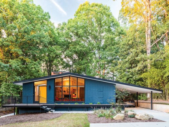
Renovating a house built in the 1950s can be tricky. On one hand, mid century modern enthusiasts often want to preserve the original footprint and design elements that were unique to the post-war era. On the other hand, a home should be conducive to modern living. “With the major remodel, I did my best to give a nod to the original mid century design, even though we took a lot of it down to the studs,” says Beth Williamson of her split level house in Portland’s Concordia neighborhood. Beth and her husband Seth Berman lived in the property for three years before finally committing to a renovation, and even then, they nixed two designers before bringing in architect Risa Boyer.
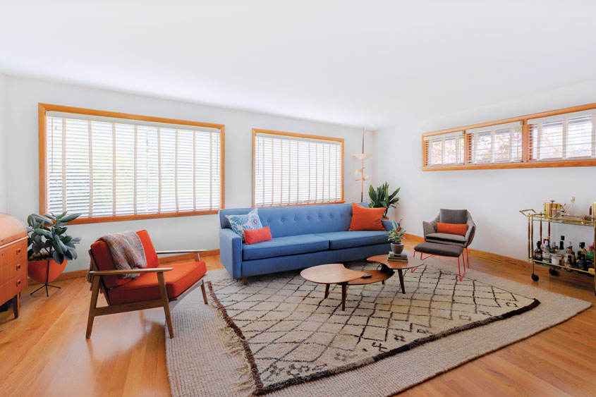
“They were really debating whether they should move or stay,” says Risa, who has remodeled several midcentury homes in the area. She encouraged Beth to go with her gut on her design choices and collaborated with her on adapting the home to the couple’s lifestyle.
Related Reading: MCM Architecture of the Pacific Northwest Region
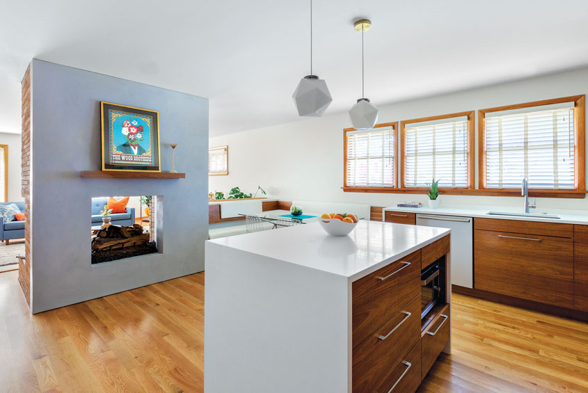
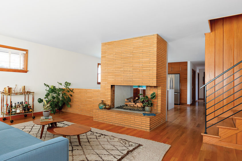
The focal point of Beth’s vision was preserving the original brick fireplace in the living room at the front of the house. “We didn’t have that ridiculous of a budget, so I had to really consider what was important to me,” she says. But amending the floor plan to create a more open space was challenging. Although technically a split-level house, the home is divided lengthwise into four living areas. Adding to the layout puzzle, a rogue bedroom separated the kitchen and dining room from the living room on the main floor.
“For me to stay in the house, I needed better light, I needed a more modern flow,” Beth says. They chose to move the kitchen and dining area to the center of the house and to remove a section of the brick fireplace to make the entire space more cohesive. The homeowners hesitated at gutting the kitchen, which featured stunning plasterwork done by hand from the previous owner, but Beth held fast to her vision. “I felt that if I did that well enough and kept some nods to the midcentury, I was improving the house and not taking away from its original character,” she says.
Related Reading: Inspiration Gallery– Mid Century Modern Fireplaces
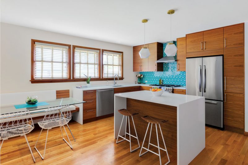
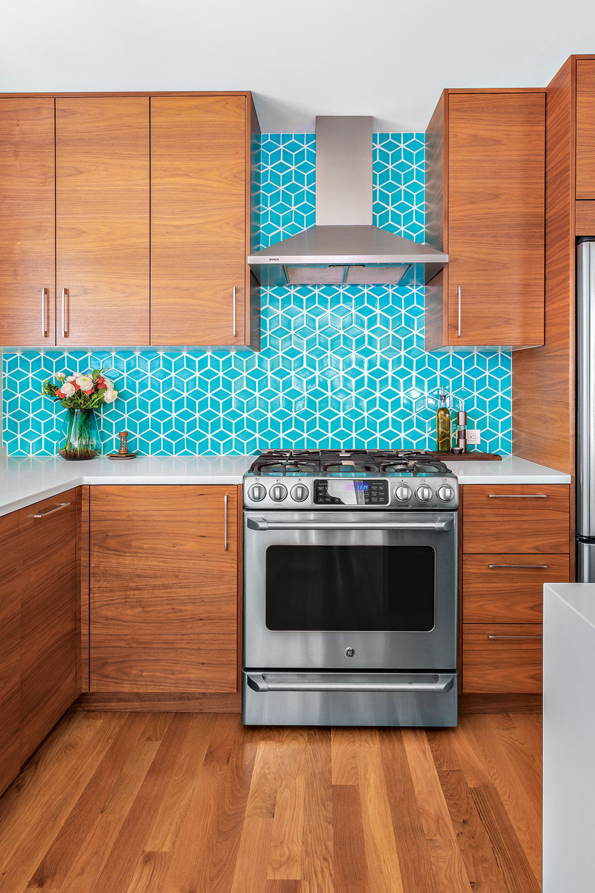
These nods include installing custom walnut doors and drawer fronts on Ikea cabinets, and white Caesarstone on the kitchen countertops with a waterfall edge island. A glass Atos dining table flanked by a walnut bench and modern wire dining chairs create a clean, minimalist aesthetic while providing a welcoming gathering place adjacent to the living room.
“When you respect architecture so much, there’s definitely a lot of pressure when you make substantial changes to a home.”
The original dining room, meanwhile, has been reimagined as a nursery (the couple is expecting later this year). A built-in china cabinet will be used to house baby clothes and stuffed animals, Beth says. The kitchen on the northeast corner of the house was converted into a den that also doubles as the home’s main entry. “Down the road, I foresee it being the playroom. Right now, my dog controls that room,” she laughs.
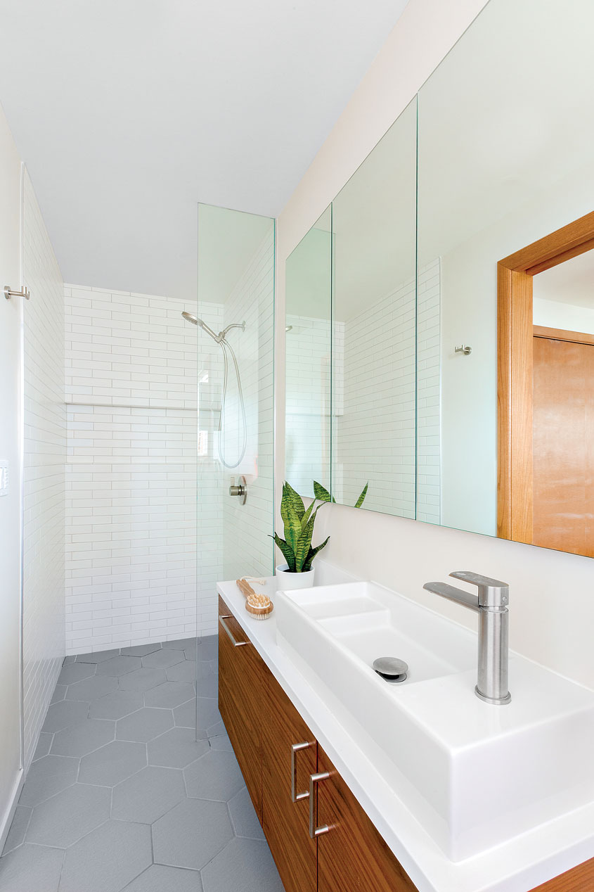
Upstairs, the homeowners expanded the half-bath attached to the master bedroom, while operating within the confines of the area’s peculiar layout. “We were working with a 42-inch wide space, so we had to get creative,” says Risa, who maximized the square footage by adding a pocket door across from a narrow vanity. She positioned the shower at one end of the bathroom and the toilet at the other. A large three-section mirror above the sink helps brighten the room, while walnut cabinets and hexagon floor tiles pay homage to the home’s midcentury roots.
Although the homeowners had to make due with a clunky layout for several years before saving enough for their desired renovations, they feel the end result was well worth the wait. “When you respect architecture so much, there’s definitely a lot of pressure when you make substantial changes to a home,” says Beth, who hopes to spend many more years in the newly refreshed midcentury abode. She adds, “Finding Risa was huge in helping us visualize this home in a more modern, functional way. We’re pretty proud of what we did.”
Can’t get enough of mid century renovations? Learn more about how this A-Frame Cabin stole the show right here!
And of course, don’t forget to follow us on Instagram, Facebook and Pinterest for more Atomic Ranch articles and ideas!

