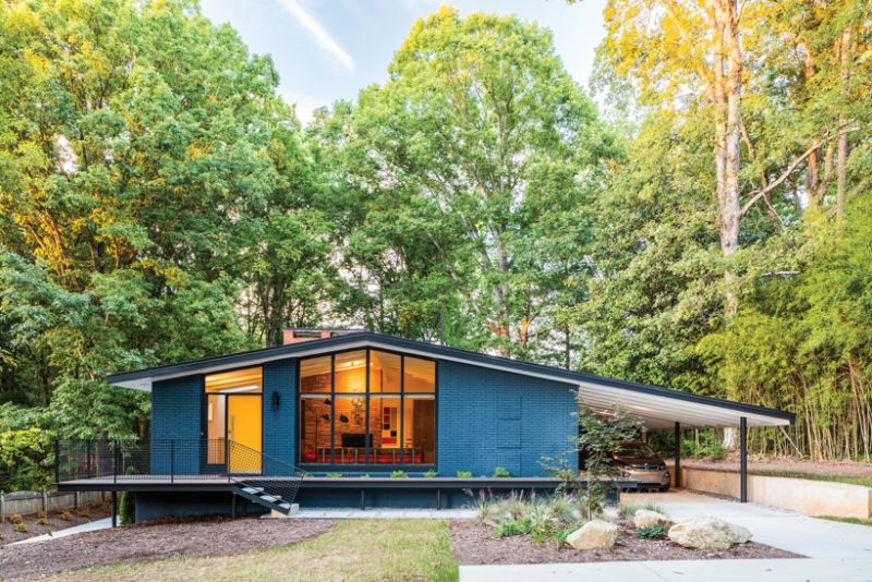
Blame it on the 1970s. Already in desperate need of a mid century renovation less than two decades after its construction, the classic low-sloped ranch house in Raleigh, North Carolina, had been made into a hodgepodge of stuffy rooms and random additions. Gold carpet and heavy floral curtains blanketed the main level, which was awkwardly divided into separated spaces, while the basement was a maze of dark and cloistered bedrooms.
The final straw, a clumsy sunroom addition on one side of the house and a Plexiglass greenhouse off the master bedroom, left most people thinking the mid century home should be leveled to make room for new construction. Joseph Amory, however, had a different vision.
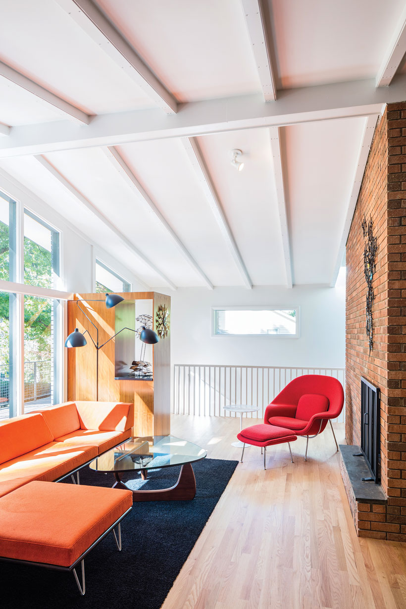
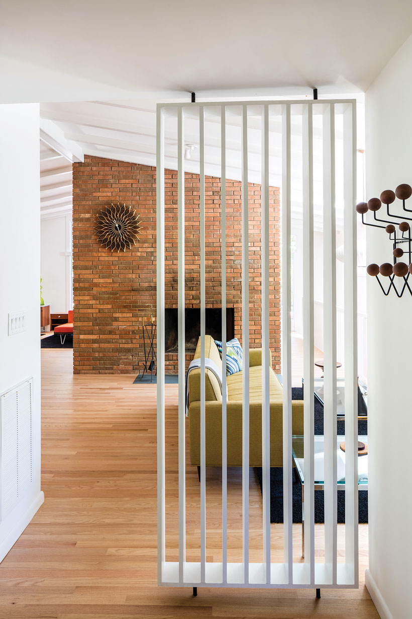
“The house came up on an estate sale, and I fell in love with it,” says Joseph, who purchased the home in 2014 from the son of the original owners. He enlisted local architecture firm In Situ Studio to oversee a renovation that would restore the 1959 residence to its former glory, while also making the space conducive to modern living.
“We wanted you to walk into the house and feel like it could be original,” Joseph says. He gutted much of the interior himself during the year-long planning process and drew inspiration from other mid century home renovations in the area.
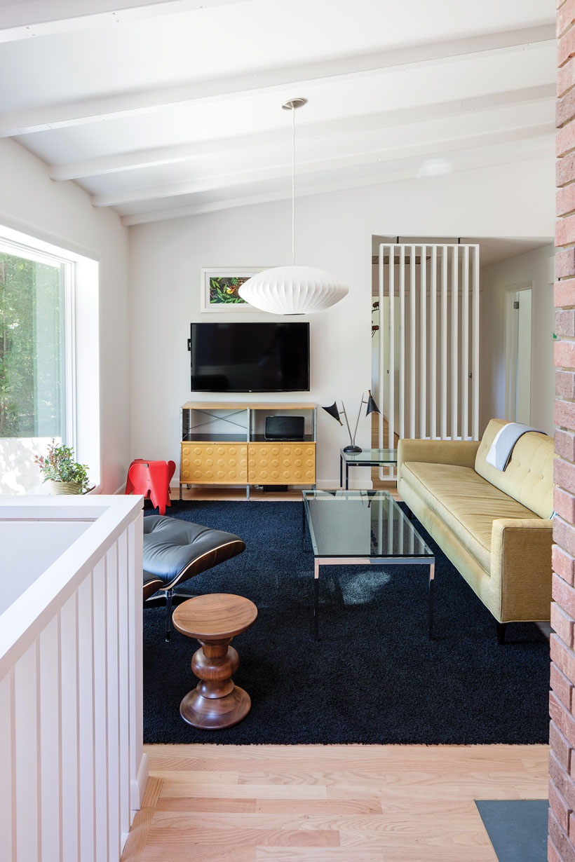
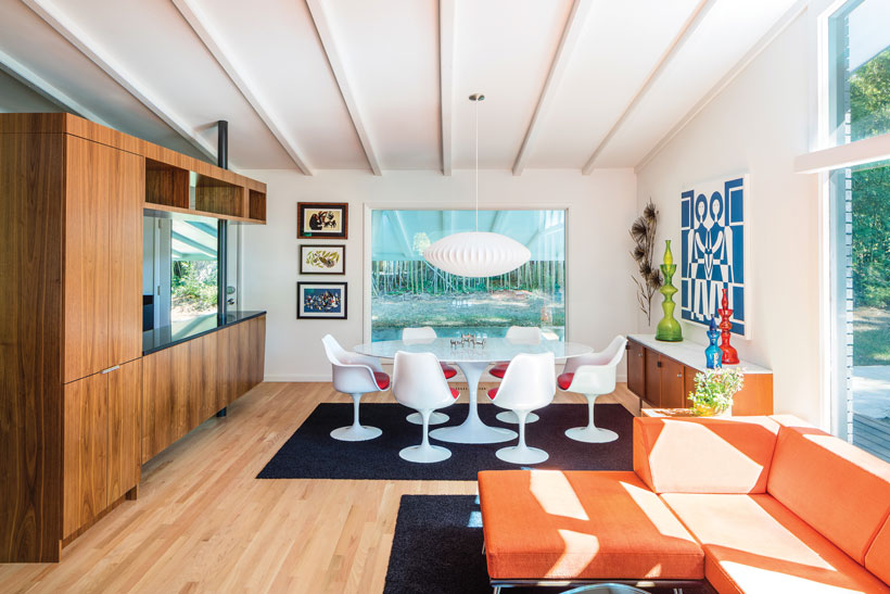
Clean Lines of a Mid Century Renovation
Joseph’s friend John Labus, a design manager for a large technology firm, came up with the idea of removing the sunroom and extending the roof to create a new carport. To further highlight the original modernist design, the architecture team nixed the crumbling front stoop and added a wrap-around floating deck and concrete stairs. “We took inspiration from the big windows and the roofline and just turned up the volume,” Joseph says.
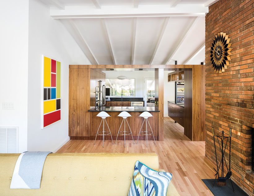
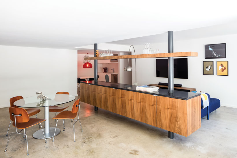
Although the house was structurally sound, removing interior walls required the addition of steel-reinforced beams to maintain the vaulted ceilings on the main level. Flipping the entry stairs allowed easier access to the basement, now illuminated by a new skylight, and a new floor plan created a seamless flow between the living room, dining area, kitchen and media room.
As a nod to the home’s history, Joseph asked to leave the brick unpainted on the two-sided fireplace that sits in the center of the space. “You can see where the old walls touched it. There are nail holes on the back side where the family tried to hang Christmas stockings and where the old mantle used to be,” he says, adding, “You can see that it had life.”
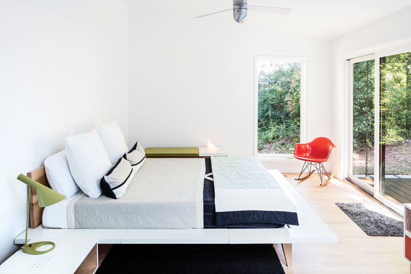
The clean lines and airy feeling are carried through in the master suite, with lofted ceilings, sliding glass doors leading to a private deck and a sky-lit shower. Minimalist furnishings and views of the wooded lot keep the space uncluttered and calm. At night, the moon shines brightly through the frosted glass bathroom partition, giving the room a serene glow.
Contemporary Touches
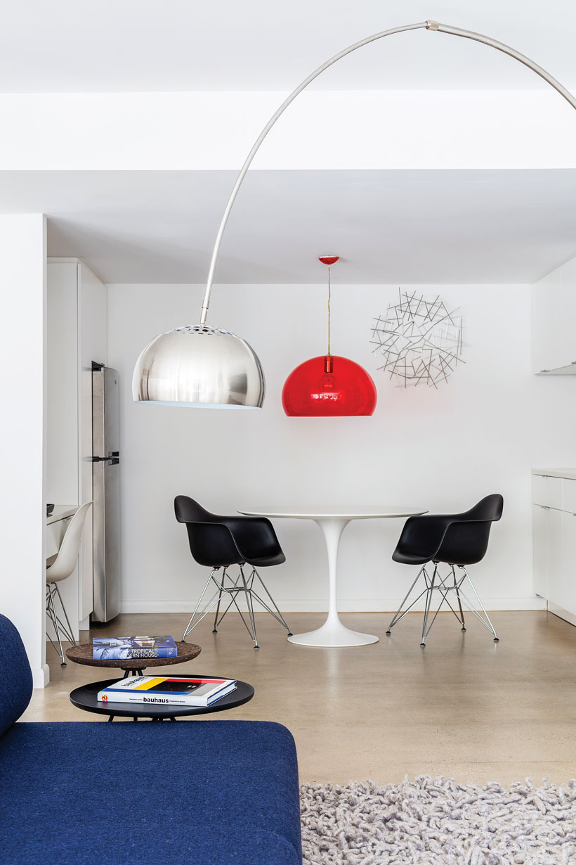
Modernist furniture and art throughout the house complement the original design without feeling overdone. Boldly-colored sectionals in both the upstairs living room and basement entertainment space invite guests to gather for cocktails and conversation. Sculpted Eero Saarinen chairs from Knoll nestled under a Nelson Saucer Bubble Pendant lamp in the dining area emanate a retro vibe. Walnut veneer custom cabinetry and black granite countertops in the kitchen reflect the home’s mid century roots, while commercial-grade Jenn-Air appliances offer modern convenience.
Although the mid century renovation took two years—part of which Joseph spent living with family in Virginia while the home was uninhabitable—the end result illustrates the benefits of preserving mid century history. Working with designers who understand and support this vision is also key to a successful outcome.
“We had so much fun with this renovation,” Joseph says of his collaboration with the team from In Situ Studio. “If they didn’t like an idea that I had, they’d just tell me and we’d move on. But we all wanted the same thing in the end.” With a beautifully renovated home that looks more Mad Men swank than 70s suburbia, the self-professed mid century enthusiast has achieved his goal.
Looking for more inspiration? Take a look inside Eero Saarinen’s Miller House. And of course, don’t forget to follow us on Instagram, Facebook, Pinterest and YouTube for more Atomic Ranch articles, house tours, and ideas!





1 comment