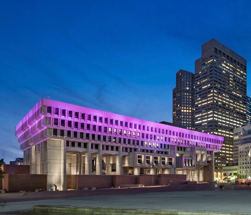
Apparently, ugly is the new fabulous! And Boston City Hall, the structure infamously dubbed the “World’s Ugliest Building,” might just be claiming a new title.
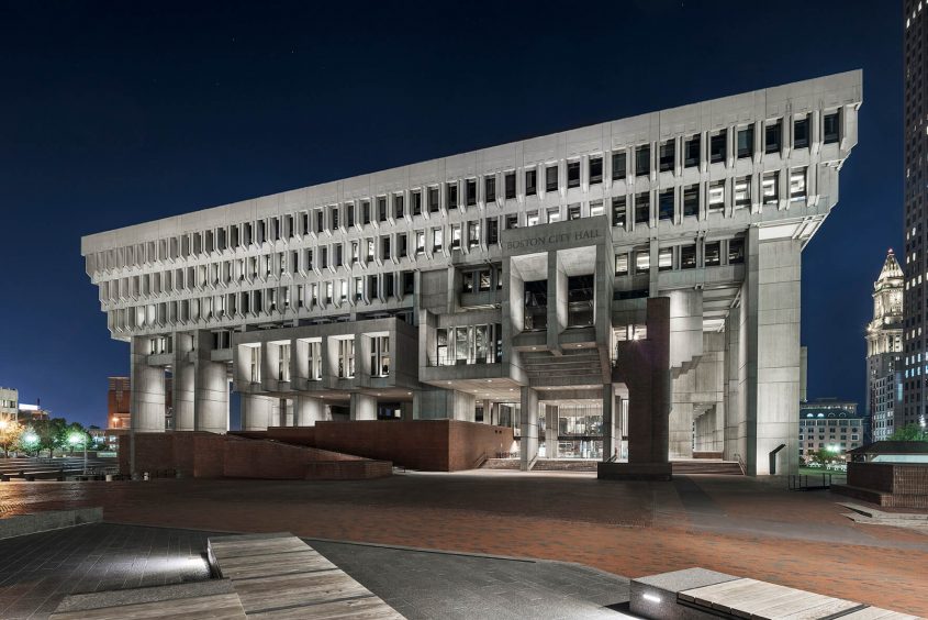
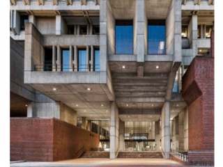
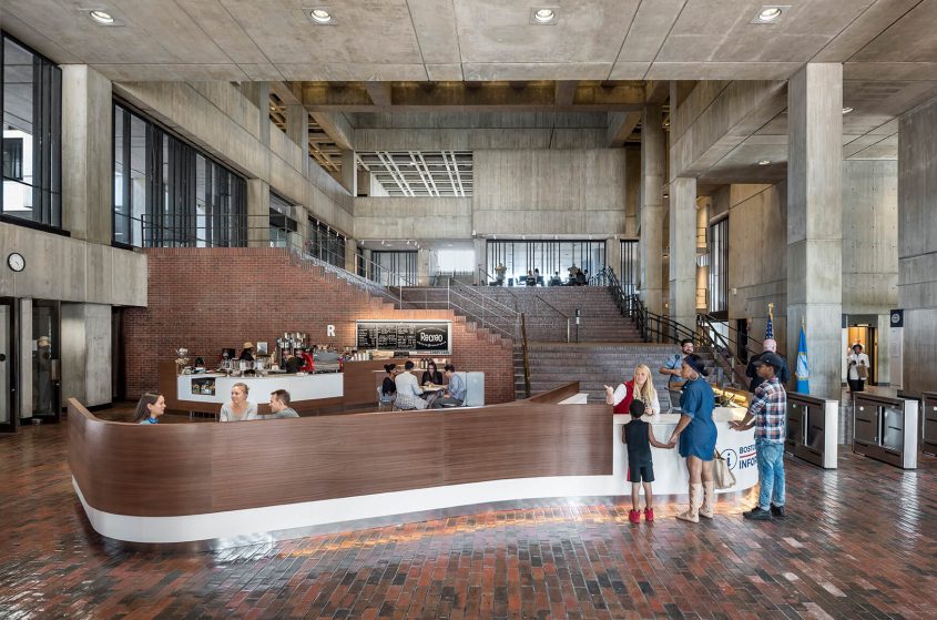
Due to renovation efforts from Utile, Inc., Boston City Hall has since been simplified, modernized, and given a new persona in response to its derogatory label. In a recent Architizer feature, the project’s architects explain that they focused on “accentuating [the building’s] significant features, and adapting it to changing programs.” This can be seen directly in the essential redesign of the structure’s security systems and support kiosks. By removing the unnecessary additions of the previous design scheme, architects reenvisioned the spaces aforementioned, keeping guest comfort and labor efficiency in mind. Improved seating areas, coffee booths, and better-equipped transaction windows are just a few of the innovations that now hold a stake in the “World’s Ugliest Building.”
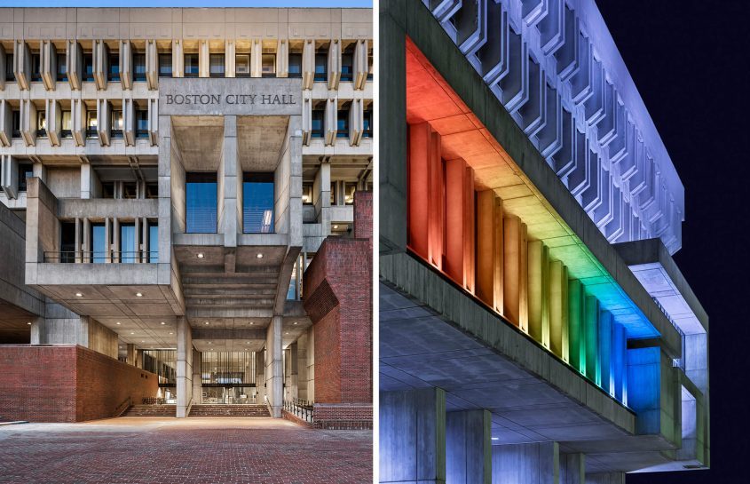
Despite these internal upgrades, Boston City Hall’s exterior was also gifted a makeover. After removing the building’s lackluster floodlights, a futuristic LED system took a proper seat along the structure’s facade. Having the ability to change colors and adhere to the sustainability efforts of Boston, these LED lights were the perfect choice for the redesign process. According to the minds behind this decision, “the new lighting plan uses LED technology to celebrate the building’s architecture and restore its original design intent of civic aspiration and monumentality” (Architizer).
After 50 years of neglect, the “World’s Ugliest Building” is now chic, functional, and fit for the programmatic requests of the future. So, let’s give this brutalist wonder the praise it deserves, and celebrate its rise from the ashes!
Want to learn more about the “World’s Ugliest Building”? Well, never fear, because Architizer.com is here! Check out their exclusive article on this mid-century masterpiece.

