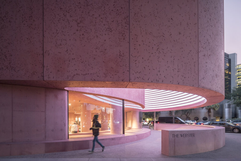
Experimental retail should have the power to pull people out of their homes while giving something back to public life. Near the historic Los Angeles Beverly Center, The Webster stands out as a gentle, yet striking sculptural marvel. The soft color in the concrete works to warm up the original Brutalist shell. Designed by Adjaye Associates and completed in 2020, The Webster seamlessly blends Brutalist and Mid Century Modern styles.
Brutalist Pink Concrete
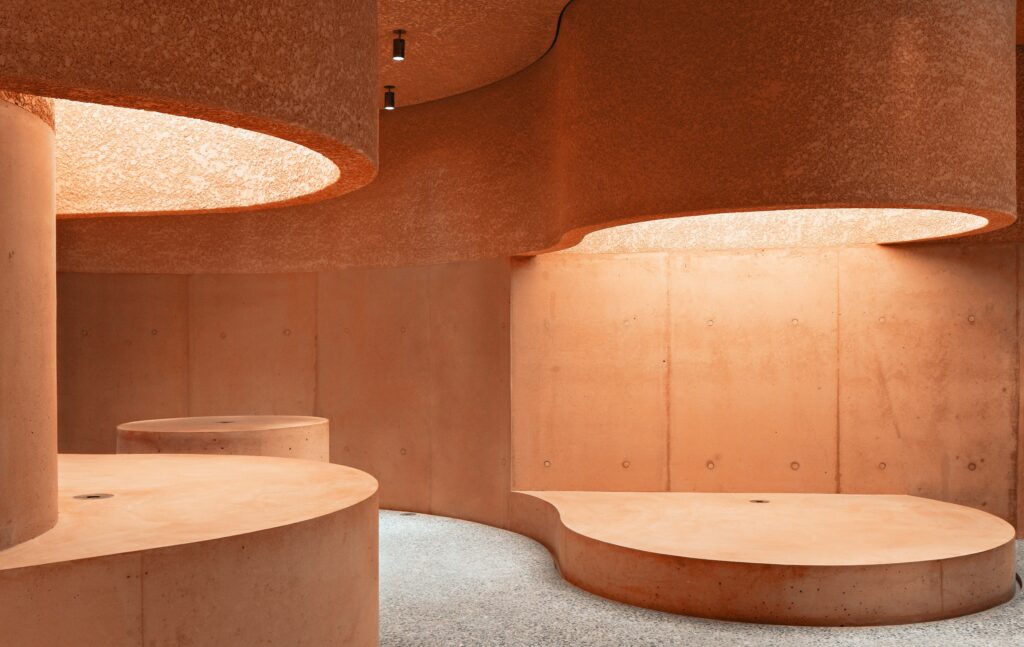
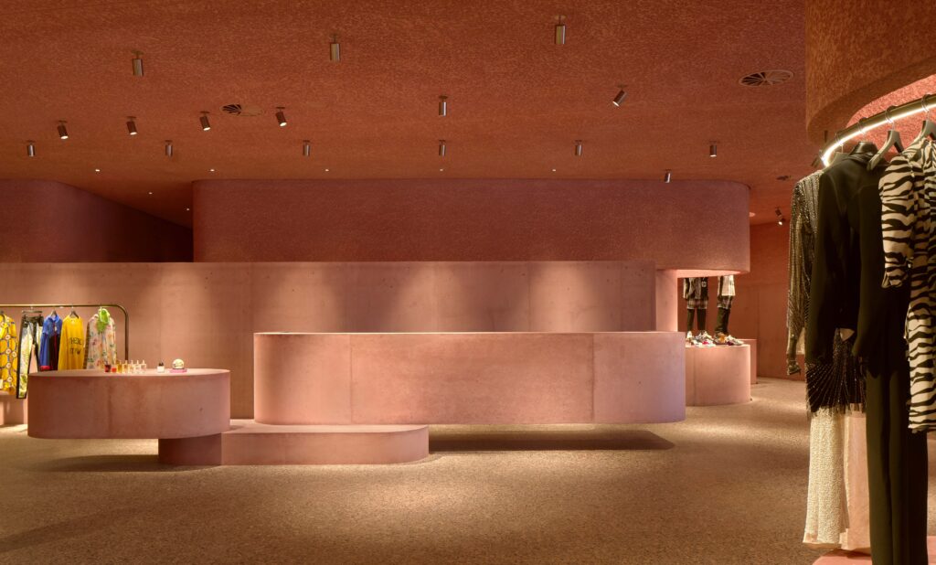
The Webster’s seventh space occupies 11,000 square feet in L.A’s bustling Beverly Center. The Brutalist concrete exterior of the building is saturated with a pink dye, “an ode to the luminosity of California, where the Pacific light naturally amplifies saturated colors”, Adjaye Associates says. At the front, there is a water fountain and digital art display. Inside the space, the warm color scheme continues with varying textures and types of concrete. The columns and displays create smooth vignettes for the merchandise, while bronze framed mirrors show off the lines of the building.
Community Gathering Space
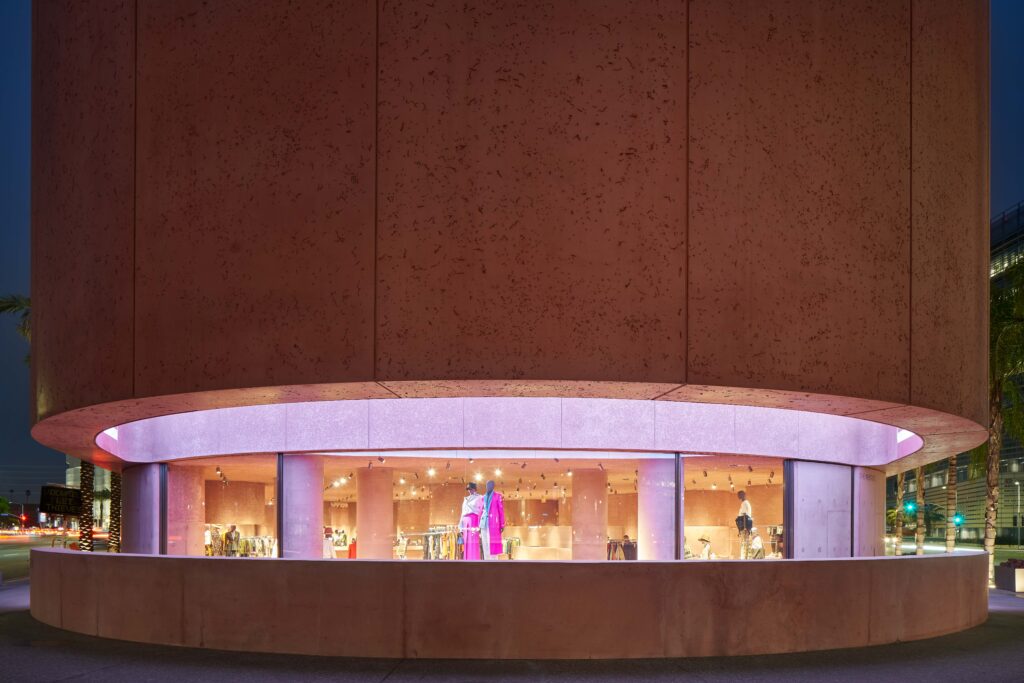
The retail market has been rough for some, but The Webster has been on an upswing. Laure Heriard Dubreuil, founder of The Webster aims to make community gathering spaces where people can linger and discover. Cutting the interior square footage short at the front, The Webster created an inviting public space for the city. Only visible from below, a digital art wall spans the inner curved surface. The art wall is intentionally low resolution and will display works of art commissioned by The Webster. Blending the Brutalist exterior with a Mid Century Modern detail is a 3-pane panoramic wall of curved glass. To soften the design in the fitting rooms, Adjaye Associates used vintage 1950’s wallpaper from the client’s personal collection. The Webster believes in providing a fully sensory shopping experience where customers can touch, try, and have a personal connection.
Mid Century Modern Tones
The design of the Brutalist raw concrete (think massive forbidding walls) is softened with Adjaye Associates’ injected pink dye. Using one of the colors common in the mid century modern color palette helps tie the styles together. At the front in particular, the curved glass dissolves the boundary between the outside space and the store’s interior. Inside, displays and surfaces appear to float. Clean lines and exaggerated slabs can be spotted everywhere. The Webster blends Brutalist and Mid Century Modern styles with a very minimalistic appearance. The space favors function over flashy design. Though the Brutalist concrete textures do vary, the building uses very little variation in material.
Hungry for more Brutalism? Check out Brutalist Architecture 101 and the Sao Paulo Museum of Art!
Feeling the travel bug? Enter for your chance to win a $1500 AirBnB gift card! Find out more on official rules and how to enter here. Disclaimer: The giveaway is in no way sponsored, endorsed or administered by, or associated with, AirBnB.
And of course, don’t forget to follow us on Instagram, Facebook and Pinterest for more Atomic Ranch articles and ideas!


