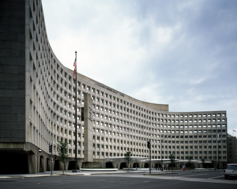
While visiting Washington DC, consider driving by 451 7th Street SW, better known as the Robert C. Weaver Federal Building. You can’t miss it—this massive X-shaped structure commands attention. It also instantly conveys its purpose; you will know at once looking at its imposing lines that it is a government building. In fact, it is the headquarters for the Department of Housing and Urban Development (HUD).
The Robert C. Weaver Federal Building deserves a closer look, both because of its historical importance, and because it can help us reconceptualize some common assumptions about brutalism.
“Dignity, Enterprise, Vigor and Stability” in the Robert C. Weaver Federal Building

In the early 60s, two things happened in quick succession. One was the release of a report titled Guiding Principles for Federal Architecture, which the Ad Hoc Committee on Federal Office Space established by President John F. Kennedy came out with in 1962. The second was the inception of HUD in 1965.
The HUD headquarters needed to meet the requirements in the Guiding Principles for Federal Architecture, which meant it needed to “reflect the dignity, enterprise, vigor and stability of the American National Government” and “embody the finest contemporary American architectural thought.”
It also had to be consistent with the purpose and values of HUD. The US General Services Administration (GSA) explains, “HUD’s creation was rooted in the federal government’s response to urban decline that resulted from the post-World War II wave of suburbanization.” GSA continues, “In accordance with HUD’s urban renewal program, GSA selected a building site in a designated redevelopment area in the city’s Southwest quadrant.”
So, HUD’s headquarters, like HUD itself, helped to actively revitalize a blighted district. The architect for the project was world-famous Marcel Breuer. He built HUD’s headquarters in a style that incorporates aspects of brutalism and expressionism.
A Design that Lets in the Light, Literally and Figuratively
Ask a layperson to describe brutalism, and they will often come back with words like “heavy,” “cumbersome,” “blocky,” “raw,” and, well, “brutal.” Ask them for mental associations, and they might mention dictatorial governments. But this surface glance captures neither the spirit of brutalism nor many of its expressions.
Brutalist structures were designed to be functional. During the post-World War II period, countries around the world required an efficient, economical approach to rebuilding. Infused with democratic-socialist ideals, brutalism sought to resolve housing shortages and other social ills through pragmatic design. At the same time, the aesthetic conveys a sense of solidity. So, it was well-suited to the requirements and mission of the HUD headquarters.

As with many of his other designs, Marcel Breuer’s Robert C. Weaver building challenges us to reconsider whether brutalism is “heavy” or “blocky.” Perhaps brutalism can be heavy and light, blocky and graceful. Columbia University professor Barry Bergdoll refers here to the “heavy lightness” of Breuer’s works. He writes, “Breuer’s long career, despite marked shifts between his early European and later American work, were the material and structural experiments and also, in transmogrified ways, the pursuit of lightness.”
Despite this being the first time precast concrete was used to construct a US federal building, the Robert C. Weaver building does not look heavy—or not entirely. The tapered piers at its base with the wide, dark gaps between them help the mass of concrete above appear less heavy. They also frame the structure exquisitely, as you see in the image above.

Not only does the Robert C. Weaver building “let in the light” in terms of lightness, but it does so in another way as well. The shape of the building and with its graceful curves is functional, in keeping with brutalist standards for efficiency and quality of life. It optimizes the availability of natural light for the workers inside. So, while “light” and “graceful” may be words a lot of people would not think to associate with brutalism, here you see them on full display. We should note that the almost “sculpted” look of the curved walls also typifies Expressionist architecture.

We could say the Robert C. Weaver Federal Building also lets in the light in one more way, this time figuratively. By bringing beauty and function to a part of D.C. that was in need of redevelopment, it opened a window on the possible, showing how “light” could be brought to blighted urban areas. Since HUD’s job was to help improve access to housing for those most vulnerable, in doing so, the structure highlighted the “light” the US government hoped at that time to bring to the lives of its citizens as well.
For more on brutalism, see Brutalist Architecture 101. And for more instances of brutalist architecture, see Pretty (and Brutalist) in Pink and The Imposing Brutalist Grandeur of UW’s Red Square. And of course, don’t forget to follow us on Instagram, Facebook and Pinterest for more Atomic Ranch articles and ideas!

