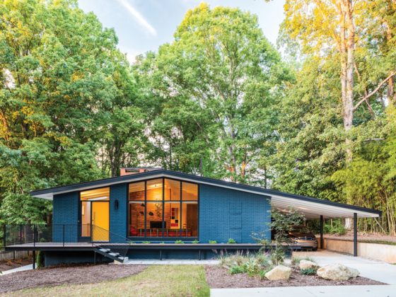
It’s time for some color in our SacMod Makeover home. Join us in our fourth article about refreshing our Sacramento Carter Sparks designed, Streng Bros. built home as we focus on defining the interior spaces with color.
We also offer tips on picking your paint colors and on how to work with the “popcorn” wall texture often found in Mid Century Modern homes.
An open floor plan found in many MCM homes like ours doesn’t mean you have to paint all the rooms the same color or settle for painting the walls white. Far from it. You can give each room its own identity and still achieve a cohesive look.
The trick is to pick three or four colors that work well together as well as pick repeating colors and patterns in accessories such as pillows, rugs and decor items to further tie the rooms together.
We prefer bold colors in our homes and we looked forward to painting over the white color the walls had been painted to get the home ready to sell. Choosing a new color palette helps to make the space feel more like home.
Our budget doesn’t allow us to hire a professional painter, and in this time of Covid, we didn’t really want a crew of painters in our home. So it was an easy decision to handle the painting ourselves.
But we have limited experience in painting, so we started with less public rooms to get a lot of practice before we attempted the more public spaces of the living and family rooms.
The SacMod Makeover Colors
You can find many articles and opinions on what colors qualify as Mid Century Modern colors. We read numerous articles as well as poured over our back issues of Atomic Ranch for inspiration.
In the end, we chose our colors based on the colors in our artwork and furniture as well as colors we loved from prior homes.
All of our paint choices were from Benjamin Moore in a matte finish.
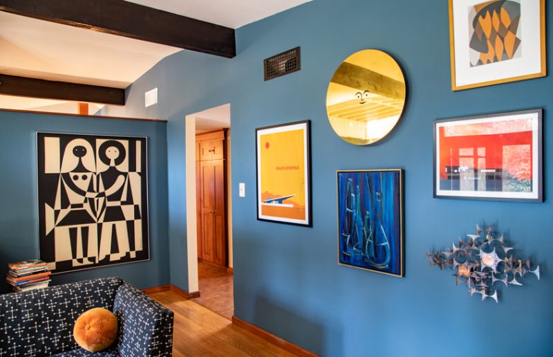
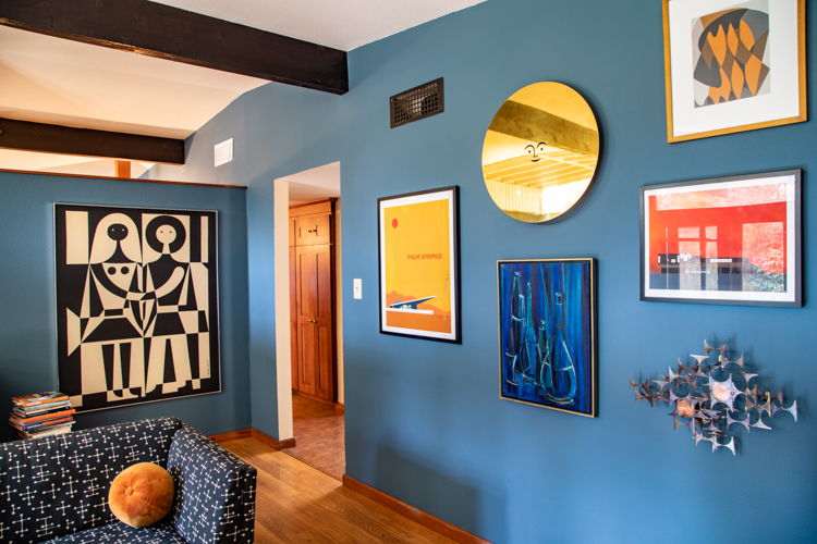
Our floor plan includes an open ceiling between the living room and family room. We visually connected the two spaces by painting the wall that ran between the two rooms the same color of Benjamin Moore 1645, Thousand Oceans. (See photo at top of post.)
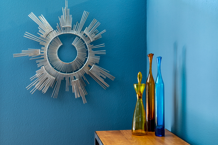
The living room displays most of our artwork, so we painted the entire room one color to show off the art. This bold color really makes our vintage C. Jere sculpture and Blenko glass pop.
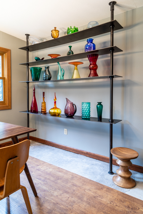
As noted, the family room now has the main wall shared with the living room in blue. The rest of the family room/dining area was painted Benjamin Moore 1482, Sabre Gray—a gray color that complements the blue accent wall and lets the colors of our (mostly) vintage Blenko glass collection really pop.
We also used this gray color in one bedroom and another room we use as an office. Both of these rooms also have orange accents on pillows and other decor items, providing another visual connection to the rest of the house.
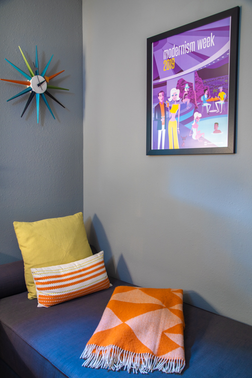
We took into consideration when selecting colors that Carter Sparks was inspired by architect Frank Lloyd Wright, so our home has Arts and Craft touches such as the dark wood of the kitchen cabinets and interior doors.
In fact, we selected one of our colors inspired by the classic Frank Lloyd Wright red called Cherokee Red—our office was painted Benjamin Moore HC-183, Country Redwood.
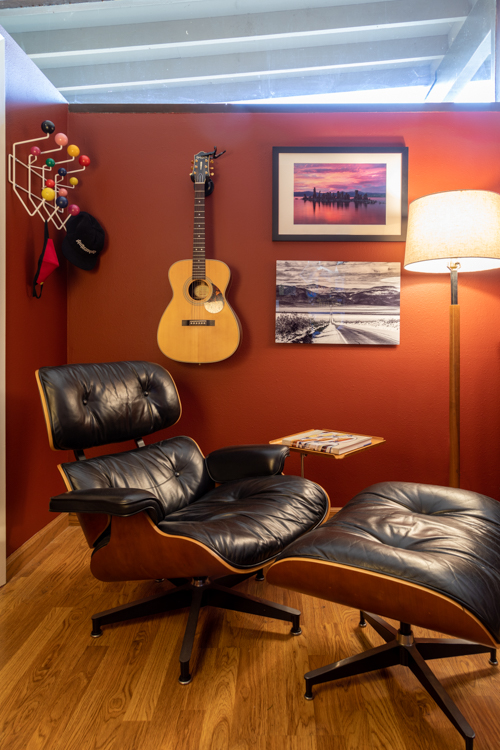
The open kitchen area was painted Benjamin Moore 958, Ocean Beach—a neutral color that works well with the gray and blue in the open family room/dining area as well as with the existing dark wood and the backsplash and granite counters that we hope to one day replace.
Painting Technique
Like most homes of this era, the walls have a “popcorn” texture as opposed to a smooth, flat texture.
This uneven texture makes painting a challenge. After a lot of trial and error and hours of online research, here are several tips to make working with textured walls a bit easier:
Create a ridge
The biggest challenge was achieving a smooth, even line where the ceiling and the walls meet. The uneven texture also makes it almost impossible not to get paint on the ceiling.
A trick to create that desired even line between ceiling and wall is to use a flat-edged screwdriver and run it along the space between the ceiling and wall, scraping off a bit of the texture as you do so. This creates a tiny ridge in the ceiling which the tip of your paint brush will naturally go into.
Finish one wall before starting another
Another tip is to paint one wall at a time. It sounds like common sense, but in our first attempts we were painting all the room corners then going back to roll paint onto the walls. We thought we were saving time by having one person do each task, but the result was wall color that was uneven.
We got the best coverage when, after painting the corners on one wall, we immediately rolled paint on the same wall before the corner sections could dry. Then we moved on to the next wall.
Use a bright light when working and consider two coats of paint
Most women who color their hair know what a “holiday” is—a holiday happens when your colorist misses a spot. The same thing happens when you are painting on textured walls. We found that the darker colors needed two coats of paint. And all the rooms benefited from setting up lights to illuminate the bumps created by the texture in the walls that our roller could easily skip across to create a holiday. Look for the holidays after you finish each wall so you can fix them on the spot before the paint drys.
And don’t use your expensive Nelson bubble lamp as your light, because you might bump it and it just might fall into the paint …
Our other painting challenge wasn’t related to the wall texture at all but to the baseboards in each room. In many spots the baseboards weren’t flush with the wall, creating a noticeable gap where you could see the white drywall. The gap was especially noticeable in the rooms with the dark colors. The ultimate fix will happen when we replace the floors. For now, we painted a thin line of color along the baseboard to fill in the gap and to trick the eye a bit.
Just don’t look too closely.
Stay tuned for more on our progress of our Sacramento Modern Makeover and pick up tips along the way. See previous installments on our SacMod makeover here as well as at patriciakline.com. There you will also find profiles of other mid century modern enthusiasts written for Atomic Ranch as well as articles on Mid Century Modern finds such as where to shop, eat, drink and stay in Palm Springs.
Of course, don’t forget to follow us on Instagram, Facebook and Pinterest for more Mid Century Modern inspiration!

