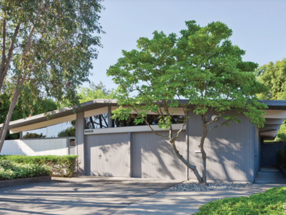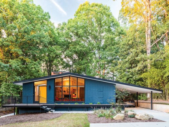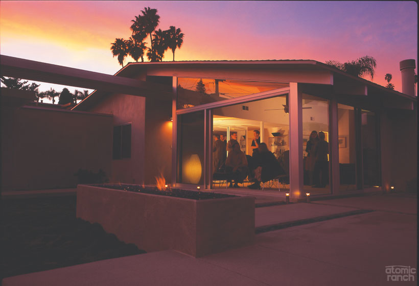
The Pacifica neighborhood near Mission Bay in San Diego features several models of Palmer & Krisel homes.
Pacifica Calls
“I started to really understand mid century style when I was in high school and college,” says Cheryl Dine, who lives in a Palmer and Krisel house overlooking Mission Bay in San Diego. “My mom gave me a book with Scandinavian-designed furniture in it, and I thought, ‘Oh, I have to go to Norway and Denmark and see this stuff’—as if it wasn’t here.”
Cheryl, a graphic designer, and her husband, Marty, a golf-course consultant, have just come off a two-year exterior renovation where they re-landscaped, replaced every door and window and re-plastered the exterior of the house. They bought their home almost 10 years ago.
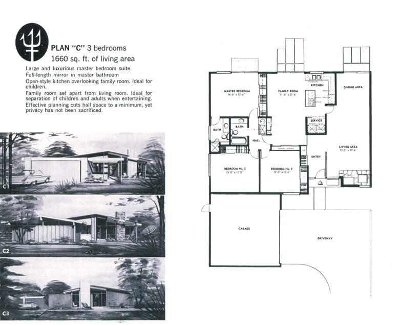
Neighbors Darren and Elise Bradley have also recently finished a major remodel that netted them an expanded kitchen and master bath, a pool in the backyard and an updated front facade. The scientist (her) and aerospace manager (him) bought their 1960, 1,600-square-foot post-and-beam home two years ago and are among the younger residents of the Leonard Drogin–built tract.
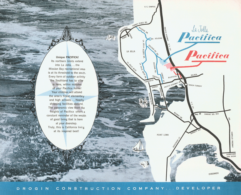
“Marty and Cheryl are the social directors of the neighborhood,” Darren says. “As soon as we moved in and they saw what we were doing with the house, they figured, ‘Ah—kindred spirits!’ and left a note on the door.”
A third couple, Lynn Reizer, a filming coordinator, and husband Rex Heftman, are two more of the handful of residents who love the Pacifica tract’s modern architecture, a decided minority in an area where most people buy for the view and location. Rex bought his P&K some 20 years ago, pre-Lynn; when he moved in, he was the young kid on the block.
“I knew from Eichler but not from P&K,” Rex, a graphic designer, says. “To see that there was an architectural house in San Diego County and that it was for sale, much less that I could afford it, was unbelievable. I was assuming I’d buy an ugly house—what else is there? But I drove up in the car with my realtor friend and said, ‘I’ll take it.’ When he asked if I didn’t want to get out of the car, I said, ‘No; it’s mine.’”
Pacifica and Palmer & Krisel
William Krisel is known for the Alexander homes in Palm Springs that he and partner Dan Palmer designed beginning in the mid-’50s. Today, the butterfly, flat and folded-plate rooflines of the Twin Palms and other tracts epitomize midcentury modernism. But perhaps his most well known icon is the Alexanders’ own Life “House of Tomorrow,” also dubbed Elvis’ Honeymoon Hideaway. One year, of the 10 largest builders in America, seven of them were Palmer and Krisel clients, Bill Krisel says today, estimating he’s been responsible for designing 40,000 living units.
“Drogin built in 10 or 12 different locations using my designs,” says Krisel. “Alexander homes were done at an earlier date; they were basically second homes and the ones in San Diego were full-time. The Pacifica and Palm Springs houses are the same in that they’re both post and beam, but the Palm Springs ones are much more daring or interesting in their exterior designs.
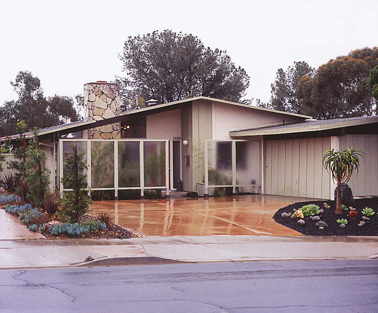
“Leonard Drogin knew about my houses in Palm Springs and thought they were a little too much for people in San Diego, that they need to have a house that looked like a house,” he explains. “The strange thing is, a competitor of Drogin’s engaged me to do the Alexander-type house in University City and quite a few other areas of San Diego County, and they sold quite well. Drogin didn’t want to go that far, so all of the Pacifica houses are front- or side-gable models.
“Unfortunately, in most of these houses that front on the street, the biggest element is the garage or carport. You need to change the garages so that people don’t think the houses are exactly the same. I have the ability to visualize all of the possibilities—you can turn it this way, you can change the roof slope or add a high or low section.
All of these ideas have to be restricted by cost; I have to have ideas that are practical and fit within the budget. When you work with builders and developers, their main forte is, What’s the bottom line? My objective is how good a design I can do.”
The Dines are launching a website about the Pacifica tract, sharing some of Krisel’s marketing materials and area history in order to educate fellow homeowners on the significance of the style. “We want to show what the spirit of the architecture was when they were originally conceived, but I don’t cast myself as the arbiter of good taste,” Marty says.
“Of course there are the people who roll in and decide, ‘Oh, gosh; this house is a bag of crap. I have to have a big, giant stucco block.’ They turn them into a Spanish McMansion or a Little Tuscany. All we can do is give people knowledge about what’s here and why it was done,” he offers. “Hopefully that will inspire some of them.”
Young Bucks
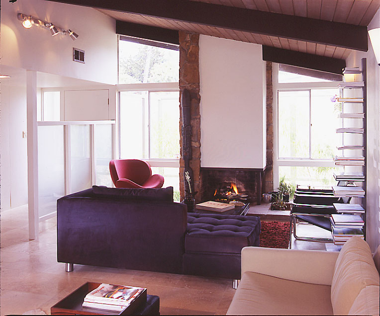
The Bradleys took their stylistic cues for their P&K Pacifica remodel from homes they’d seen in Palm Springs, as well as the Eichler playbook. “We returned it to the color palette that was used in the neighborhood originally: beams were typically dark chocolate brown with sage green or beige board and batten,” says Darren. “To give us additional privacy without needing curtains, we used Mistlite panels of textured glass for a fence—a similar design cue to Eichlers.”
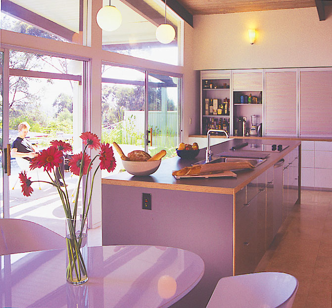
In their floor plan, the kitchen and den were open to each other, but there was a wall between the living/dining area and the kitchen. They removed the wall, annexed some of the den for the kitchen and the remainder for a new second bath, and added a glass slider wall leading from the kitchen to the pool patio. The
original second bathroom was absorbed into an expanded master bath.
Elise, who is an accomplished cook, enjoys the new 13’ x 16’ kitchen, with its mix of high-end and budget finishes and fixtures: Miele appliances, white lacquer cabinetry and gray countertops from IKEA, Hansgrohe faucets and travertine floors. The couple hired Hector and Pamela Magnus of Architects Magnus to help gel their vision.
“The budget limited the amount of structural modifications. Existing openings were made taller, clerestory windows were added over existing doors and only a small portion of the rear wall had to be retrofitted for seismic loads,” says Hector Magnus. “Darren and Elise were great at researching and making decisions on products and materials that allowed them to keep within a relative distance of their budget. When clients suggest cost-savings items, I don’t pause at all. I believe if a strong design direction is developed, materials—cabinets in this example—can be substituted in an effort to meet a budget without hurting the design or function of architecture.”
Social D
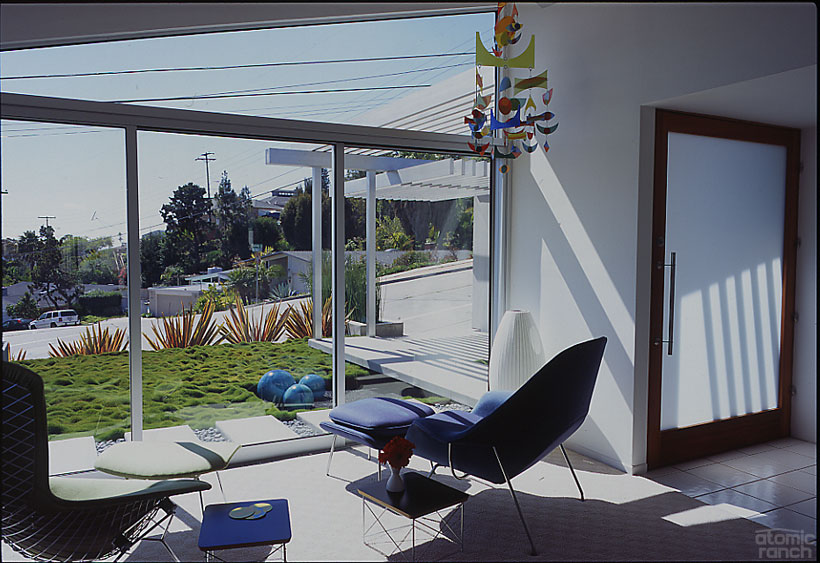
“For months and months we went to different architectural sites and modern houses in Los Angeles and San Diego, taking pictures and admiring different design schemes,” says Marty Dine about figuring out what to do with their exposed, hilly Pacifica lot.
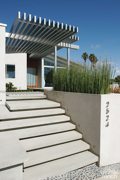
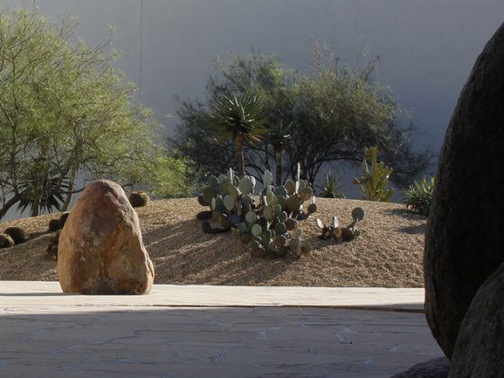
“What we had was a slope with weeds, volunteer palm trees and Brazilian pepper trees, all ill-maintained. Over time, we stripped all that off while we were figuring out what we wanted to do. Neither one of us are gardeners; the landscape is more architecture to us.”
Their house is a model “C,” the same as the Bradley home, but flopped. Prior to their purchase, POs had razed
the original stone fireplace and relocated an enclosed firebox to the side of the house to open up the view. Guy West, an architect friend of theirs, helped coalesce their ideas and took things further than the Dines would have on their own.
The plan that emerged included a retaining wall that steps down the slope; an aggregate driveway; a new concrete bench, planter box, fire pit, stairs and walkways; and an aluminum trellis that casts architectural shadows on the cement. They also changed out all of their windows and had the exterior coated with smooth plaster.
“The project just kind of grew; we were going to redo the landscape, then we said let’s do the concrete, let’s re-stucco and do all the windows. We’re thrilled with it, but it wasn’t the best way to go about it; you’re supposed to have a budget and stick to it,” Cheryl laughs.
“I did say I’d love to be outside and be warm; what can we do about that? I liked everything Marty and Guy were proposing, but when the money factor hit, I had to get talked into things. I was the one who had to hold them back. Still, they went out of control. But if I didn’t like something I nixed it.”
Crotchet Club
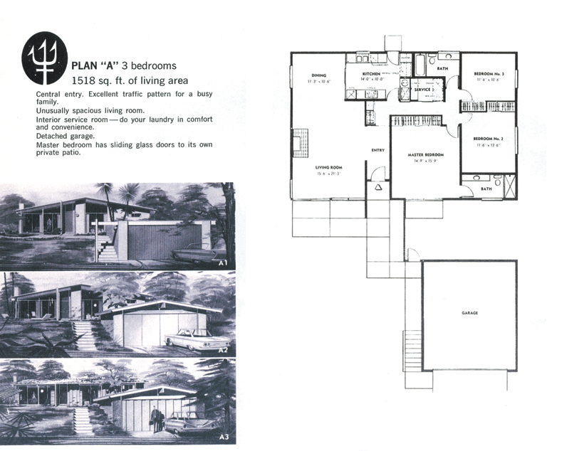
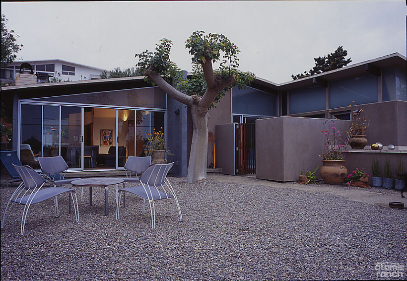
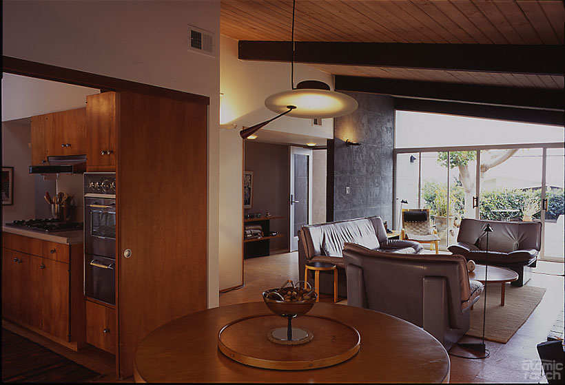
Rex and Lynn’s Pacifica home is a different P&K, a model “A.” He’s added a studio for his graphic design business, but the rest of the layout, including the kitchen with its pocket doors and the unpainted tongue-and-groove ceiling, is original. Windows were replaced in 1994 and, due to a settling problem brought on by leaking hot water pipes in the slab, the living room has a replacement self leveling cement floor from the same material they use in broadcast studios, then topped with cork.
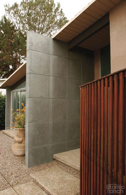
The pair met over Rex’s hobby of renting out the house for commercial photo shoots, but Lynn finds she doesn’t have the stamina to see their own place used as a set. “The last time there was a job here,” she says, “within 10 minutes the sliders were popped out and all of the furniture was in the front yard; I could not get out of here quickly enough.”
The house is energy efficient and smartly designed, Rex attests. He jokes that he’s been kicked off the Eichler online forum for his replies to homeowner complaints about MCM insulation: “Open a window; get a sweater” sums up his approach. He contends installing a foam roof is far more expensive than leaving the heater on year-round.
Rex has lots to say on the current popularity of MCM: “Modern design isn’t a style, it’s a process. The passion for midcentury will follow a curve and could peak at anytime, but the fundamental ideas will prevail.
“If you define modern design by its superstars—it’s Eames, therefore it has to be modern design; if it’s modern design, therefore it must look like Eames—that would be style. The fact that the eaves on the house are a certain size—not because I think it looks nice or it follows the Golden Proportion or because it was on another house that I liked—but because it’s right for that house, that’s modern design.”
“I’m always happy to see someone move in who bought a Pacifica house for what it is and not for what they could turn it into,” Lynn interjects. Rex counters that he doesn’t expect insensitive upgrades to disappear anytime soon. He also expects that the dominant trend of mansionization will continue for the foreseeable future.
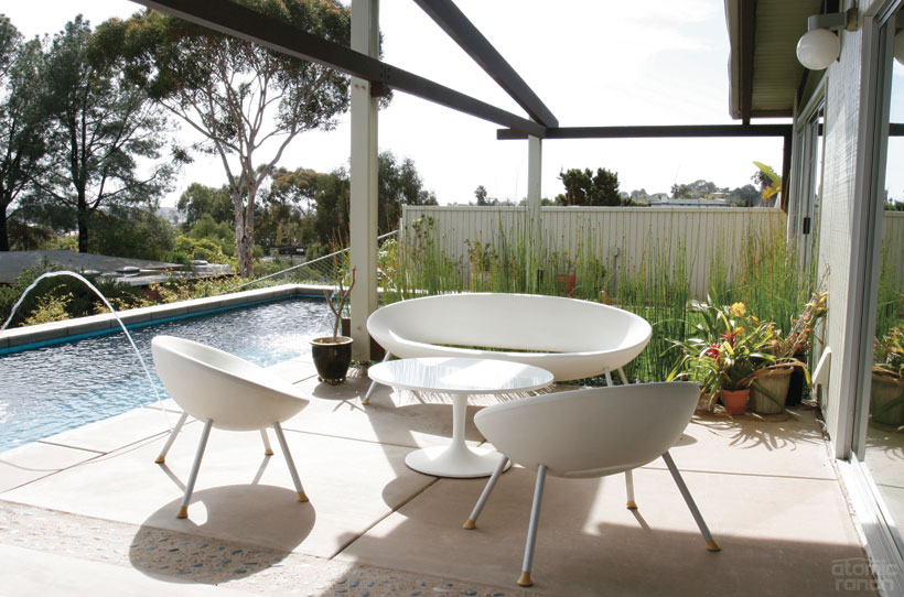
“It’s drummed into people what they should aspire to. If you’re not at all interested in design or architecture, you’re going to buy what’s being sold,” says Darren Bradley. “[Today’s housing] is like everything else—supersized—but a lot of people are going to come to realize that you don’t need a 5,000-square-foot house for two or three people and that it’s probably more trouble than it’s worth when you consider upkeep.
“When friends who live in those kinds of homes come see our place, they’re shocked when we tell them how small it is because it doesn’t feel that way. They’re amazed to hear the houses are 1,500 or 1,600 square feet; if you ask them to guess, they’ll say 2,500. If the home is designed well, you don’t need a lot of space. Well-designed spaces can serve multiple functions.
“We’re trying to get preservation status of some sort and enough of us to have critical mass when it comes to design directives,” Bradley continues. “But first, we want to build awareness for this community and style of architecture, to encourage other homeowners and people who appreciate the architecture to consider moving here.”

And of course, don’t forget to follow us on Instagram, Facebook and Pinterest for more Atomic Ranch articles and ideas!


