What happens when an interior designer turns her trained eye to her own Frank Lloyd Wright-inspired kitchen?
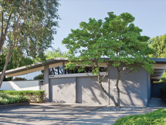
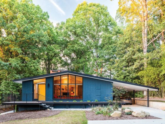
Having never lived in a mid century home before, when the Szidon family found themselves moving from the East Coast to the West Coast, they knew they wanted a change from their 1839 Greek Revival. A 1953 Lafayette, California, home—the work of Fred Langhorst, an apprentice of Frank Lloyd Wright no less—turned out to be the perfect antidote.
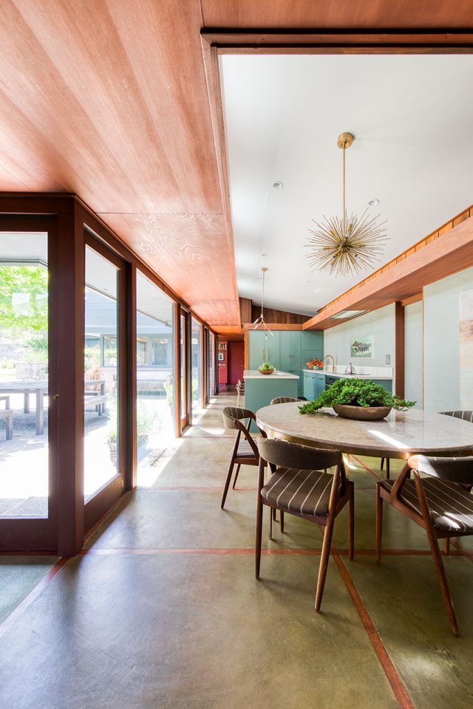
After living in the home for a year, Debra Szidon, founder of The Cass Clutch and Cocoon Home Design, along with her husband, Alex Szidon, father of three, tackled the not-so-small task of lovingly renovating their mid century kitchen.
A Designer’s Vision
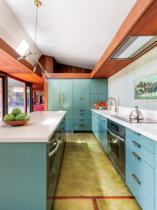
Functionality and aesthetics led Debra to renovate the kitchen. “The cabinets and counters were updated at some point but with little to no consideration for the original design,” says Debra, noting multiple counter heights as one of the culprits.
When the family moved in, the kitchen had its original footprint—a layout that was dark and confined, complete with upper cabinets and a typical 1950s dividing wall with a pass-through.
In planning for the new design, Debra’s main goal was to meet the needs of her modern family of five. This called for better utilizing the available space to create a larger, brighter kitchen with an oversized island. “The kitchen is literally the main entry to our home, and we wanted to blend it into the surrounding areas and with the exterior,” she says. “Floor-to-ceiling glass windows surround the kitchen, opening to a courtyard and garden. We wanted to blend the two.”
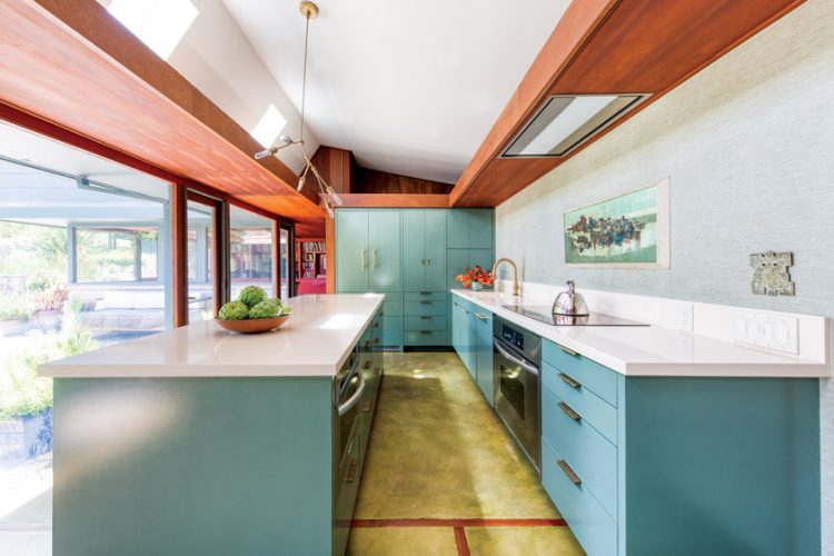
Given the home’s unique horseshoe floor plan and the kitchen’s starring role, Debra sought to “lessen the kitchen effect” and instead make the area feel like a welcoming living space. To that end, paneled appliances, few upper cabinets and wallpaper in place of a typical backsplash all play a huge role.
The Art of Balance
Despite wanting to make changes to the kitchen, Debra felt some elements were not up for debate—namely the home’s iconic valances and the original concrete radiant flooring, which were painstakingly restored.
One element that did change was the floorplan—or at least as much as the concrete floor allowed. Debra removed the dividing wall to connect the kitchen with the dining room. “I strongly believe in preserving original features as much as possible—as long as they work for the way we live,” she says. “In the case of our kitchen, it was cramped and not easy to use. By removing a wall, we made it functional for modern-day family living.”
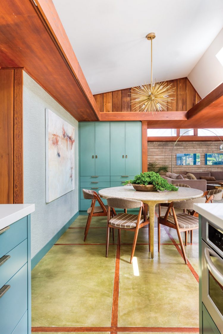
According to Debra, if you truly love mid century design and the time period, balancing authenticity with personalization comes naturally.
For the Love of Mod
To capture a mid century aesthetic while using new materials, Debra focused on the color palette and textures. She chose colors that work well with the redwood paneling, offsetting the material’s warmth, and added texture through hardware and wall treatments that speak to the brick details found in other parts of the house.
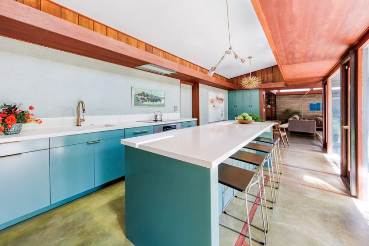
In the home she describes as “mid century modern with modern-day elegance,” Debra’s innovative kitchen design is a natural expression of the home’s already stunning aesthetic.
Want to craft the mid century kitchen of your dreams? Here are our favorite statement pieces guaranteed to turn up the heat!
And of course, don’t forget to follow us on Instagram, Facebook and Pinterest for more Atomic Ranch articles and ideas!






1 comment