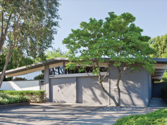
This 1960 raised ranch in Omaha, Nebraska, had vintage details and design potential. And it was just the thing that the clients of Andrea and Brian Kelly of AToM were looking to remodel. However, it didn’t have an open kitchen.
In the original layout, the kitchen was separated from the living and dining spaces. Working with an expert, Andrea and Brian came up with a solution that would deliver exactly what their clients wanted.

Open Kitchen Concept
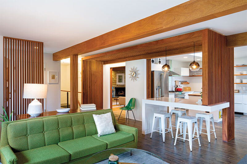
“The renovation included removing all interior walls between the kitchen, dining and living rooms. That included the central load-bearing support for the roof,” the Kellys say. “Along with our structural engineer, we proposed a solution to modify the stick framing above the ceiling plane. It would carry the load with new columns and beams, which would be wrapped in mahogany. We wanted it to become part of the focal piece of the space: the breakfast bar.”
The new mahogany columns, beams and accompanying slatwall structures contrast with the glossy white breakfast bar. The result provides a major “wow” look in the space.

“The high-gloss white surface floats on one end, suspended by the delicate mahogany slatwall screen,” the Kellys say. “The columns and beams disguise the new structure that is now supporting the roof. The wood slats create an enclosure around the bar that both allows and obscures views of the adjacent dining and living spaces, depending on your vantage point. On the opposite end, the slats mask visibility to the more private parts of the house.”
Beyond the breakfast bar is an open kitchen featuring a mixture of custom and prefab pieces. They provide the family with an abundance of storage and prep space, plus an array of display options for their vintage pieces.

Budget-Friendly Upgrades
“All of the base cabinets in the kitchen are from IKEA. This allowed us to manage the budget more effectively and focus on the custom components,” the Kellys say.
“However, as expected, the dimensions of the IKEA units didn’t exactly fit the space we had to work with. So, we used it as an opportunity to insert special moments, such as the wine rack in the island and the cookie sheet cabinet. Both these features have the same dimensions and pull your eye into the kitchen. Their punch of color breaks up the lower half of the island that is otherwise completely white. Additionally, the open shelves and cherry butcher block top for the island are custom features.”

Opening up the kitchen also brought a new brightness to the home, a touch the Kellys particularly appreciate. “While we are pleased with the whole of the design, we absolutely love the amount of light in the space, which gives it a new, vibrant life,” they say.
“When we restructured the roof framing, we allowed for a new skylight that is located directly above the center island. The skylight itself is quite small, but the opening in the ceiling plane mimics the size of the island below, and the white-painted drywall is tessellated to reflect light.”
Need more kitchen inspiration? Check out this 1959 California kitchen remodel.
And of course, don’t forget to follow us on Instagram, Facebook and Pinterest for more Atomic Ranch articles and ideas!


