I often find that, over the years, the intended “purpose” for many rooms and mid mod spaces has been changed or altered to meet the needs of the people that live there. Many times, the space is improved because it caters better to our lifestyles today, but other times, I find myself wondering “What were they thinking?” or “What was this once upon a time?”
It was those exact questions I found myself pondering while working on this 1956 mid mod home in Palm Springs. Directly off the kitchen, there was a small room that you had to walk through in order to get to the master bathroom. The space had three doors: One to the kitchen, one to the bedroom and one to the exterior… add in some oak cabinets, plus some beige granite and it was a cramped wannabe hallway with storage. I determined that the previous owners likely wanted more kitchen storage, so they made the space feel like a pantry, adding the cabinets to maximize their kitchen. However, as this was no longer necessary, we removed the cabinets to make the space feel open. In the process, I determined that, once upon a time, this space was intended for the laundry! This was far more logical than the current location outside on the patio with a plywood wall that blocked the view. Of course, we had already planned to relocate the laundry back inside the house, so this space wasn’t destined to be a laundry room again.

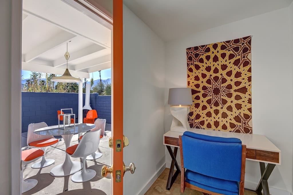
I changed my focus to improving the flow of the house, and this “room” was a huge factor. I hated feeling like the master bedroom was directly off of the kitchen so I made it my mission to change that. We removed the wall separating this space from the kitchen so that the space had one fewer door. The solid exterior door was replaced with a glass one to capitalize on the mountain views (which were now exposed once more after having removed the outdoor laundry). With one door eliminated and another made to feel like a window, the only door left led to the bedroom and that wasn’t going anywhere. I needed to create a space that was appropriate near a kitchen and a bedroom. An office was the perfect solution—it created a purpose, added function and demanded a focal point which this Midcentury Modern home was clearly lusting for.

A treasured wall tapestry from the Jonathan Adler sample room, given to me when I was an intern there, found its new home on the freshly painted white wall. The colors are eye catching the moment you walk in the front door, and the eye of the pattern almost seems to pull you from across the room. Anchored below is a Modern Desk with a reminiscent Midcentury white lacquer/wood finish. A funky white lamp from Z Gallerie and an authentic MCM blue desk chair that my sister saved from garbage in Wisconsin (she’s my hero) all came together to make this a smart space. Outside the new glass door, you have beautiful mountain views and ample natural light that makes the space feel more inviting. You no longer feel like you’re walking through the kitchen to get to the bedroom nor do you feel like you’re in a cramped hallway. Instead, the space flows together seamlessly and creates another functional and beautiful midcentury focal space in this home.
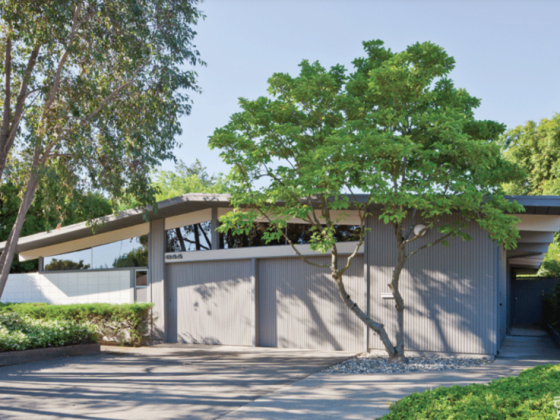
Interested in one of the items you see in the “after” photo? This curb appeal shot doesn’t have as many options, but if you can buy it, the direct links to purchase can be found in the resource list below.
Going to Palm Springs and want to rent this home? Email me at flippingdiaries@gmail.com for details!
See the rest of this home’s mid mod spaces at Modernism Week!
Want to tour this home and two other successfully renovated midcentury homes? Atomic Ranch is hosting a home tour during Palm Springs Modernism Week February 19 and 20. Tickets are selling fast, so be sure to secure yours today!
James Judge is a designer, flipper, blogger, future TV host and all-around house-a-holic. He strives to take ugly houses and make them into beautiful homes. He loves a collection of all styles but especially enjoys midcentury modern. James appreciates good design and thoughtful solutions to help get the look for less. To see more photos from this project and other transformations, check out James’s blog, Flipping Diaries, or follow him on Instagram or Twitter @flippingdiaries.
RESOURCES
Whalen Computer Desk
Tulip Style Table
Orange Tulip Style Chairs


