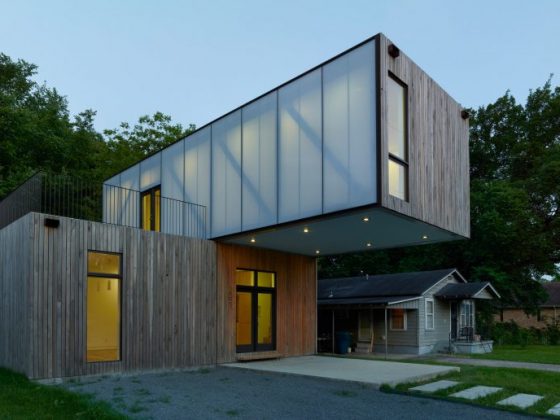
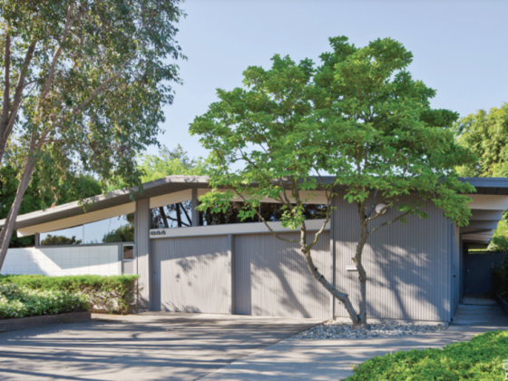
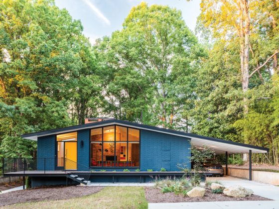
Many homes built during the midcentury have natural curb appeal. With the dramatic roof lines, clerestory windows and layered materials, it’s clear to most people when looking at a midcentury modern home what style it was meant to be. However, the same is often not true for ranch-style homes that sometimes seem like the ugly step-sister in comparison. Although many ranch homes share some similar qualities, they often lack midcentury curb appeal and don’t have a clear identity.
Over the years, many people have taken midcentury ranches and turned them into traditional-style homes. The unique interior or exterior details of the time are sometimes lost as the house was made more streamline. Sometimes this works for the house (gasp!), but oftentimes, it leaves the home feeling generic and void of character. As a flipper, these are two feelings that I avoid like the plague because, when it comes time to sell, you want the house to stand out and speak to people.
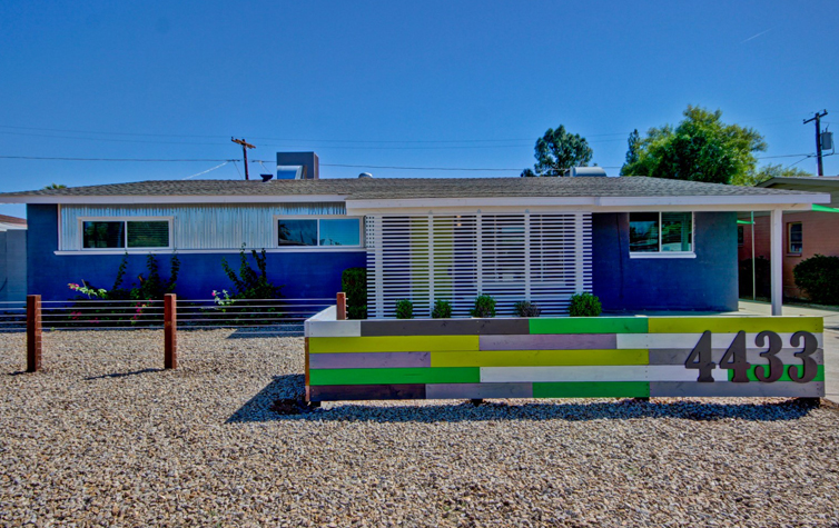
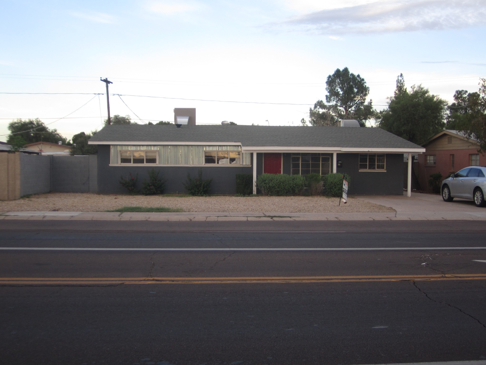
One of my favorite projects got a midcentury curb appeal overhaul. Built in 1952 and located in central Phoenix, Arizona, the odds were already stacked against it—it was on a busy street and surrounded by other identical houses … hello, 1950s tract homes! However, what stood out to me was the corrugated metal that added by a previous homeowner to replace the old siding that had separated the front windows once upon a time. I was inspired that someone recognized the modern potential of this home and I wanted to pick up where they left off.
First, we replaced all of the windows to improve the energy efficiency for the house as well as remove the traditional grid pattern and embrace a cleaner look. Many midcentury modern homes have an element of privacy, whether it’s with the orientation of the house or, many times, with a decorative barrier to allow you to see out while preventing outsiders from looking in. To capture this element, we nailed 1x2s to the front posts in a horizontal design leaving a 1-inch gap between each one. This helped to block the busy street from the large living room window, provide shade and, at night light, create a fantastic visual element as the outdoor light glows through the caps. This design is a low-cost solution and has become a “signature” look that I love to use on homes for function and style.
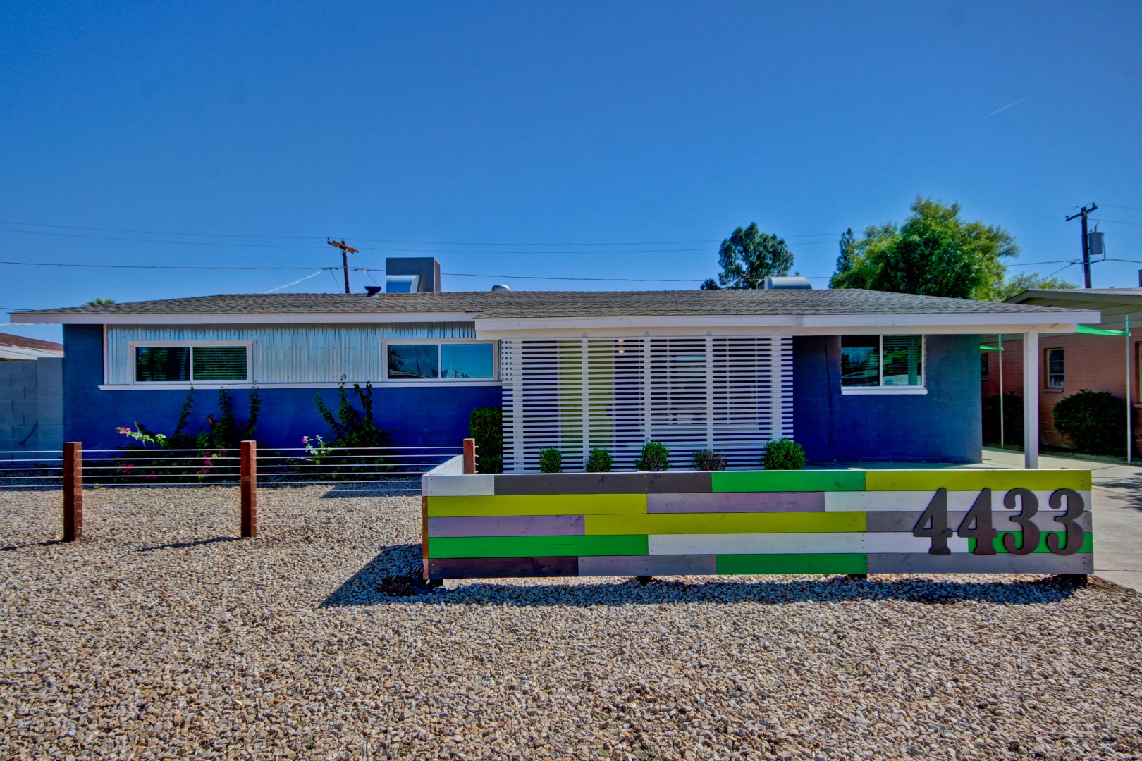
Many MCM homes also have staggered lines; however, with a ranch home, this characteristic is often missing. To make the home feel more modern, we created a front courtyard that could double as an extra parking space when needed. We mounted spare wood of various lengths in an L shape, extending 30-inches high directly in front of the new entry design. This created a layered look and gave the home the staggered lines it needed. To create a dramatic visual contrast, the boards were individually painted using all of the colors from the house. An exaggerated scale is a common element to many modern homes, and this patchwork of color became the perfect background to mount large address numbers. To develop these staggered lines further, we created the beginning of a recessed garden in front of the two high bedroom windows. Wood posts, connected by wire, were extended off the courtyard to create definition within the yard and provided the perfect location for future desert landscaping. A huge part of midcentury curb appeal is making sure the yard complements the house—oftentimes with mid mod homes, less is more!
James Judge is a designer, flipper, blogger, future TV host and all-around house-a-holic. He strives to take ugly houses and make them into beautiful homes. He loves a collection of all styles but especially enjoys midcentury modern. James appreciates good design and thoughtful solutions to help get the look for less. To see more photos from this project and other transformations, check out James’s blog, Flipping Diaries, or follow him on Instagram or Twitter @flippingdiaries.

