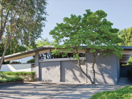
This 1950s house had gotten a complete “makeover” before it found its way into my hands. Everything original had been stripped by the previous flippers and “updated” with new generic fixtures and finishes. A lot of people love things that are new—even if what’s new is cheap and lacks character. However, I knew this house deserved more, so I set out on my mission to re-flip it.
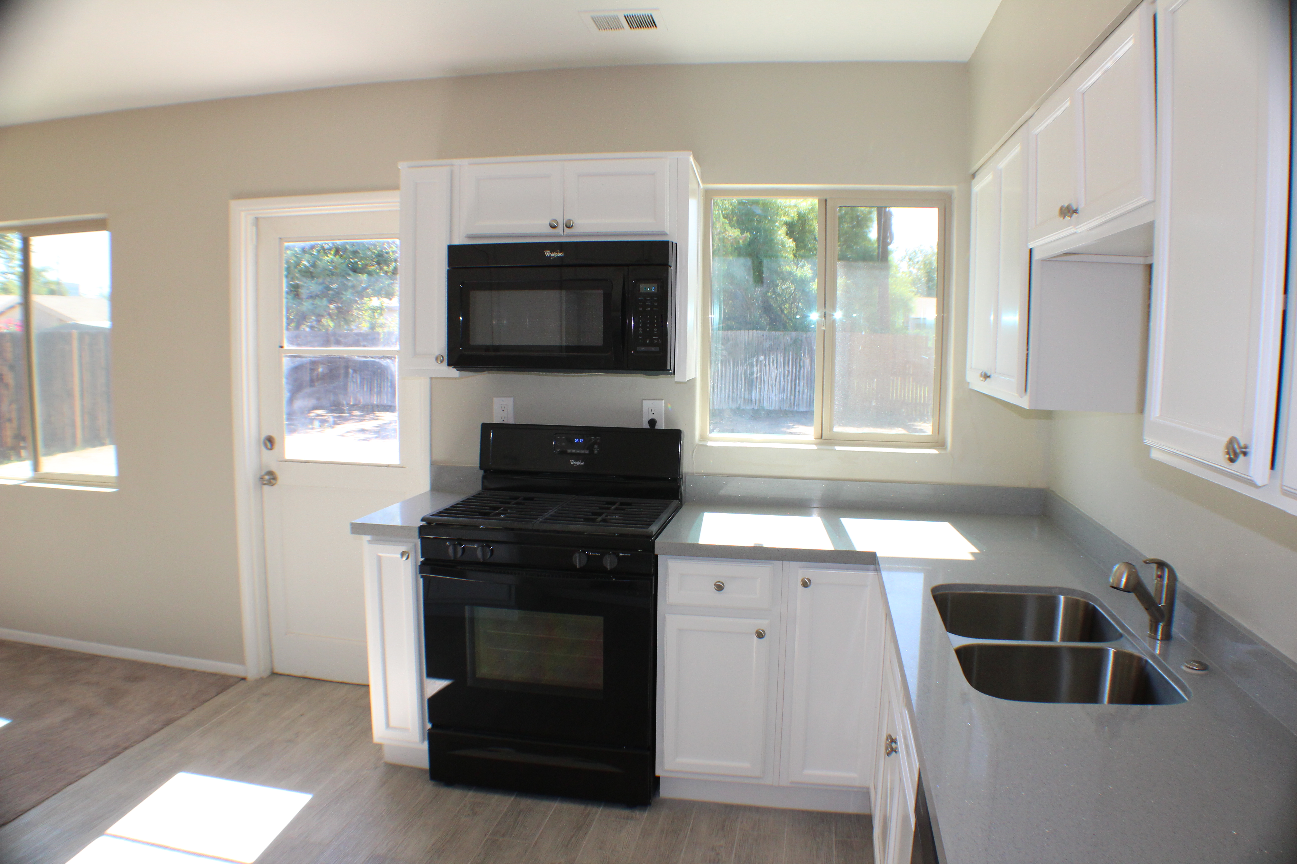
The kitchen was by far the most frustrating space: Basic Home Depot cabinets had been installed with simple black appliances, and boring cabinet hardware. The one exception to all this dullness was the beautiful quartz countertops, which were anything but generic. But I found myself asking, “Is this one exception enough to work with?”

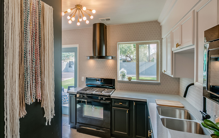
For the sake of reusing, I decided to keep most of the “new” kitchen that had been recently installed. To blend in with the basic black appliances, I painted the base cabinets a matte black. This created a streamline appearance on the bottom, and a rich contrast with the white cabinets up above. This was further enhanced by painting the soffit above the cabinets to match, creating the appearance that the cabinets extended to the ceiling, one of my favorite design tricks in any style.
At this point, you’re probably thinking: “That’s a fun trick, but where is the mid mod influence?”

To bring the 1950s back into this kitchen, we swapped out the boring cabinet hardware for fun brass cabinet pulls, and the generic kitchen light was replaced with a bright gold sputnik (thanks to a can of spray paint) that tightly hugs the ceiling. Previously, the cabinets and microwave above the stove felt awkward and cramped; we removed them and replaced them with a matte black exhaust hood. The resulting airiness helped to make the kitchen feel more spacious and highlighted the beautiful geometric backsplash.
The light grey hexagon tile was installed from the counter all the way up to the ceiling and around the door for visual interest. The back door was replaced and painted baby blue for needed pop of color! However, my favorite piece in this transformation is the vintage-inspired wall tapestry. In the process of my mission to re-flip, we decided to build in the refrigerator so it didn’t look like an afterthought, but we were left with a large black panel. The juxtaposition of the soft and colorful fibers against the crisp and color-blocked kitchen created the essential balance that the space needed.
Many people might look at this kitchen and say that it’s not strictly Midcentury Modern. They wouldn’t be wrong, but it does have reminiscent features that could qualify this as a version of new-age mid mod; something that we will likely see a lot more of in the upcoming years. The truth is that it’s very hard to make a new kitchen created of traditional materials and qualities look MCM without completely gutting it, but with the right changes and attention to detail, you can often achieve something better.
James Judge is a designer, flipper, blogger, future TV host and all-around house-a-holic. He strives to take ugly houses and make them into beautiful homes. He loves a collection of all styles but especially enjoys midcentury modern. James appreciates good design and thoughtful solutions to help get the look for less. To see more photos from this project and other transformations, check out James’s blog, Flipping Diaries, or follow him on Instagram or Twitter @flippingdiaries.
Resources
Tapestry, designed by Mandy Sue Johnson from the ‘Made and Found Boutique’ on Etsy
Backsplash Tile from Floor & Decor


