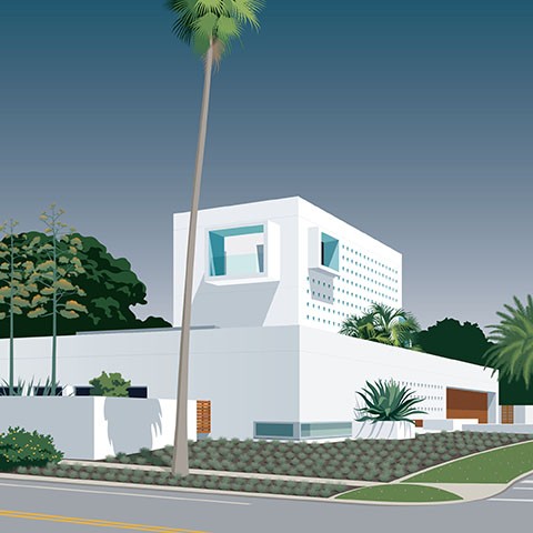
If you are not yet familiar with the name John Pirman, now is the time to take note! The artist and graphic designer specializes in translating the bold, graphic simplicity of MCM architecture to a bold, graphic simplicity in 2-dimensional artwork. You might have already come across his illustrations in Forbes, Vogue, The New York Times or The Wall Street Journal, and his art is regularly featured in publications local to his Sarasota, Florida home.

Similarly to the geometric lines and unadorned planes in MCM architecture, Pirman’s work also avoids ornamental detail. “When you subtract details from an image, you give it a kind of symbolic power. My designs are very architectural because they are based on geometry. I like to let what is in the image fuse with the background. For me, it’s about evoking a feeling more than representing a particular image,” says Pirman. While elements are clearly flattened in favor of simplicity of form, he uses the illusion of perspective to lend a sense of real dimension to his illustrations. All of the elements have their chance to shine.

Simple, yes, and no less bold because of it. The reason behind this is his use of color. When you look at Pirman’s work, you probably wouldn’t describe them as colorful, as he uses a limited palette in each image. As you scan over his work, however, you’ll notice bright hues and shadows, warm and cool tones, and contrasts that pop.
As someone who currently lives in an MCM paradise in Sarasota, Florida, Pirman is heavily influenced by the community and its artistic culture. He exhibits his work locally and his portfolio features many landmarks in the area. If you want to see more of his work, you can checkout his portfolio here.

