Pantone has thrown the design world for a loop with Ultra Violet- a rich and bold purple. A recent poll through our Instagram showed that an overwhelming number of Atomic Ranch readers aren’t fans of the pick—73% to be exact. That being said, the color does look pretty good on this sofa from Joybird.
Luckily for modernists, Pantone isn’t the only one who makes annual color predictions. The paint companies we all know and love have also deemed the hues they think 2018 will be known for. So how do these other Colors of the Year fare? Are they right for your Midcentury Modern home?
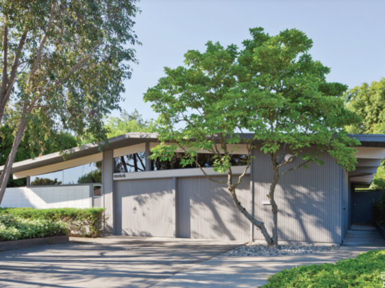
The Green Hour, by Dunn Edwards
Despite being inspired by “turn-of-the-century Paris, when 5 o’clock became known as ‘The Green Hour’ due to the popularity of absinthe,” this hue carries serious midcentury apropos. It’s deep blue-green carries a grey undertone—making it easy to pair with other colors and helping to make wood tones pop.
Tip: Not so sure about diving in with color? Try The Green Hour as an accent in your entry-way or dining room.
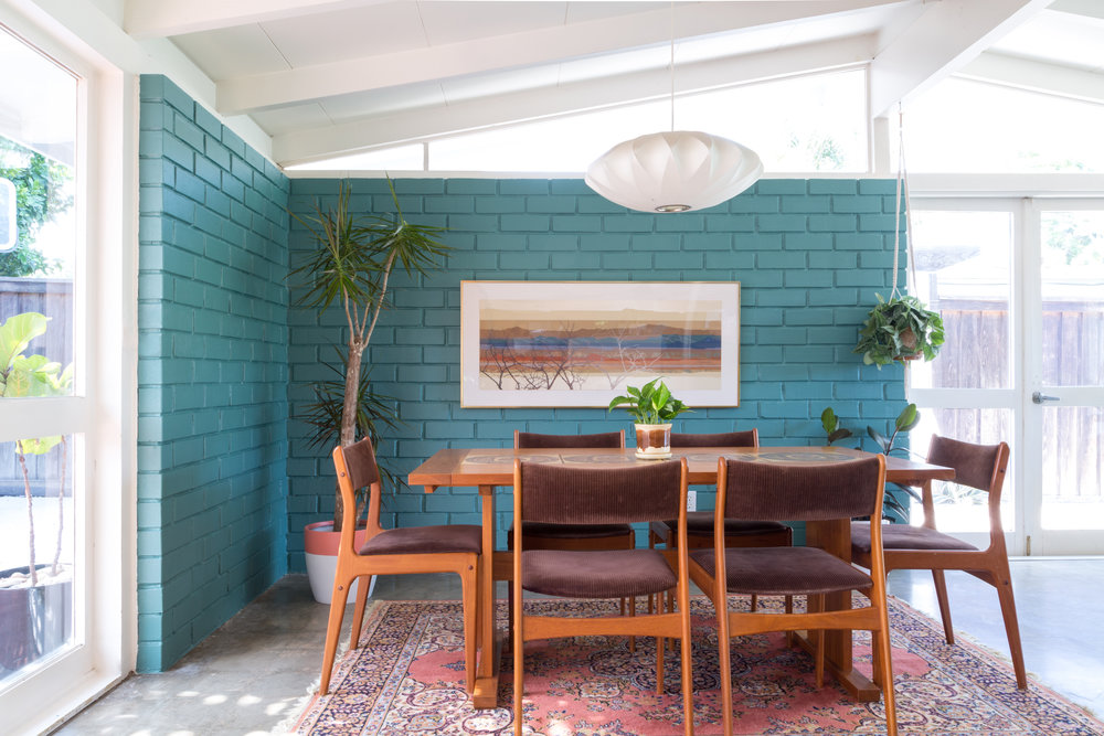
Deep Onyx, by Glidden
Another bold pick, Glidden chose Deep Onyx for 2018. The classic black may feel intimidating at first glance, but for modernists seeking simplicity or those who prefer metallic finishes and earthy hues, this striking selection may be just what you’re looking for.
Tip: Try Deep Onyx in a room with lots of windows and natural light. The contrast will create a modern backdrop for your midcentury furnishings.
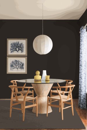
Caliente, by Benjamin Moore
Are white walls a thing of the past? Benjamin Moore also chose a bright hue—a deeply dynamic red. The Benjamin Moore website features several midcentury spaces with the paint color, so it seems the company had modernists in mind with the selection.
Tip: A color this vibrant is best for living spaces, so keep it to the dining or living room. It could also be a great pick for the front door!
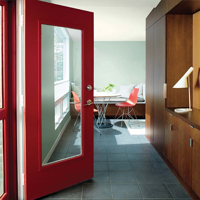
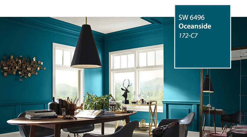
Oceanside, by Sherwin Williams
Described as, “a collision of rich blue with jewel-toned green, a color that is both accessible and elusive,” Oceanside is a gorgeous hue that, while similar, leans more on the blue side than Dunn Edward’s selection. “Oceanside is universal when it comes to design style from Midcentury Modern to Mediterranean-inspired, traditional to contemporary,” says the site.
Tip: This deep, rich color is ideal for creating a soothing environment—so give it a try in your bedroom.
At the end of the day, you know what colors are best for you, your family and your midcentury home. The lesson we can all draw from the 2018 colors is that bold is most definitely “in.” If the new year has you looking to refresh your living space, don’t be afraid to run with your biggest and boldest midcentury ideas.


