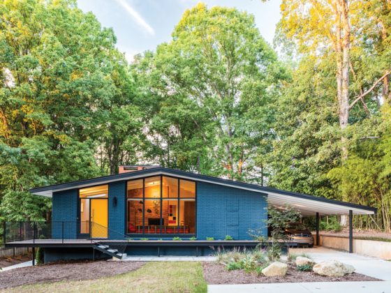
Renovations are common when purchasing a home built in the 1950s or ‘60s. When homeowners Debbra Palmer and Gina Centioli fell in love with their Mid Century Modern home in Boise, Idaho, they knew it needed updates. So, they hired Jessica Luque, principal designer and owner of Stussi Luque Design to complete a master suite renovation.

Functionality
When they first purchased the home, it appeared as though the master bedroom was originally two rooms that had been combined into one. This made it lengthy but without a lot of usable space, and there was no master bathroom. “The clients wanted a spacious master bedroom that would have lots of functional storage, while also allowing for a powder bath,” Jessica says. “They wanted changes to feel true to the period in which the home was built and speak to their personal minimalist tastes.”
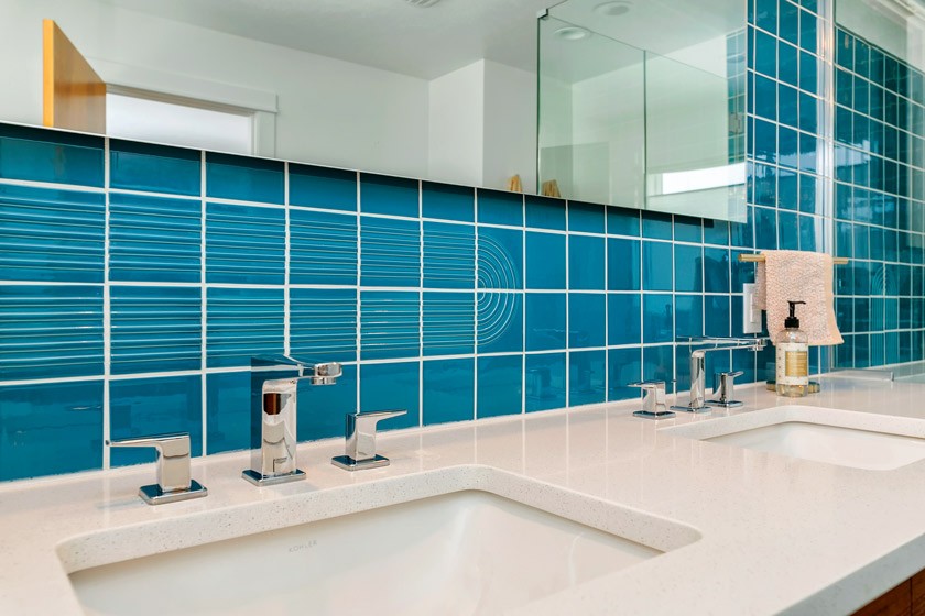
Jessica came up with a plan to use some of the extra space in the master bedroom. She wanted to create a new master bathroom while simultaneously giving the bedroom a much better flow. Plus, she could use some of the extra space for a new guest bathroom in the hallway.
“This was by far the most exciting part of the project for me to work on. We ripped everything down to the studs,” Jessica says. She drew the layout and elevations and selected all the finishes to create a stunning master bedroom and bathroom.
Colorful Updates
Now, a glorious full-tiled wall is the focal point of the new master bathroom. It anchors the vanity and shower together. Other highlights include a counter that seamlessly moves from the vanity into the shower as a ledge. There’s also a teak vanity by MonkeHaus and half-moon-shaped drawer pulls that add just the right amount of sparkle.
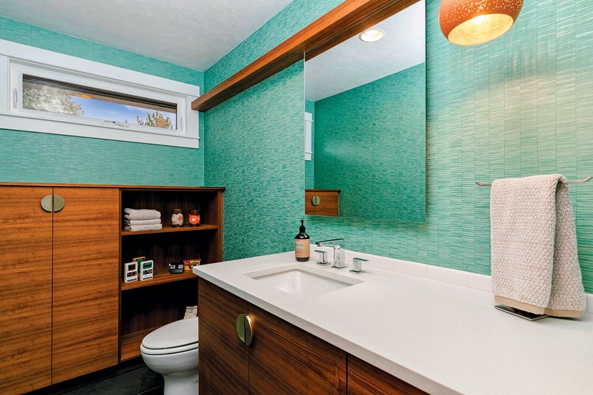
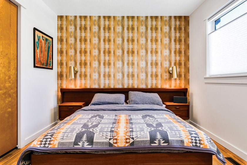
Anywhere that you can see into the master bathroom from the bedroom, you are treated to the sight of wallpaper reflecting off the bathroom mirror. “The two spaces are really married in that way and complement each other,” Jessica says. “The colors are pulled throughout both spaces in art and linen. I think the balance is playful and perfect between the two spaces.”
With her keen eye for design and love of Mid Century Modern design, Jessica was able to complete the modernist master suite renovation.
Budget-Minded
Master suite renovations can easily skyrocket in price, but Debbra and Gina focused on achieving their dream home within their budget. Here’s how they did it.
- Prioritize. “Within our budget, our priorities were to give the house a little curb appeal and to say goodbye to the 1990s DIY main bathroom,” Debbra says.
- Stay flexible. Certain upgrades were necessary, including new egress windows and wells. To accommodate them, Debbra and Gina put off other projects for later, like breeze block walls and a patio.
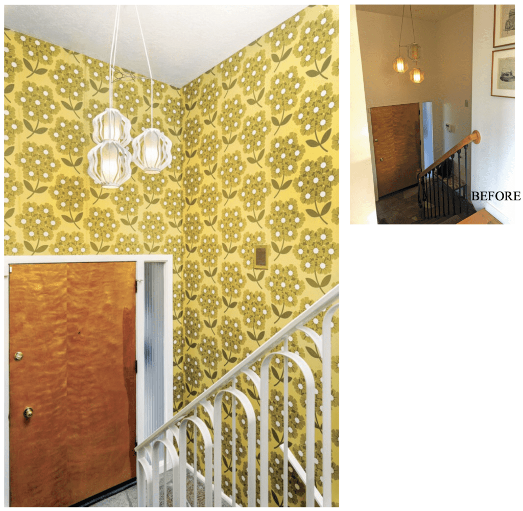
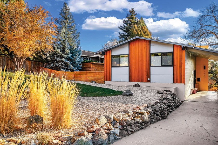
- Allow some splurges. Maintaining the home’s historic integrity was important. So, the couple splurged in some areas, including cedar accent siding, a custom-built iron railing in the entryway and the bathroom tile. “The results were great!” Debbra says.
- Get creative. The entry to the home features natural stone, and Jessica wanted to echo it in the master bathroom floor. “The wall tile was a splurge, so the floor tile needed to be more cost effective,” she says. “I ended up selecting a Home Depot stocked black slate tile that fit both the budget and the natural-element aspect.”
If you need another makeover fix, head over to the Fullerton Forever kitchen and bathroom renovation.
Of course, don’t forget to follow us on Instagram, Facebook and Pinterest for more Mid Century Modern inspiration!


