How to design a small MCM space that delivers memorable moments.
We demand a lot of our (often small) MCM kitchens. They should be sleek yet serviceable, ample yet organized and, of course, reflect your personal style. So how do you balance it all? Interior designer Christine Turknett says it’s all about unifying your elements and, like any other room, choosing your focal point.
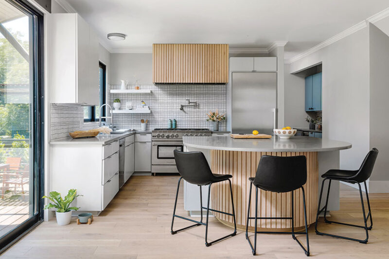
“When designing an MCM kitchen, I focus on mixing clean lines with warm tones and color palette,” she says. “The combination between the colors and the motifs in the space tie it together and gives the kitchen a distinct identity that reflects your style.”

Building on a motif is a great way to concept a unified design—even for design novices. “For example, the backsplash may contain colors and shapes that I try to mimic in the tone and shape of the hardware and appliances,” Christine explains. “If there is a white penny-tile backsplash, then I try to mix in a contrasting metallic color, such as round brass knobs and appliance pulls.”
Designing for Small Kitchens
It’s an extra challenge to fit all your requirements when working with a small kitchen footprint. The key here, Christine says, is to keep an eye on editing. “Select one bold design element and balance it out with neutral details to create a focal point—either lighting, backsplash or cabinet color, but not all three,” she says. “Lean toward lighter cabinets, flooring and countertops” as darker tones can make the space feel small and enclosed. And don’t underestimate the details. Christine likes to select knobs or smaller pulls with unique features that imbue the space with depth and personality.


Maximal Function in a Simple Space
Christine says a small, streamlined kitchen can take on heavy-duty tasks just as well as larger spaces. In addition to selecting smaller appliances, you can hide appliances like microwaves in lower cabinets to create cleaner sight lines. “Opt for open shelving if that’s functional for your lifestyle and consider drawers over cabinets,” she suggests.
Another option is to lean on movable workhorses. “Adding a small portable kitchen island can be one way to get the task space you need without permanently forfeiting the space,” Christine says. “But be sure to measure beforehand for clearance around the island, which should be at between 36 to 42 inches for it to be truly functional.”


Clear Your Countertops
Christine’s favorite ways to simplify your small MCM kitchen style without sacrificing functionality.
- Use a wall magnet for basic items, like knives.
- Store your spices in a drawer.
- Use a pegboard or simple metal bar on less prominent walls for infrequently used pots/pans.
- Pour frequently used cooking oils into attractive small labeled dispensers next to the stove.
- Save counter space for fun appliances, such as colorful toasters or coffee makers.

The Keys to a Small but Stylish MCM Kitchen
Christine’s recipe for a stylish meal prep space.
Clean lines
Think flat-panel or slim Shaker cabinets. Keep your drawer and cabinet hardware simple and minimal—or lose them completely with a notched cabinet design or one with a lip. Think about your countertops for clean lines too, through eased or flat countertop edges. And avoid busy countertop materials such as granite. Last but not least, incorporate plumbing fixtures such as sinks and faucets with sharp angles.
Warm tones
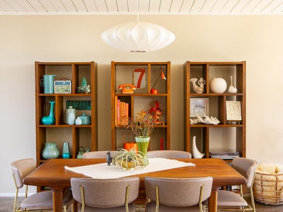
Walnut, teak, mahogany. These wood tones are ubiquitous in MCM design. Replicate the vibe with similar warm tones through wood or hardware.
Vintage-inspired backsplashes
Look for shapes, colors and patterns like round Penny tile or geometric tiles in classic shapes like square, rectangle or semi-
circle. Less conventional subway-tile patterns such as basketweave, horizontal or vertical stack will work as well. You can also create great mod style with 3D rectangular or square tiles.
Lighting is key
Mid Century Modern sconces and pendants deliver instant mod style. Shop MCM lighting options here.
When in doubt, less is more.
Looking for more small MCM kitchen organization advice? Don’t miss MCM Kitchen Storage Organization. To see more of Christine’s work, check out Project House Austin. And of course, don’t forget to follow us on Instagram, Facebook, Pinterest and YouTube for more Atomic Ranch articles, house tours, and ideas!


