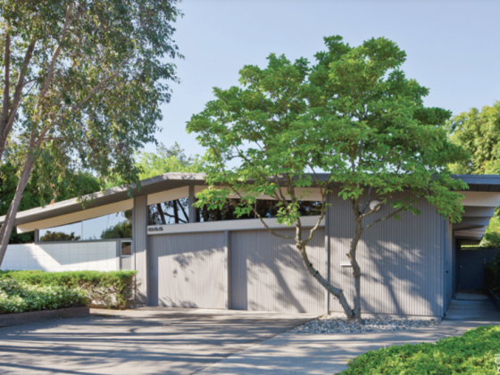
As much as midcentury design exudes color, there’s a cozy neutral look that thrived in the ’50s and ’60s. From beautiful wood pieces to natural wood-grain wall panels, midcentury modernists were down for brown. So when Ed and Neil wanted to leave their city loft behind for something closer to nature, they pounced on this home designed by Philip Esbensen. But when your home is natural and neutral, how do you balance that look in your furniture? Read on to find out how Ed and Neil used Joybird Furniture to make their midcentury home a masterpiece.
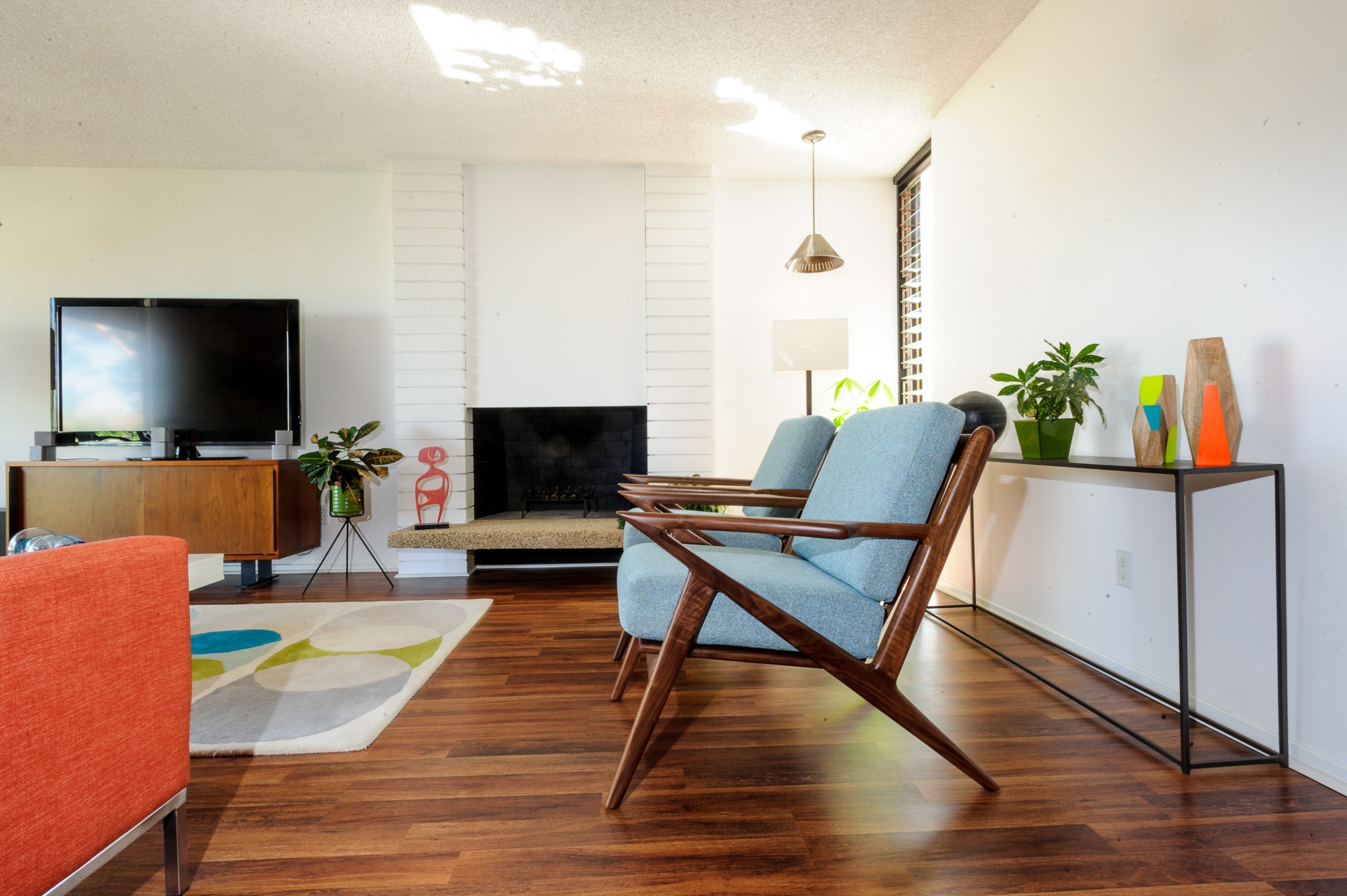
How Did You Approach the Interior Design?
Neil: It was important to us not to interrupt the architectural integrity of the home—the post and beams, the sliding doors, the original tilework—so we chose materials that would have been available during that time period.
Ed: When we first moved in everything was beige. The walls were beige, the floors were beige and we wanted more of a cheerful environment. Over the first weekend we came in and painted the entire house white and the objective was to fill it with color.
Neil: We knew what we liked and we simply began filling our home with good design and things we wanted to live with.
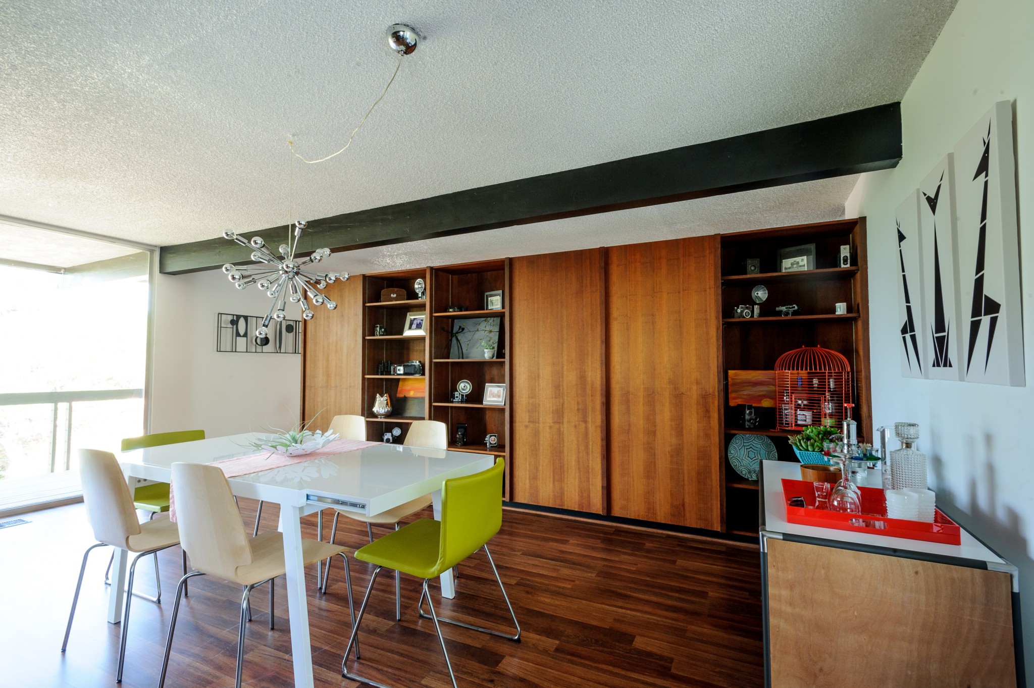
How Has Living in a Mid-century Home Inspired You?

What’s Your Favorite Space in Your Home?
Neil: I would have to say it’s whatever room I am currently in. To keep things fun we often switch decor items and furniture around… and then wait for the other to notice or say something!
Ed: Everyone loves the sunken bathtub in the guest bathroom. What I like is the home office, because it has all of the photographs and blueprints that the architect gave to us hanging on the wall. For me it completely brings the house together, because you get to see what it used to look like and that it still is that.
What about the spaces gives Ed and Neil a zen atmosphere? What kind of pieces are the building blocks for their nature-loving home? Read the rest of the story to find out and see more incredible rooms of this beautiful home.

