Focus on Function.
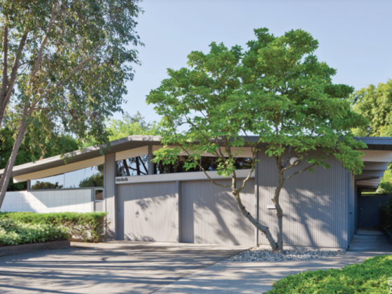
One of the basics of MCM design is usability. Caitlin and Tim Medeiros fell in love with this California home the moment they pulled up to the curb. Yet when they toured the house, they realized the previous owners didn’t know how to use the space. They had made terrible furniture placement choices that made parts of the midcentury architecture unusable or hidden. “They had a wall unit in front of a window and you couldn’t even use the French doors,” Caitlin says. “They didn’t understand the house at all.”
Make sure your furniture fits the space—not just aesthetically, but physically. Don’t block windows, keep hallways free of bookshelves that will cause traffic jams and choose a dining table that doesn’t crowd the kitchen. If your home is functional, you’ll be able to enjoy it better.
Keep Things Simple.
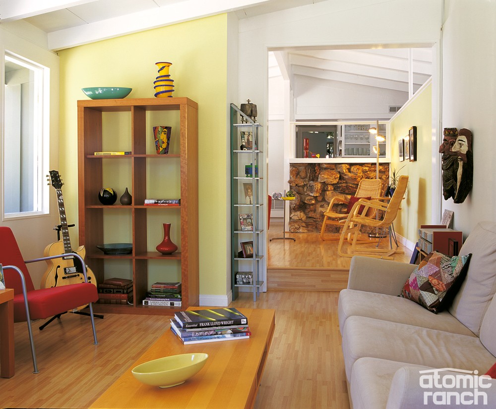
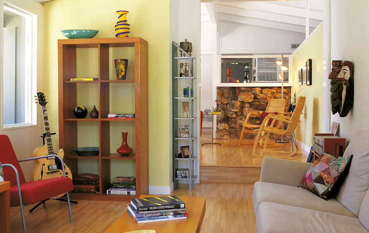
Simplicity goes hand-in-hand with function when it comes to midcentury basics. The walls and floor are a good indicator of this. How much of the walls and floor can you see? Take a close look at the Medeiros’ living room—no floral-patterned rugs inhibit the floor, and the wall hangings stay simple and clean.
This doesn’t mean that you can’t display knickknacks and small accessories. Just keep them confined to their own areas and don’t crowd too many objects at once. If you have space in a bookshelf to display a few vases, highlight them by including one object in each space, instead of trying jam in multiple pieces.
Add Color.
While midcentury style stresses simplicity and a lack of clutter, it doesn’t downplay color. Add bright pops of vibrant hues with a bright orange sling chair or lime green sota chair. If you want to stay neutral with your major furniture pieces, paint an accent wall in a bright shade, or add color through smaller accents such as a TV stand or sheets on your bed. Just remember that simplicity trumps color—so only add pieces if they’ll contribute to your overall MCM aesthetic.


