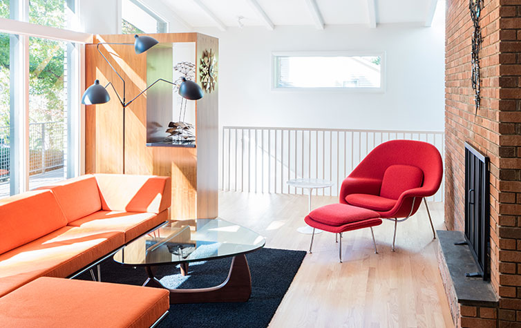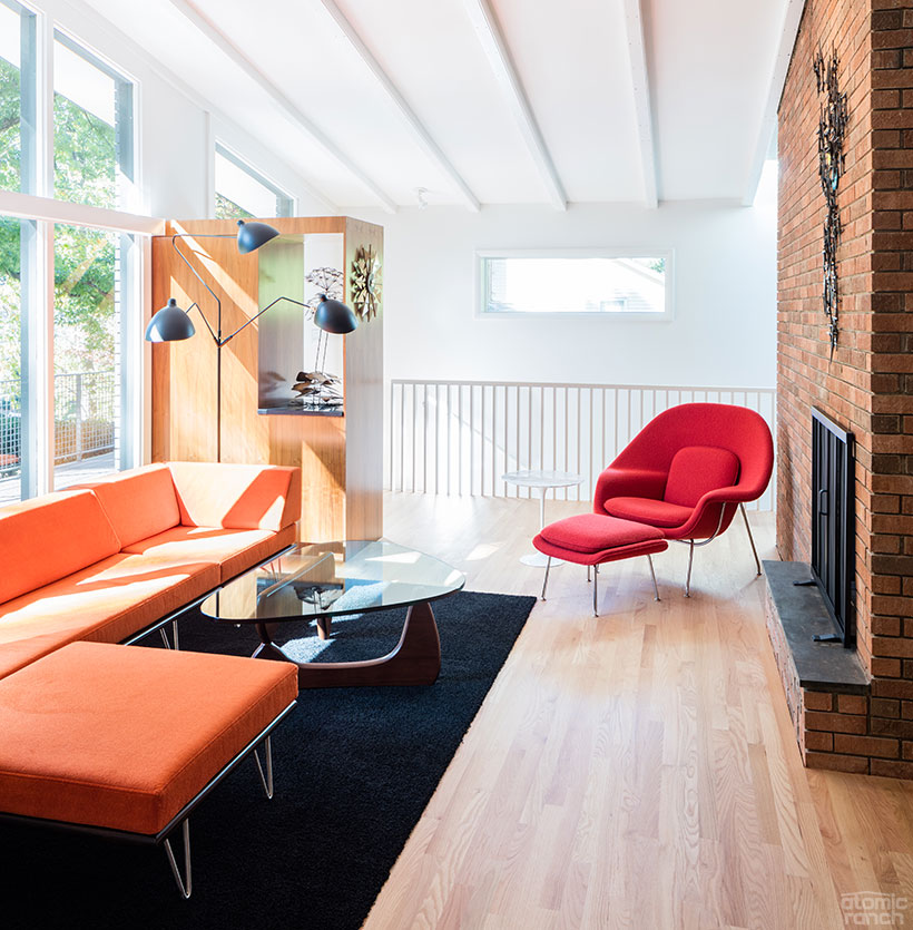
There’s nothing cleaner than a room where all the pieces fit together. The style, the color, the lines—everything gels into one classic, cohesive space. And this living room from a home in Raleigh, North Carolina, has us staring at its beautiful combination of iconic pieces and crisp silhouettes. Maybe that’s why we picked it for our 2017 Design Issue—you’ll have to grab a copy yourself to find out. In the meantime, check out the essential pieces of this space and get the look for yourself.
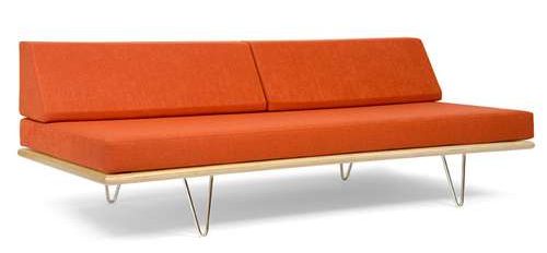
CaseStudy V-Leg Daybed
With endless options of sectional, chaise and arms, it’s no wonder this sofa makes a great starting place for building a room. As in the name, Modernica’s CaseStudy series is inspired by the famed Case Study homes from the midcentury—and that inspiration shows. The clean lines and low profile make this sofa recede into the room while the pop of the orange upholstery keeps it a true statement. As with many pieces from the era, this sofa is a pretty low profile, which gives it that relaxed, conversational feel. It also means it’s a good choice when pairing with period designs that have a similar height to them.
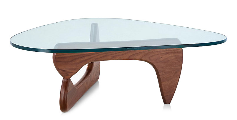
Noguchi Table
Arguably one of the most recognizable pieces from the pantheon of midcentury design, this humble yet beautiful coffee table designed by Isamu Noguchi is an icon among era living rooms. The design is sleek and stylish without being overbearing. The materials are everything we love among the designs of the period, and it’s delightfully utilitarian (glass tabletops, anyone?). The Noguchi table makes a perfect addition to any high-design living room, a perfect complement to your other pieces without hogging all the attention. There’s a reason you see this table everywhere—its versatility is second to none.
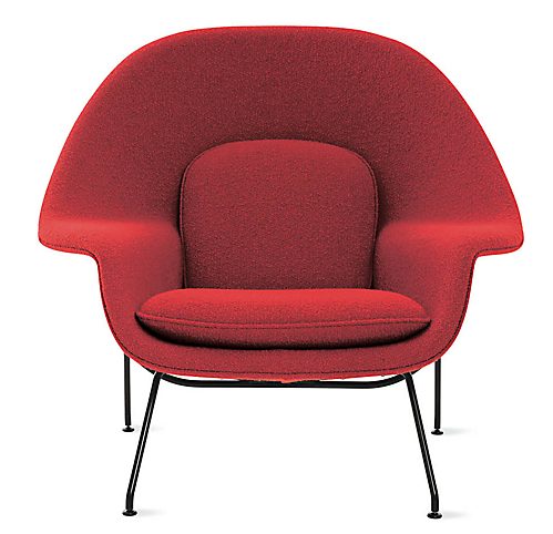
When designing a Midcentury Modern living room, you can’t really escape the name Eero Saarinen—nor would we want to! It’s no real surprise that Atomic Ranch is a fan of the womb chair, but putting our personal favorites aside, there’s something so eye-catching about this design. Its roundness, its narrow legs, its broad shoulders—and if you’ve never sat it one, you’re missing out. In this room, we love how well the red upholstery blends with the other colors in the room, from the warm tones of the brick fireplace to the orange fabric of the sofa. It’s a warmth that simply pops in the sun-drenched white bones of the space.
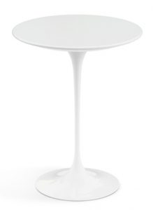
When you want a side table to set your martini on but you don’t want it to steal the thunder of the amazing pieces around it, the simpler the better. Another iconic Saarinen design, the pedestal table is often paired with Saarinen’s other pedestal pieces, particularly the tulip chair. While we certainly like that look, there’s something refreshing about pairing the simple pedestal side table with the striking womb chair, a move that still works well because, well, Saarinen is Saarinen.
Holstebro Floor Lamp
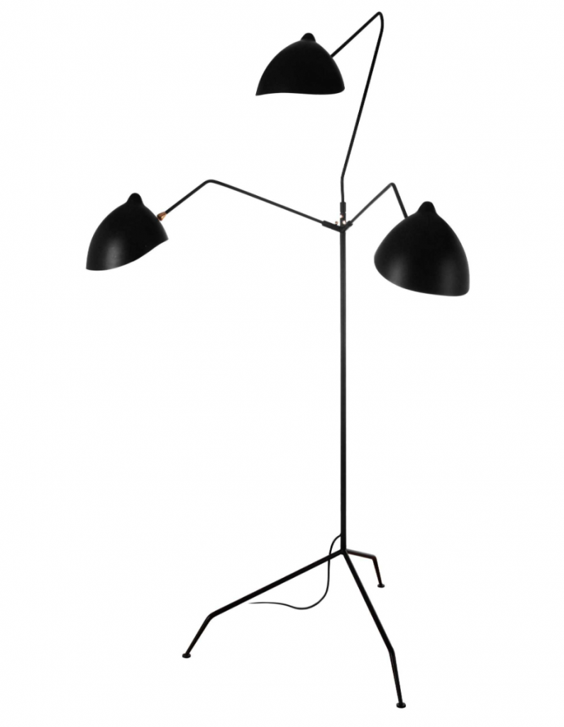
Nothing beats a basic piece with character, and this lamp from Silnovo is exactly that. Black is never a bad color for things you want to fade into the background. And while it doesn’t dominate the area, the Holstebro lamp lends its modern style to the space. Though we love the arc lamp as much as the next modernist, practically speaking, it doesn’t shed too much light around the room—plus, if you’ve ever knocked your head on the beautiful yet low-hanging lamps, join the club. As far as lamps go, the Holstebro gives you the interest of something like an arc lamp but offers you the ability to redirect light in a more practical way. Plus, it doesn’t hurt that the black tubing and feet are reminiscent of the womb chair nearby, either.
Love designing with icons? Well, it’s time to get iconic.
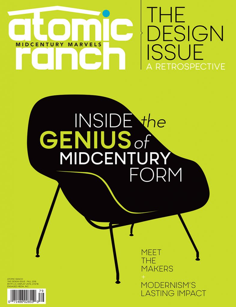
The Design Issue: A Retrospective gives you an in-depth look into the genius behind midcentury architecture and furniture design. Meet the makers that built the look of modernism and get acquainted with current influencers, thought leaders and adopters. Get your copy today at your local bookstore or newsstand, or order it here.

