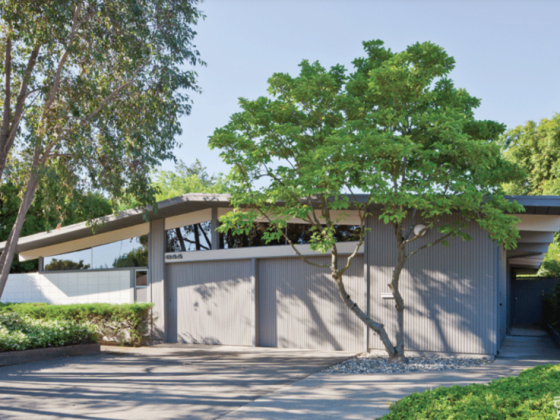
The Streng Bros. were a staple of midcentury architecture, playing with space and floor plan like few architects at the time (Part 1). But throughout the years, various homeowners and tendencies toward trendy design turned a beautiful home with a classic kitchen into a modernist nightmare.
This Streng home was carpeted throughout and had cottage cheese ceilings and countrified decor when homeowners Paul Torrigino and Richard Gutierrez bought it. On the plus side, previous owners had pushed out the back of the family room in an architecturally appropriate manner, and with the sellers living elsewhere part of the year, the house had been lightly used. Gutierrez designed the daisy motif in the living room and picked the perky colors for the renovation.
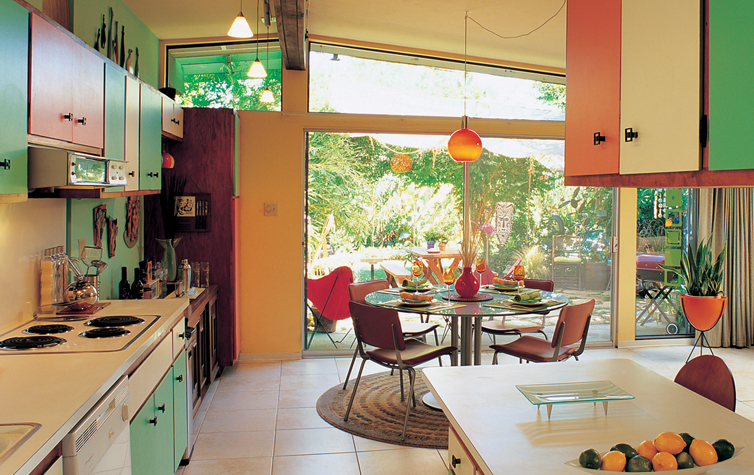
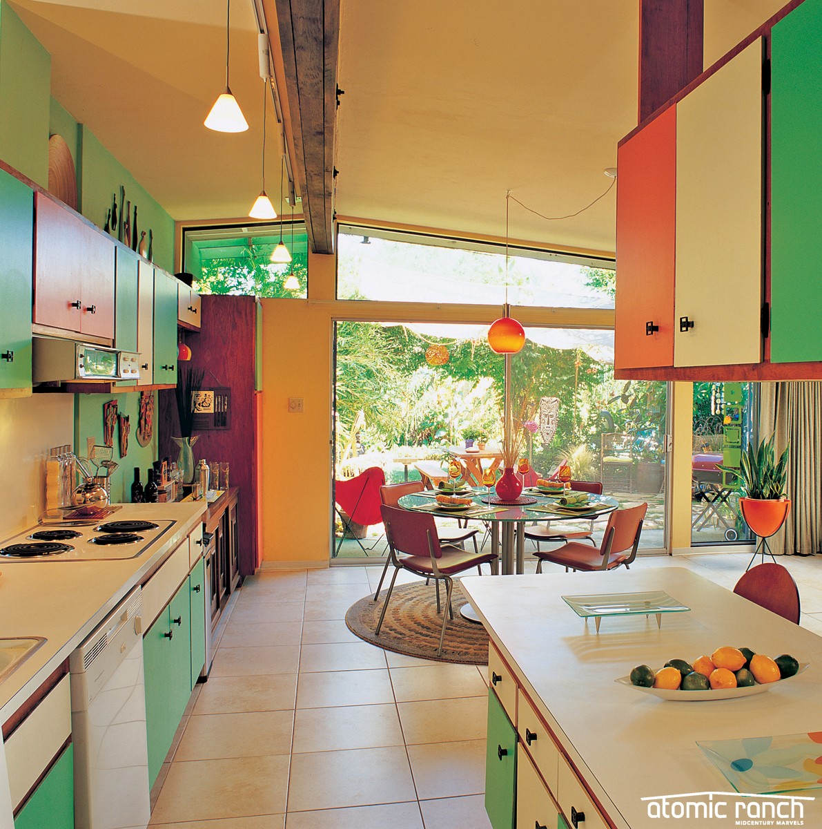
The classic kitchen that prompted the purchase still has its original GE appliances and a “flying coffin” suspended cabinet similar to those found in Eichlers. “When we first saw the low counter [between the kitchen and family room] we thought we would build it up. But we do breakfast buffets and martini parties; it’s perfect for that,” Torrigino says. “Most people have remodeled their kitchens in this neighborhood, and they all have waist-high tile or granite counters; I’m glad we didn’t alter ours right away.”
“I saw a picture of Bill Streng at his house in Davis, and he has the same counter in his own kitchen,” Gutierrez adds.
The pair sanded the dark brown cabinet bodies and refinished with a cherry stain, then painted the doors green and orange, but “it looked like a pack of Wrigley’s spearmint gum,” Torrigino admits. The addition of a few white doors worked to soften the look.
With the bones of the home revitalized to its former midcentury glory, all the homeowners needed were the finished touches: furnishings, art and a little bit of kitsch. Check back for Part 3 of this house tour to find out what amazing pieces grace this amazing space.

