If you want to start a lively architectural debate, bring up brutalist architecture or brutalism. Defined by blocky concrete forms with exposed utilities and creative use of both symmetrical and asymmetrical elements, brutalist buildings divide people. Some love them while others despise them. What you won’t find are a lot of folks who don’t have strong opinions.
There are a lot of misconceptions surrounding brutalism, however. Many people can correctly identify brutalist architecture when they see it, but they do not know its history, nor do they understand the intentions underlying the choices of forms and materials. This post will clear up some of those misconceptions and address common charges against brutalism.
Misconception 1: Brutalist Architecture is “Brutal”
First of all, even the name “brutalism” is often misunderstood. You might think it literally refers to the style having a “brutal” look and feel. But actually, Swiss-French architect Le Corbusier coined the term. It comes from the phrase “’beton brut.” That is simply French for “raw concrete.”
Misconception 2: Brutalism is Authoritarian

Some of the dislike for brutalist architecture comes from a mental association between this style and authoritarian regimes.
This is not entirely off-base; brutalism was popular in the Soviet Union. But communist governments certainly were not the only ones who embraced brutalism. After World War II, brutalist architecture became popular throughout Europe, especially in Britain.
Actually, brutalism can espouse democratic or democratic socialist ideals as easily as it can socialist ideals.
Indeed, even non-socialist countries have chosen brutalism to convey their messages architecturally. Take the Robert C. Weaver Federal Building by Marcel Breuer (pictured above). This structure was chosen to “reflect the dignity, enterprise, vigor and stability of the American National Government” in accordance with the Guiding Principles for Federal Architecture.
Misconception 3: Brutalism is Dehumanizing

A common charge against brutalism is that the massive scale of the structures and the gray concrete dehumanizes individuals. But actually, the goals of brutalism could not be more opposite that.
During the post-war period, there were housing shortages. In Europe and Eastern Europe, socialist and non-socialist countries alike flocked to brutalism to build affordable housing. This was part of a push to create more egalitarian societies where peoples’ basic needs would be met and their dignity respected.
These goals have played a role in the selection of brutalist design for public buildings too. In the image above, you see Paul Rudolph’s Boston Government Service Center. Rudolph picked this style because he felt it was more personal and imaginative than the International Style, which was in its heyday. Every design choice he made was to reinforce the worth of the individual, to inspire, and to offer “space for the subconscious.”
Misconception 4: Brutalism is Uninviting

Some people allege that brutalism is uninviting, putting up massive concrete walls to shut passersby out. But many brutalist structures were built specifically to invite people in.
Take the example of the famous Boston City Hall by Michael McKinnell and Gerhard Kallmann. Architecture professor Mark Pasnik explained, “So many people call these buildings Stalinist, but nothing could be further from the truth … Kallmann, McKinnell, and Knowles did have an idea that this would be a very democratic building. They saw it as open. There’s very large columns that allow you to enter into the building in multiple ways. It doesn’t work like that anymore, but that was the original idea of that.”
Misconception 5: Brutalism is Cumbersome, Blocky and “Ugly”
Finally, some people criticize brutalism for purely aesthetic reasons—but I would argue that they are overlooking the nuanced realities of brutalist architecture.

Yes, brutalism can look heavy and blocky. But as this image of the Herbert F. Johnson Museum of Art by I. M. Pei shows, brutalist architects can also achieve spectacular lightness. With its high cantilever and huge “window” below, this structure appears marvelously lightweight, even with its massive concrete forms.

As to claims that brutalism looks too “blocky” or “clunky,” take a look at the brutalist skyscraper at 33 Thomas Street. The lines are so sleek and elegant that it might put you in mind of Art Deco. Clunky is the last thing it is.
Now you have a different perspective on brutalist architecture. While it is commonly associated with authoritarianism and seen as dehumanizing, it was developed in accordance with egalitarian ideals. If anything, humanity is at the heart of brutalism.
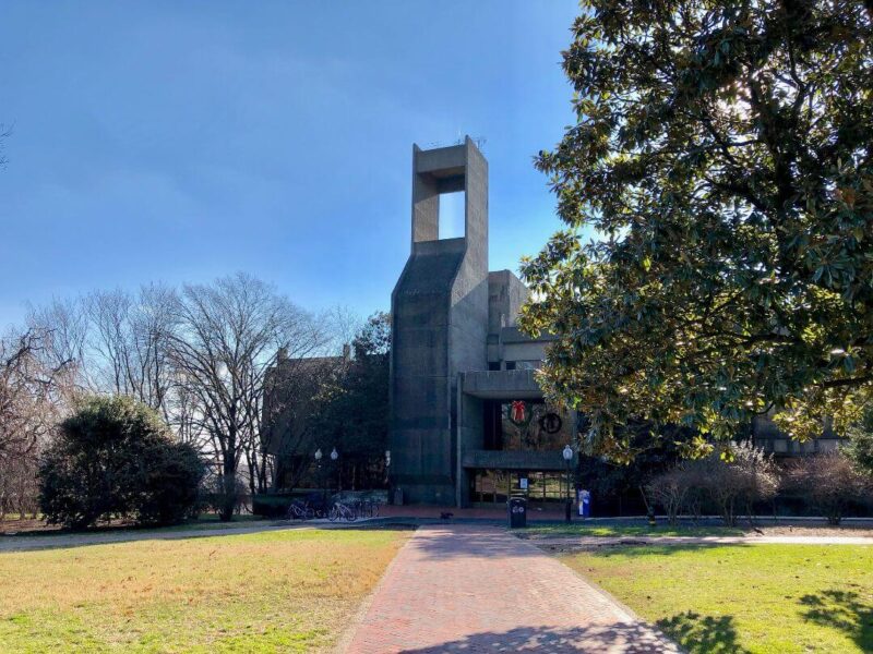
If you enjoyed this post, you also may also like Lauinger Library: A Brutalist Take On Romanesque Design (the building in the featured image in this post). And of course, don’t forget to follow us on Instagram, Facebook and Pinterest for more Mid Century Modern inspiration!


