Any fan of Mid Century Modern architecture and design is familiar with the German art school Bauhaus, which existed from 1919 until 1933. Some famous Mid Century Modern architects associated with Bauhaus include its founder, Walter Gropius, as well as Ludwig Mies van der Rohe, Marcel Breuer, and others.
The influence of Bauhaus is all around us, but you may not be sure how to recognize it. This post will serve as a field guide.
Is Bauhaus a Style?
First of all, let’s clear up a common misconception. There is no one distinct “Bauhaus style.” Bauhaus is more properly termed a “school” or a “movement” in architecture and design.
The Bauhaus approach was one of holistic design, bringing together architecture and other forms of design. It was intended to be simple, functional, and affordable, making use of the latest technology. The emphasis on industrial materials and processes ensured that ordinary consumers with modest budgets could enjoy Bauhaus buildings and objects.
Since Bauhaus is a movement, calling a building “Bauhaus” is a bit broad. We could mean it was designed by a Bauhaus architect during the school’s existence, or after. Or we might just mean it shows Bauhaus principles at work. In fact, those principles have become so ubiquitous in contemporary and modern design that Bauhaus often just seems to “blend in” to the scenery for a lot of people. Let’s take a look at those principles now.
1. Clean, simple lines

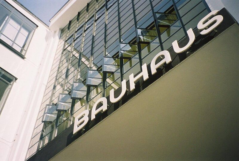
Bauhaus architecture is simple, with clean lines. The Bauhaus building in Dessau pictured above only showcases straight lines. But graceful, regular curves are also common in Bauhaus buildings (the typography on the Dessau building showcases those types of lines).
2. Truth to materials
A variety of materials may be used in Bauhaus buildings. But steel, concrete and glass are generally present in copious amounts. A principle called “truth to materials” is part of the Bauhaus philosophy. What it means is that instead of attempting to conceal a material’s “truth”, it is preferable to use it in its original form (i.e. raw concrete).
3. Geometric forms

Bold geometric shapes and forms are a key component in Bauhaus buildings. Squares, rectangles, triangles and circles may all figure prominently in structures.
The prominent use of geometric shapes in Bauhaus architecture and design reflects the holistic principles of the school. Russian painter and art theorist Wassily Wassilyevich Kandinsky, for example, taught Bauhaus artists and designers about the use of geometric shapes (as well as primary colors).
4. Asymmetry
Bauhaus buildings commonly feature some design elements that are asymmetrical in their layouts.
It is important to understand asymmetric does not mean “out of balance.” Although Bauhaus structures feature asymmetry, their architects worked hard to ensure that they felt balanced and maintained continuity of materials, colors and styles throughout.
5. Glass curtain walls

Glass curtain walls are another feature that Bauhaus designers helped to bring into the mainstream. They would become a prominent part of modernist architecture during the mid century period, particularly in the International Style.
6. Flat roofs
The most common roof profile for a Bauhaus building is one that is flat. From a functional standpoint, flat roofs have some drawbacks. They do not offer great drainage. But from an aesthetic standpoint, they are very satisfying, and can help a structure to evoke the idea of a cube—one of those primary shapes that Bauhaus architects appreciated. And in a climate that does not receive a lot of precipitation, the lack of a slope would not be a significant detractor.
7. Bold pops of color

When we showed you the exterior of the Bauhaus building in Dessau earlier, you might have noticed the bright red front door standing out against the otherwise neutral colors of the façade.
The interior features more of these bold pops of color. In this stairwell, for example, you can see a blue wall, and bands of orange and yellow. The black lines of the railing also emphasize the simple but pleasing shapes of the stairs against the white walls—further examples of clean lines and geometric forms.
The bursts of color in Bauhaus are often—but not always—primary colors. If they look familiar to you, that may be because they are calling to mind the artworks of Piet Mondrian, who co-founded the De Stijl movement in the Netherlands. Many Bauhaus architects and designers turned to his work for inspiration.
If you enjoyed this post, you may also like The Wassily Chair and Here’s What You Need to Know About Bauhaus. And of course, don’t forget to follow us on Instagram, Facebook, Pinterest and YouTube for more Atomic Ranch articles, house tours, and ideas!


