Earlier this year, we announced that we’re working on our first project house series in Austin, Texas! Our talented designer Christine Turknett of Breathe Design Studio is working on infusing our new build structure by Midcentury Custom Homes with 1960s vibes. We asked her to share her favorite MCM design elements from past projects of hers that are both functional and striking.
1. Tapered Furniture Legs
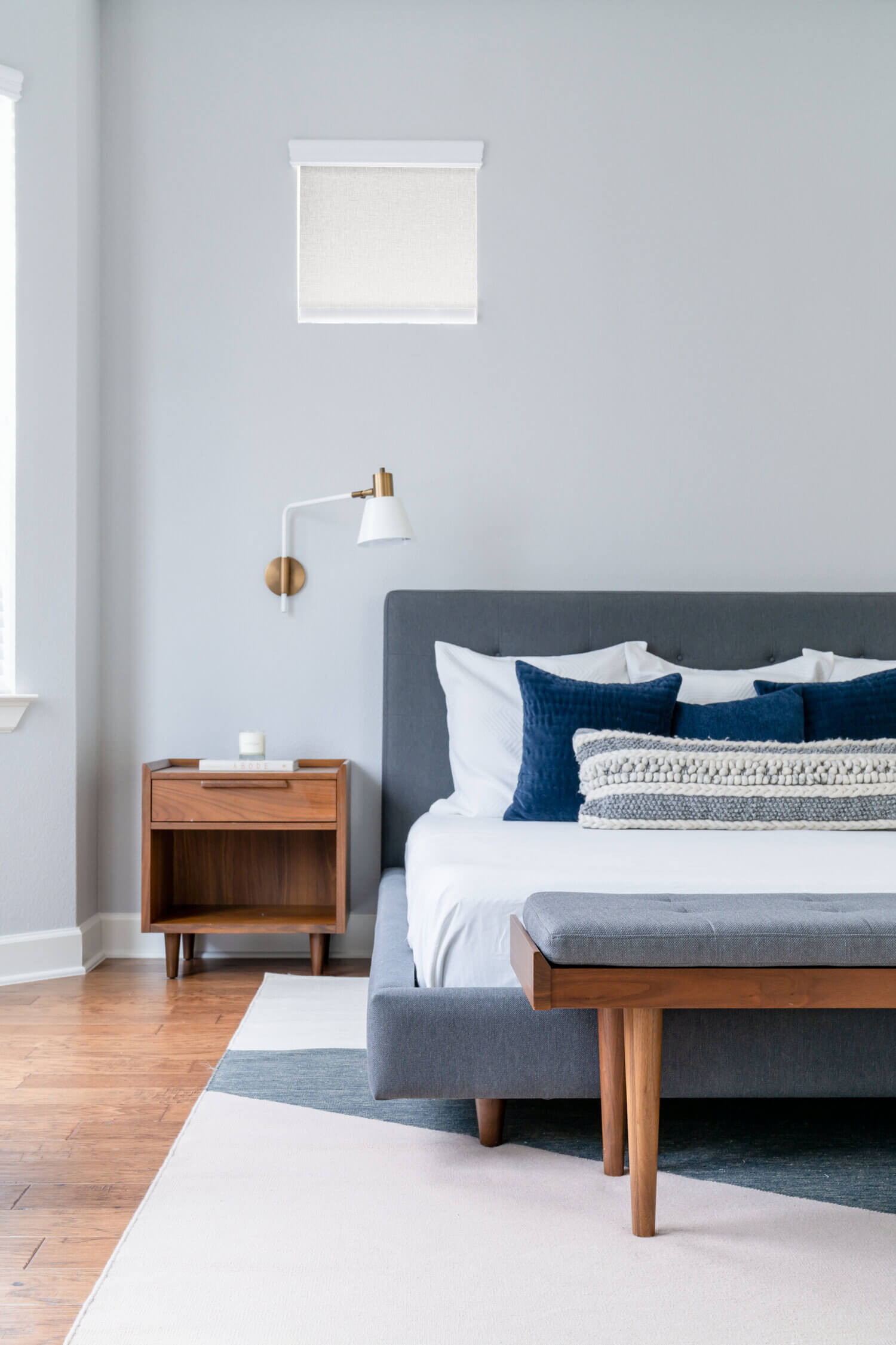
“The leg of a sofa tells me so much about its identity. If I had a make or break for a sofa, I prefer furniture that fits high off the floor. It’s so much more elegant than a bulky rectangular shape that’s not going to be as refined. Tapered legs give furniture a different look. They come in black metal, wood, brass, thick, thin options and different heights. You can choose between oak, walnut or espresso, so the possibilities are endless,” says Christine.
2. Molded Plywood Furniture
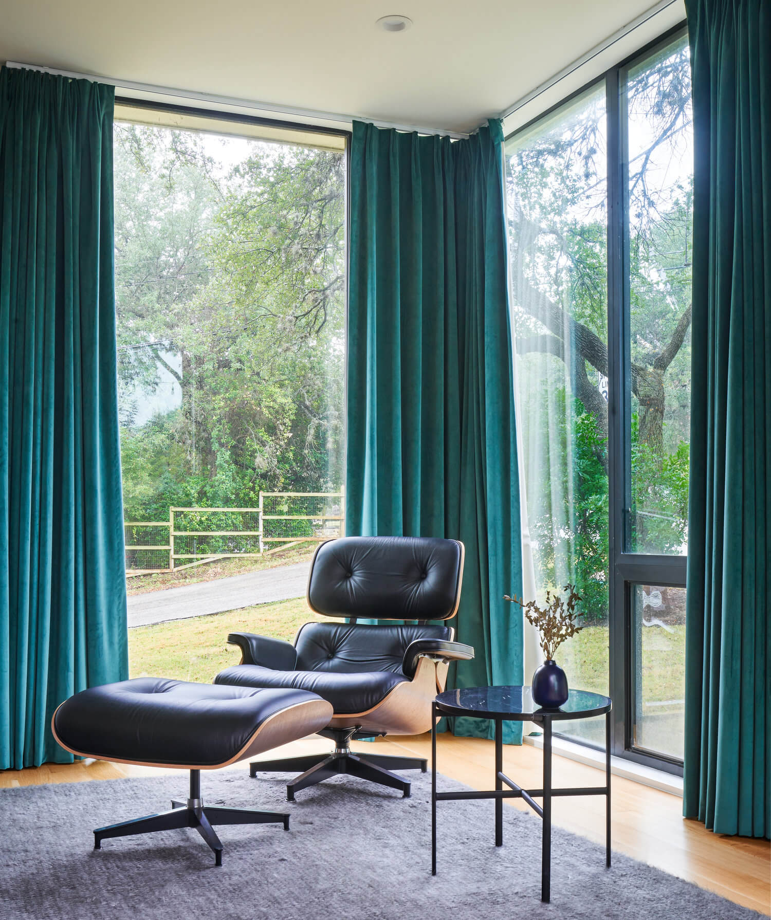
Molded plywood furniture is an innovative MCM design element that’s been loved for decades. “Molded plywood accounts for the human form. All iconic Eames chairs are in molded plywood, and they’re the most comfortable chairs in the world to everyone, no matter their size. It’s functional, durable and not fussy. The pieces aren’t always upholstered, so it’s a clean design. As a cost-effective way to increase comfort and functionality, it’s had a huge impact on the design world,” says Christine.
3. Colorful Appliances
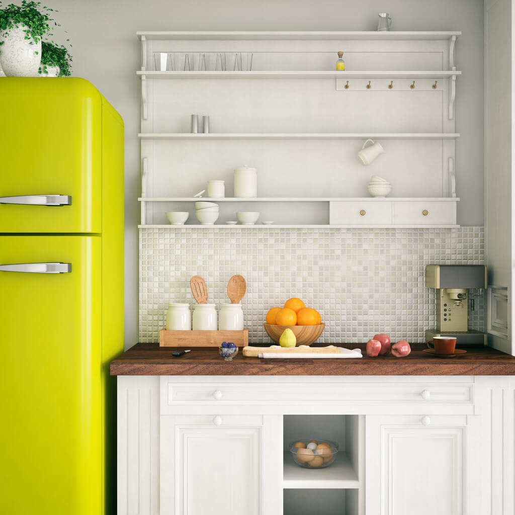
Colorful appliances give off a fun retro vibe that can bring any kitchen back to the mid century. “We’re going to have Elmira Stove Works appliances in the casita of Project House: Austin. The glossy, bright colors pushed me to create a thoughtful, deliberate color palette of yellow, red, mint and orange for the space. My personal favorite colors on appliances are turquoise or robin egg blue,” says Christine.
4. Eichler Wood Paneling
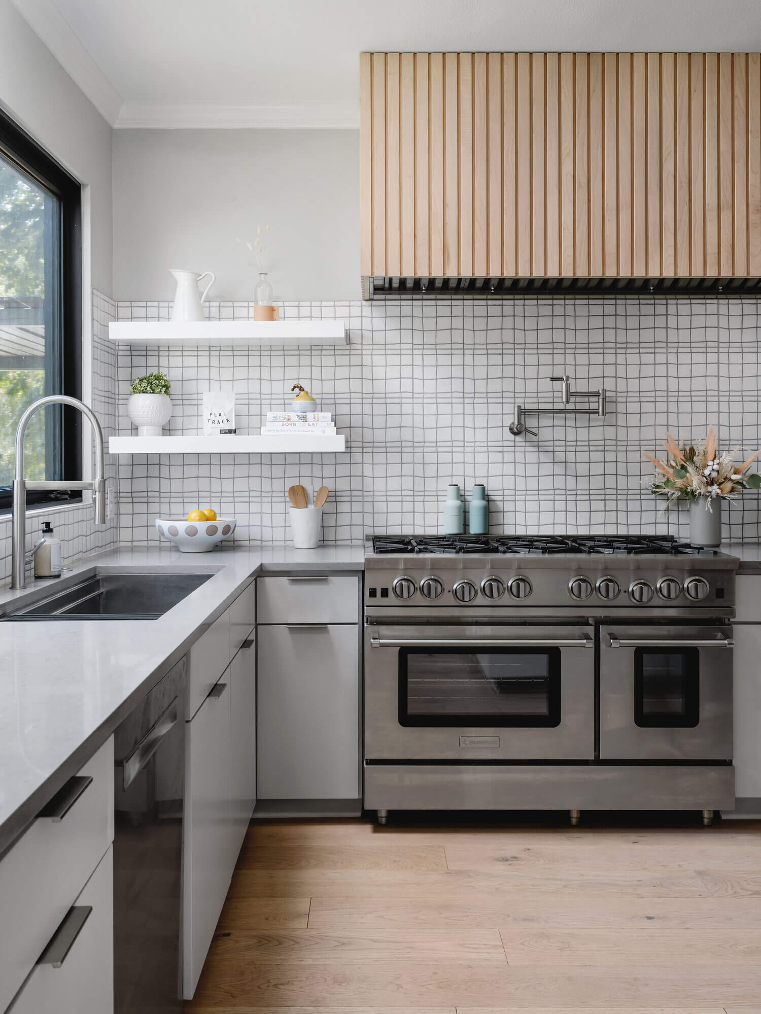
Eichler wood paneling is a popular vintage MCM design element that’s still used today. “I like using Eichler wood paneling in interiors to use it in a way that’s unexpected. It was a big part of original MCM homes in California on the exterior, but you don’t see it inside older homes. The paneling has definitive lines and is a quality material. It inspired me when designing Project House: Austin,” says Christine.
5. Organic and Geometric Shapes
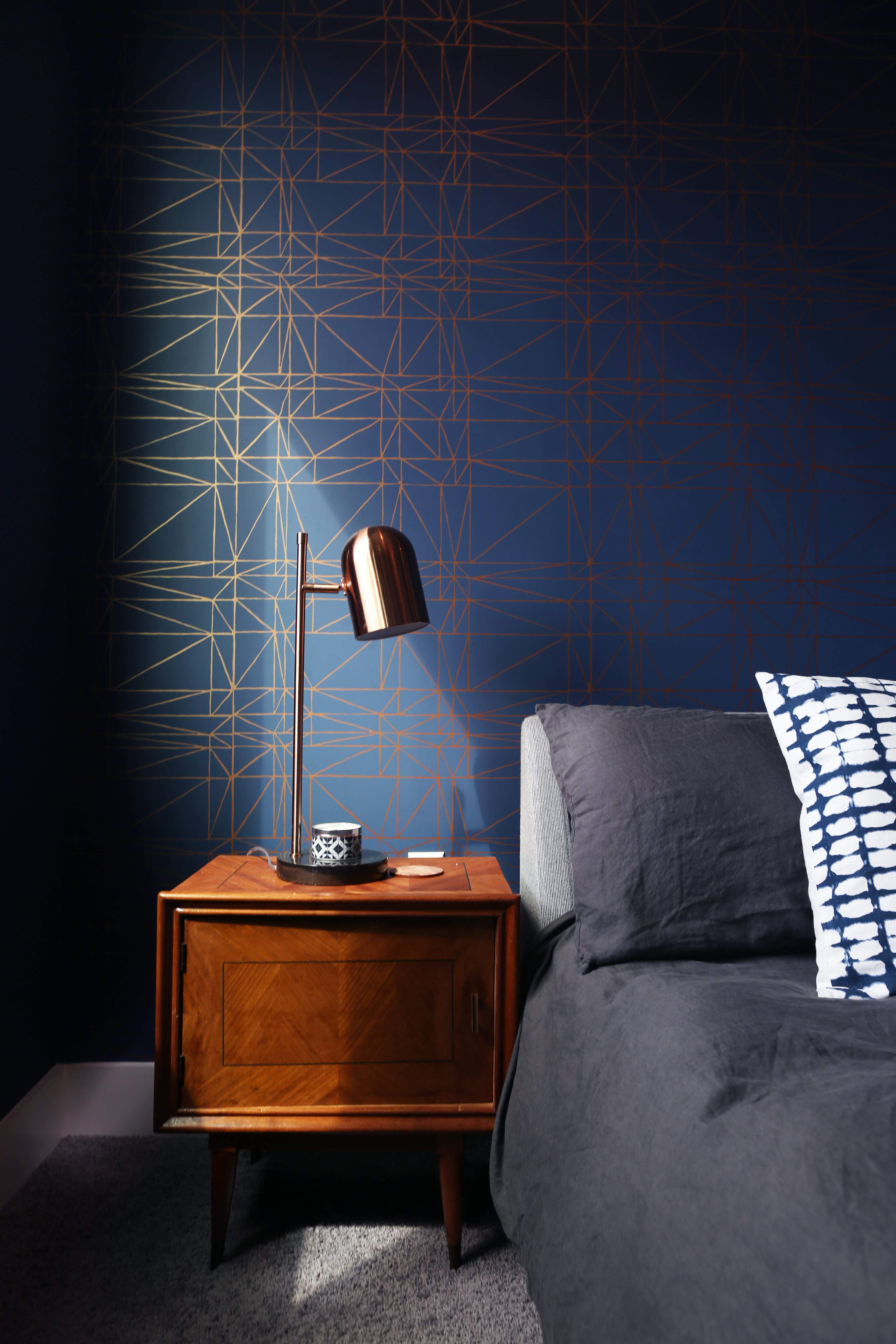
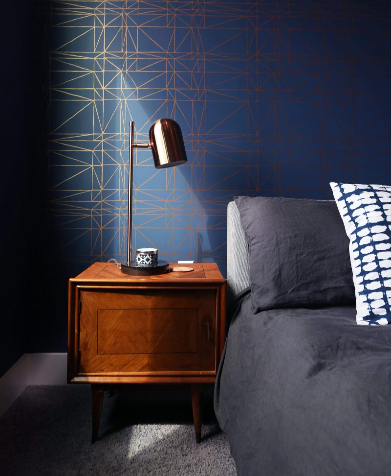
“I am heavily influenced by the geometric motif. People associate angular with modern design, but I like that organic and geometric shapes aren’t perfect. I embrace imperfection and things that aren’t what you would expect. I want to create warm modern spaces that are welcoming and fun, and shapes and silhouettes are an important part of that. This wallpaper is a more complex series of lines that’s more creative, but it’s still clean. It reflects the imperfections of nature,” says Christine.
For more on Christine, visit Breathe Design Studio.
Want more info about Project House: Austin? Read our announcement and get a sneak peek of the companies and products we’ll be working with.
Stay tuned here at atomic-ranch.com, in our print issues, and follow us on Instagram, Facebook and Pinterest to keep tabs on all things Project House!



1 comment