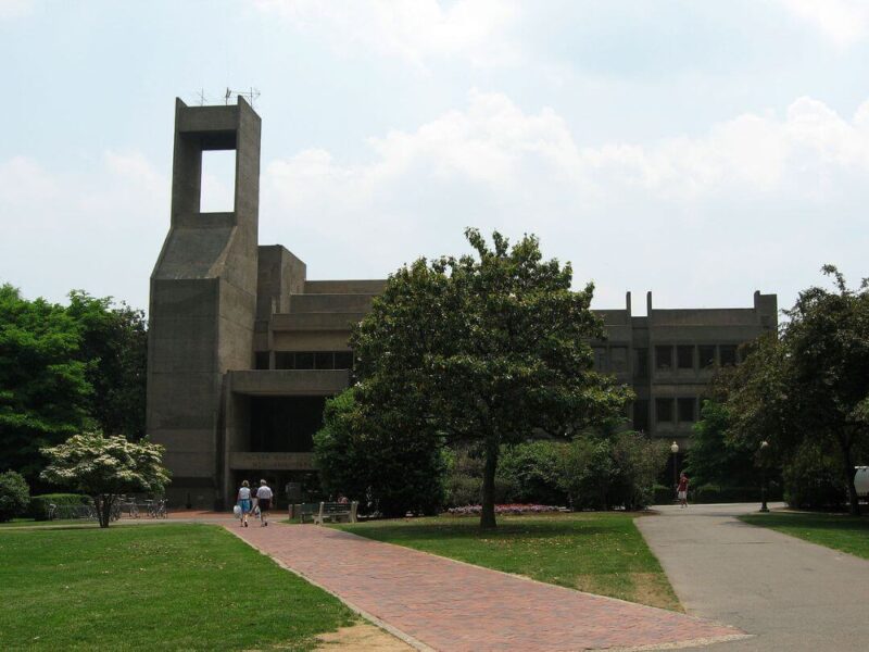
Among the Romanesque, Georgian and Gothic buildings that define the Georgetown University Campus, you will spot one Brutalist building that stands out through its stark modern lines. This structure is Lauinger Library, designed by architect John Carl Warnecke.
Like some other Brutalist landmarks, Lauinger Library has a divisive reputation. Let’s take a closer look at this intriguing structure, Warnecke’s design decisions, and the building’s reception.
A Modernist Interpretation of Flemish Romanesque Architecture

At first glance, the Lauinger Library seems an unusual diversion from the more traditional architecture around it. But its design pays homage to specific buildings on campus.
The main library on campus used to be Riggs Library, which is housed within Healy Hall. That cast iron building dates back to 1891, and features Flemish Romanesque architecture with an iconic tall clock tower.
When the university’s collection outgrew the space available in Riggs Library, Georgetown commissioned John Carl Warnecke to design a new library.

Warnecke’s design drew inspiration from the Flemish Romanesque Healy Hall as well as the Gothic Copley Hall and White-Gravenor Hall. The library’s official website references a 1966 concept paper by Warnecke. The site explains, “The common denominator in these buildings ‘is the undulating exterior wall surface and the profusion of vertical elements’ and Warnecke wanted to recognize these aspects in the design of the library with ‘an irregular outline and a pronounced vertical emphasis.’”
Of course, the most prominent parallel is the Lauinger Library’s spire. This is an architectural nod to the Healy Hall clocktower. But the materials also match. Warnecke wrote, “The material of the new library will incorporate dark gray granite aggregate similar in color to Healy Hall and similar in color intensity to the foliage of the trees on the hillside below. It will blend quietly into the existing landscape of buildings and trees, balancing the older structures that extend immediately to the west of Healy Hall.”
Lauinger Library’s Controversial Reception

Washington DC is no stranger to Brutalist architecture. Other examples of Brutalist buildings in the city include the Robert C. Weaver Federal Building and the Hirshhorn Museum. Nevertheless, the public reaction to the Lauinger Library has been mixed.

No style of architecture seems to divide critics as dramatically as Brutalism. The Lauinger Library is no exception. Here it is ranked among the ugliest buildings in the US.
The Hoya quotes Georgetown Studio Art Professor Peter Charles as explaining, “The facade says `stay away from me’ rather than `come into me.’” He attributes this to its “bunker-like” appearance and the “impenetrable, protective slabs” comprising its façade.
The interior is also criticized by some as not having sufficient natural light or openness. For functional reasons, a library can benefit from both.
University Librarian Artemis Kirk offers a counterpoint, stating, “There are a couple of spots as you’re traveling across the [Key Bridge], if you look at the campus, you see an amazing aesthetic land, of the Lauinger Library with the Healy Building. They are not identical, but it almost flows together when you look at it from that perspective. It shows how remarkable an eye those architects had.”
Love it or loathe it, there is no denying the Lauinger Library has become one of the most recognizable sights at Georgetown University. And whether you agree with the design decisions or not, you can appreciate the considerable purpose and intent Warnecke put into them.
If you liked discovering the Lauinger Library, you may also enjoy checking out some of Warnecke’s other buildings. Learn about the Hawaii State Capitol and 33 Thomas Street. And of course, don’t forget to follow us on Instagram, Facebook and Pinterest for more Mid Century Modern inspiration!


