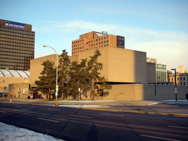
In Syracuse, New York, there is a building that stands out from the more mundane structures around it. If it wasn’t on your original itinerary while visiting the city, you probably will decide to rearrange your schedule so you can pay it a visit; the architecture is that compelling.
This structure is the Everson Museum of Art, designed by I. M. Pei. His goal with the Everson Museum was to invoke curiosity and invite exploration. The distinctive building certainly is effective in reeling in visitors and passersby. Let’s learn a little more about its history and architecture.
The History of the Everson Museum of Art

The history of the Everson Museum of Art dates all the way back to the end of the 19th century. At the time, the name of the museum was the “Syracuse Museum of Fine Arts.” A variety of buildings housed its collections over the decades to follow. Finally, Syracuse received a $1 million donation from Helen Everson in her will in 1941 to build a permanent structure.
At the time, Pei had no experience with museum design. Nevertheless, his works had impressed museum director Max Sullivan, who selected him for the job. Construction began in 1965, and the museum opened three years later with its new name.
It is also worth noting that the museum’s history intersects with that of skateboarding. During the 1980s, the surrounding plaza was a popular location for the sport. If you have seen skateboarding films by Bill Strobeck, it may interest you to know this is the location where he originally got into filmmaking. Nowadays, however, skateboarding on the premises is banned.
Sculptural Architecture that Invites Curiosity and Discovery

When you approach the Everson Museum of Art, you will notice that the blocky brutalist concrete forms are devoid of windows. Moreover, the location of the door is not at all obvious. In fact, the structure looks like a massive abstract sculpture itself.
This choice was a deliberate one. The journal Progressive Architecture in 1968 described it as, “quite conspicuously a piece of abstract sculpture within a civic plaza setting—the sort of sculpture to house sculpture, one might say—a work of art for other works of art.”

But this is not to say that the museum building detracts from the artworks within. In fact, the clever design was meant to engage visitors in such a way as to get them into the mindset to appreciate the art.

The museum’s official website explains why the front door is challenging to find. The site says, “This building breaks with tradition. It does not readily tell us how to use it, how to enter it or what to expect. This building does, in a very different way, tell us that it is about art. It tells us we should look at buildings and art from a different perspective. It asks us to explore and question what we think art, or sculpture, or spaces, or buildings should be. It rewards us with engaging art, exciting spaces and a building that is dynamic, sculptural and beautifully crafted. What begins as a search for the front door becomes a journey to experience art and architecture from a new point of view.”

We often think of buildings in a passive sense. They exist, and we exist. But Pei’s remarkable design reminds us that the relationship can be an active, transformative one. Architecture can challenge our preconceptions and elevate our thinking. When it does, it reminds us to continue to question our assumptions and engage our surroundings with curiosity and intention.
If you liked this post, you may also enjoy The Herbert F. Johnson Museum Of Art: A Window On The Landscape and This I.M. Pei Designed Hot Spot In NYC Was Transformed Into A Hospital. And of course don’t forget to follow us on Instagram, Facebook and Pinterest for more Atomic Ranch articles and ideas!


