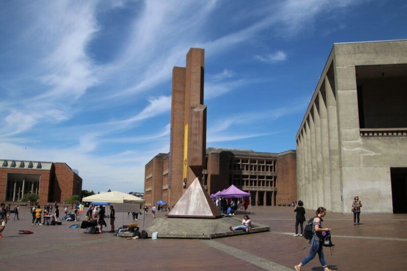
If you are ever in the neighborhood of the University of Washington, you will want to pay a visit to UW’s iconic Central Plaza, better known as the “Red Square.” Here, you can enjoy not one, but three, spectacular examples of Brutalist architecture from the 1970s.
Actually, Kirk, Wallace, McKinley & Associates completed the development plan for the structures clear back in 1966, with the Regents issuing approval the next year. Beneath the Red Square is a parking garage with space for more than 1,000 vehicles.
If it has rained recently, you will want to watch your step—those red bricks are slippery. In fact, some students at UW believe that they were made that way on purpose to try and discourage large groups of protestors.
The Daily of the University of Washington states that this is a myth, however, and could not be further from the truth. Reporter Sarah Anderson says, “Red Square —and the parking structure underneath it—was constructed in 1971. Paul Hayden Kirk, a 1937 UW graduate and influential Northwest modernist architect, designed Red Square and much of the surrounding area, including Meany Hall and Odegaard Undergraduate Library. According to Kirk, the design was actually conceived to promote gathering. The plaza ‘should be open for the people to use and the big groups to get together,’ Kirk told Don C. Miles in a 1987 interview.”
Let’s take a tour of the three Brutalist buildings.
Kane Hall

Walker & McGough, a firm based in Spokane, came up with the design of Kane Hall, completed in 1971.
Architecture professor Alex Anderson said in UW News, “It is hulking with its massive concrete piers, but it does help shape and energize Red Square much better than Gerberding Hall on the other side of the plaza. Its piers also catch the south light in interesting ways.”
He also comments that the building’s interior is a departure from Brutalism. But, he says, its façade “keeps it in the family.”
While heavy and imposing, the narrow vertical columns along with the recessed windows provide a surprising touch of lightness. The colors also coordinate well with the red bricks of the plaza, as is true with the other two buildings.
Odegaard Undergraduate Library

This building opened the year after Kane Hall, and was the work of Kirk, Wallace, McKinley & Associates. Stylistically, it bears much in common with Kane Hall. Once again, the red brick integrates well with the surroundings, and rectangular shapes dominate. The windows are again recessed, and it makes a startling contrast to the university’s famous Collegiate Gothic style Suzzallo Library.
The 2014 American Institute of Architects (AIA) Institute Honor Awards for Interior Architecture was awarded to the architects who renovated the structure from 2012 to 2013.
Meany Hall for the Performing Arts

Finally, the Meany Hall for the Performing Arts came to grace Red Square. Kirk, Wallace, McKinley & Associates built this massive, monolithic structure in 1974. It replaced the previous “Auditorium Hall,” or “Old Meany Hall.” An earthquake compromised that building in 1965.
Being as the building is an auditorium, large sections of the walls are windowless, contributing to its heavy, looming appearance. The tall vertical windows that interrupt the façade are recessed in a manner similar to the others. The building’s acoustics are praised together with its appearance, making it a delight for both senses.
If you enjoyed this tour of the Red Square at UW, you may also enjoy our tours of UBC Vancouver and Simon Fraser University. Follow us on Instagram, Facebook and Pinterest to discover more examples of Brutalist and MCM architecture in the Pacific Northwest and beyond.


